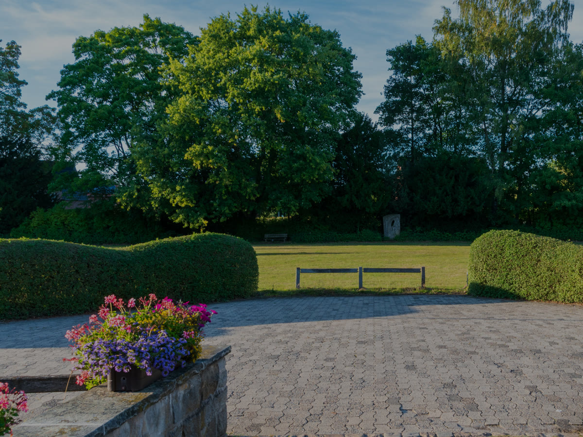
Projects
Larger pieces of work, planned and priced in writing first.
119 components, sections and showpieces for Etch on Automatic.css. Most cards run the real element: hover it, drag it, then copy it or insert it from the panel inside Etch.


Ready to plan your yard?
Tell us about the project. We walk it with you within a week.
A section background of slow, drifting colour with your content in a slot on top. Three palettes: your site's own primary tokens; Dusk, a purple and a teal glow rising along the bottom over a dark ground; and Lagoon, three cyan to green glows drifting low and quick, with its own light version on a pale mint ground. Drift speed and a still setting as props; still is also what reduced motion and a missing stylesheet get.
A full-width hero background in dark or light, with Dusk. A hero background that moves slowly behind the headline. A closing call to action with more presence than a flat band. A section divider between two plain parts of a long page.
palette (select: site, dusk, lagoon); tone (select: light, dark); drift (select: slow, medium, still); slot: content
Open the item pageLandscape design and build
We plan, plant and build outdoor rooms that settle in and stay beautiful, season after season.
A hero over drifting points that join with a line whenever two come near. The pointer, or a finger, is one more point the rest reach toward. Needs the EtchPress Runtime; without it the hero sits on a still gradient.
A network, data or security product's hero. A page about a community or a team spread across places. A dark band behind a headline about connection. The top of an integrations page.
eyebrow (text, optional); title (text); lead (text, optional); primaryLabel and primaryHref; secondaryLabel (optional) and secondaryHref; palette (select: site colours, dusk, ember); speed (select: calm, still, lively)
Open the item pageLandscape design and build
We plan, plant and build outdoor rooms that settle in and stay beautiful, season after season.
A hero over level lines that breathe like a survey map, every fourth line stronger, in your site's own colours. It leans toward the pointer, follows a finger on a phone and drifts as the page scrolls. Needs the EtchPress Runtime; without it the hero sits on a still gradient.
A landscaper's, surveyor's or architect's home page. An outdoor brand or a travel company's hero. A section header for a process or a plan. A quiet, technical ground for a product launch.
eyebrow (text, optional); title (text); lead (text, optional); primaryLabel and primaryHref; secondaryLabel (optional) and secondaryHref; palette (select: site colours, dusk, ember); speed (select: calm, still, lively)
Open the item pageLandscape design and build
We plan, plant and build outdoor rooms that settle in and stay beautiful, season after season.
A hero over a grid of dots that swell, light up and part under the pointer or a finger, with a slow wave passing through when nobody touches it. Needs the EtchPress Runtime; without it the hero sits on a still gradient.
A software or data product's hero. The top of a documentation or developer page. A dark feature band between two light sections. A contact section that reacts to the visitor.
eyebrow (text, optional); title (text); lead (text, optional); primaryLabel and primaryHref; secondaryLabel (optional) and secondaryHref; palette (select: site colours, dusk, ember); speed (select: calm, still, lively)
Open the item pageLandscape design and build
We plan, plant and build outdoor rooms that settle in and stay beautiful, season after season.
A hero over a slow liquid field of your site's own colours, drawn live in the browser. It leans toward the pointer, follows a finger on a phone and drifts as the page scrolls. Needs the EtchPress Runtime; without it the hero sits on a still gradient.
The opening of a studio or product home page. A launch or waitlist page that needs one strong image without a photo. The top of a pricing page, in the brand's colours. A closing call to action with more presence than a flat band.
eyebrow (text, optional); title (text); lead (text, optional); primaryLabel and primaryHref; secondaryLabel (optional) and secondaryHref; palette (select: site colours, dusk, ember); speed (select: calm, still, lively)
Open the item pageLandscape design and build
We plan, plant and build outdoor rooms that settle in and stay beautiful, season after season.
A hero over bands of light that drift across a dark ground like slow silk, in your site's own colours. It leans toward the pointer and follows a finger on a phone. Needs the EtchPress Runtime; without it the hero sits on a still gradient.
A music, fashion or events brand's hero. A launch page that wants movement without a video. The opening of a portfolio. A closing call to action with presence.
eyebrow (text, optional); title (text); lead (text, optional); primaryLabel and primaryHref; secondaryLabel (optional) and secondaryHref; palette (select: site colours, dusk, ember); speed (select: calm, still, lively)
Open the item page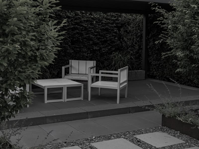
 BeforeAfter
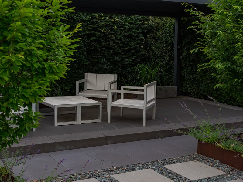
Two photos, one divider you drag. The control is a real range input, so it works by keyboard, touch and mouse, reads its position aloud, and needs no library. Labels and the start position are props.
A renovation or landscaping result, before and after. A cleaning, detailing or repair comparison on a service page. A retouching or design revision shown side by side.
before (image URL); beforeAlt (text); after (image URL); afterAlt (text); beforeLabel and afterLabel (text); start (select: 25, 50, 75 percent); ratio (select: 4:3, 16:9, 1:1)
Open the item pageLarger pieces of work, planned and priced in writing first.
A first conversation and a written plan.
Weekly, on a fixed monthly price.

A scheduled check, every season.
The small fixes, done on the same visit.
Same-day help when something cannot wait.
A tile for a bento grid: title, text, optional image or icon, and a span setting (1×1, 2×1, 1×2, 2×2). The grid packs tiles densely at four columns and stacks them on small screens. Hover lifts the tile and drifts the image.
A features grid where one or two features deserve more room. A services overview mixing photos, icons and short text. A product summary block on a home page.
title (text); text (text); image (image, optional); span (select: 1×1, 2×1, 1×2, 2×2); tone (select: light, dark, primary)
Open the item page
Three things to ask before you hire anyone, and the answers worth hearing.


A post: image, category, title carrying the link, excerpt, date and reading time. Built for loops: map its props from a posts loop and every post renders the same way; the whole card is the click target.
A blog archive fed by a posts loop. A row of three latest posts on a home page. Related posts at the end of an article.
image (image URL); alt (text); category (text); title (text); excerpt (text); date (text, shown as written); datetime (text, ISO for the time element); readTime (text); href (link); layout (select: stacked, horizontal); size (select: medium, small)
Open the item pagePlain writing on the law we practise.
Short, useful and dated, so you know when it was true.

Three things to ask before you hire anyone, and the answers worth hearing.
A Section intro over three Blog cards with a link to the archive. On a site, wrap the cards in a posts loop and map the card's props from the post.
The latest posts section on a home page. A resources or news block on a landing page. A reading list at the end of a service page.
A pattern: edit the Section intro; replace the three cards with a loop of posts mapped to the Blog card's props.
Open the item pageAn ACSS button with an arrow after its label. On hover the arrow leaves to the right and a second one arrives from the left; the button keeps its width.
A primary call to action that points the way forward. A read more or next step link styled as a button. A header button that answers the pointer without shouting.
label (text); href (url); style (select: primary, outline); size (select: default, large)
Open the item pageAn ACSS button with a light that runs one lap around its border when you hover, then rests. White on the filled style, the border colour on the outline.
The one primary action in a hero. An outline button that needs a little more presence without a fill. A pricing card's call to action on the featured plan.
label (text); href (url); style (select: primary, outline); size (select: default, large)
Open the item pageAn ACSS button with a round dot at its right end that holds an arrow. On hover the dot grows to fill the whole button and the label changes colour. Primary or outline, two sizes.
A primary call to action with a clear direction cue. A hero button that rewards the hover with a full change of colour. A pricing or booking button that stands apart from plain ones.
label (text); href (url); style (select: primary, outline); size (select: default, large)
Open the item pageAn ACSS button that inverts on hover: a layer in the label's colour rises from the bottom edge and the label takes the face's colour. On the outline style the fill takes the border colour and the label turns light.
A call to action whose hover feels like pressing in. An outline button that fills with the brand colour on hover. A form submit button with a stronger hover than a colour fade.
label (text); href (url); style (select: primary, outline); size (select: default, large)
Open the item pageA button that leans toward the pointer from a little way off, its label leaning further, and springs back when you leave. A press sends a ring of light out from the point touched. On a phone it leans to the finger and springs back on release. Needs the EtchPress Runtime; without it it is a plain button.
The one call to action a page is built around. A contact or booking button in a hero. The button at the end of a case study. A playful sign-up button on a product page.
label (text); href (url); tone (select: ink, brand, outline); size (select: medium, large); arrow (select: yes, no)
Open the item pageAn ACSS button whose label rolls up and out on hover while a second one rolls in from below: the same words, or a second message you set.
A primary call to action that answers the hesitation on hover ("It takes two minutes"). A header button that repeats its label with a little life. An outline button beside a plain one, so one of the pair moves.
label (text); hoverLabel (text, optional: a second message, empty repeats the label); href (url); style (select: primary, outline); size (select: default, large)
Open the item pageAn ACSS button with a bright sweep of light across its face on hover. Needs the EtchPress Motion stylesheet for the sweep.
A premium or featured action, such as the recommended plan. A hero button with a touch of polish. A limited offer or launch button.
label (text); href (url); style (select: primary, outline); size (select: default, large)
Open the item pageAn ACSS button with a faint line under its label; on hover a solid one draws over it, left to right.
A quiet secondary action beside a louder primary one. A text-led button for editorial or legal sites. A navigation call to action in a header.
label (text); href (url); style (select: primary, outline); size (select: default, large)
Open the item pageThe work



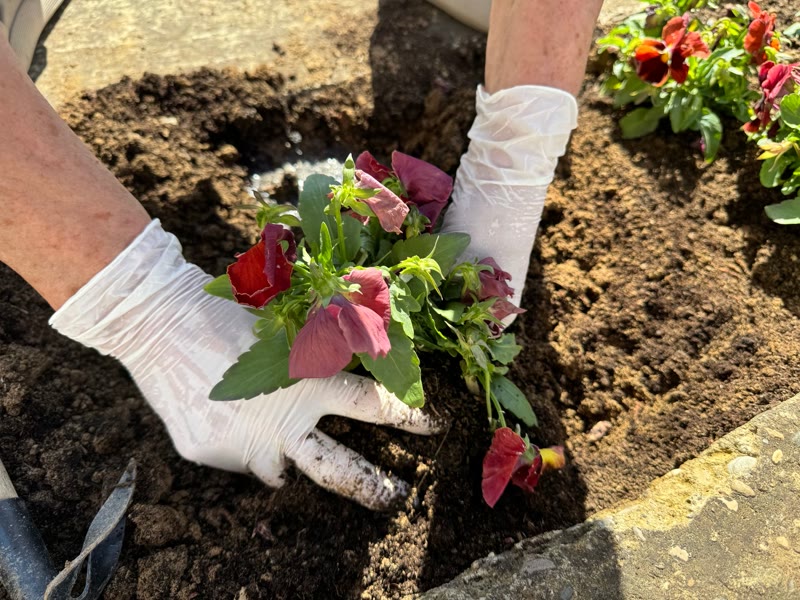




Drag it any way you like.
A wall of pictures with no edge: drag it in any direction and it keeps going, coasting when you let go and drifting when left alone. Swipe it sideways on a phone. Needs the EtchPress Runtime; without it it is a tidy grid of the pictures.
A portfolio to wander through. Photos from an event. A mood board or lookbook. A product range with no first and last.
eyebrow (text, optional); title (text, optional); images (repeater: image, alt)
Open the item pageA paver terrace with clipped hedges, built over one summer.
See the projectNative beds around a forest lake, planted for four seasons.
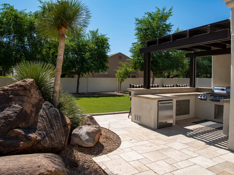
See the projectAn outdoor kitchen and a patio that stays level through winter.
See the projectDrip and spray across a wide lawn, started each spring.
See the projectRaised beds, planted to the drawing.
See the projectDrag the top card left for the next one, right for the one before, or use the buttons.
A stack of cards. Drag the top one left and it flies off and tucks in at the back while the rest step forward with a small spring; drag right and the last one comes back. It works the same with a mouse and a finger; Previous and Next buttons and the arrow keys do it for a keyboard. Needs the EtchPress Runtime; without it the cards are a row to swipe.
Testimonials worth flicking through. A handful of featured projects. Team members on an about page. Product highlights on a phone-first page.
cards (repeater: image, alt, title, text, linkLabel, href); prevLabel (text, empty hides the button); nextLabel (text)
Open the item pageA photo card that turns toward the pointer in 3D with a soft glare that follows it, its text floating a little above the picture. On a phone it turns as it travels up the screen and leans to a finger. Needs the EtchPress Runtime; without it it is a still photo card.
Project cards on a portfolio or a contractor's work page. Team or speaker cards with a portrait. Three featured services. Product cards on a small catalogue.
image and alt; eyebrow (text, optional); title (text); linkLabel (optional) and href
Open the item pageTalk to a person, not a form.
Call, write or come by. For a quote, the visit is free.
We read every message the same day and reply by the next business day.
Your form goes here: drop in a SureForms or WS Form block and delete this box.
A Section intro and a list of Detail items (phone, email, office, hours) beside a form card. The form card holds a marked slot for your form plugin's block; the details link where they can.
A contact page with details on one side and a form on the other. A get a quote section at the end of a service page. A visit us block with address, hours and a booking form.
A pattern: edit the Section intro and each Detail item; drop your form block into the marked box.
Open the item page
A number that counts up from zero once it scrolls into view, with a prefix, a suffix and a label. A few lines of script do the counting, and the final number sits in the markup, where search engines and screen readers read it.
A years in business or projects finished figure that counts up. A row of results on a home page. A fundraising or sign-up total on a campaign page.
number (text, whole number); prefix (text); suffix (text); label (text); size (select: large, display, medium)
Open the item pageReady to get started?
Tell us about the project. We talk it through with you within a week and send a written plan and a line-item price.
A closing band: a centred or start-aligned Section intro with one or two actions, on dark, light or plain. The section that ends most pages.
The closing section of almost any page. A book a call band between two long sections. A newsletter or download prompt on a dark band.
A pattern: edit the Section intro's props. Change the band with bg–light or band–dark on the section.
Open the item pageAn icon, a title and a detail: a phone number, an email, an address, opening hours. The detail is a link when you give it one. Stack them in a list for contact blocks, footers and sidebars.
A contact block with phone, email, address and hours. An at a glance card with price, timeline and warranty. A footer or sidebar list of ways to reach you.
icon (select: phone, mail, pin, clock, calendar, check); title (text); detail (text); href (link, optional: makes the detail a link)
Open the item pageA row of icons that swell as the pointer passes, the one beneath it most and its neighbours less, like a Mac's dock. On a phone, sliding a finger along the row does the same. Needs the EtchPress Runtime; without it it is a plain row of icon links.
Floating navigation at the foot of a portfolio. Quick links on a personal site. Contact shortcuts on a landing page. A playful secondary menu.
label (the navigation's name for screen readers); items (repeater: label, href, icon: home, search, mail, calendar, message, phone, heart or star); scale (select: 1.7, 1.4, 2)
Open the item page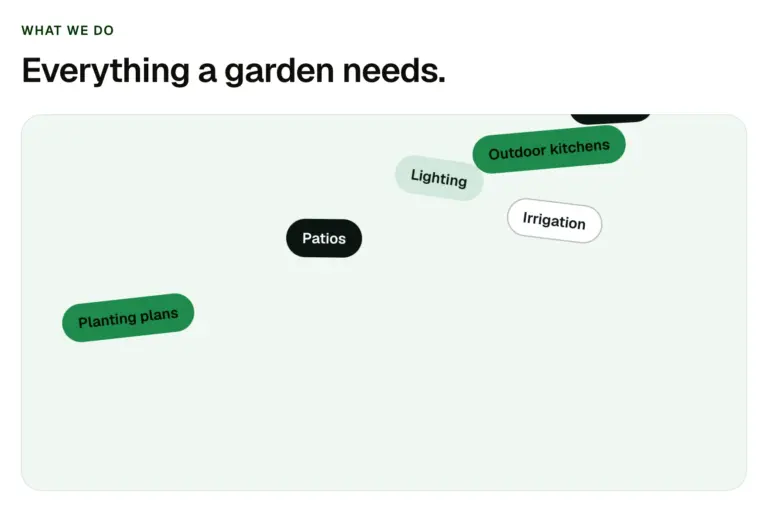
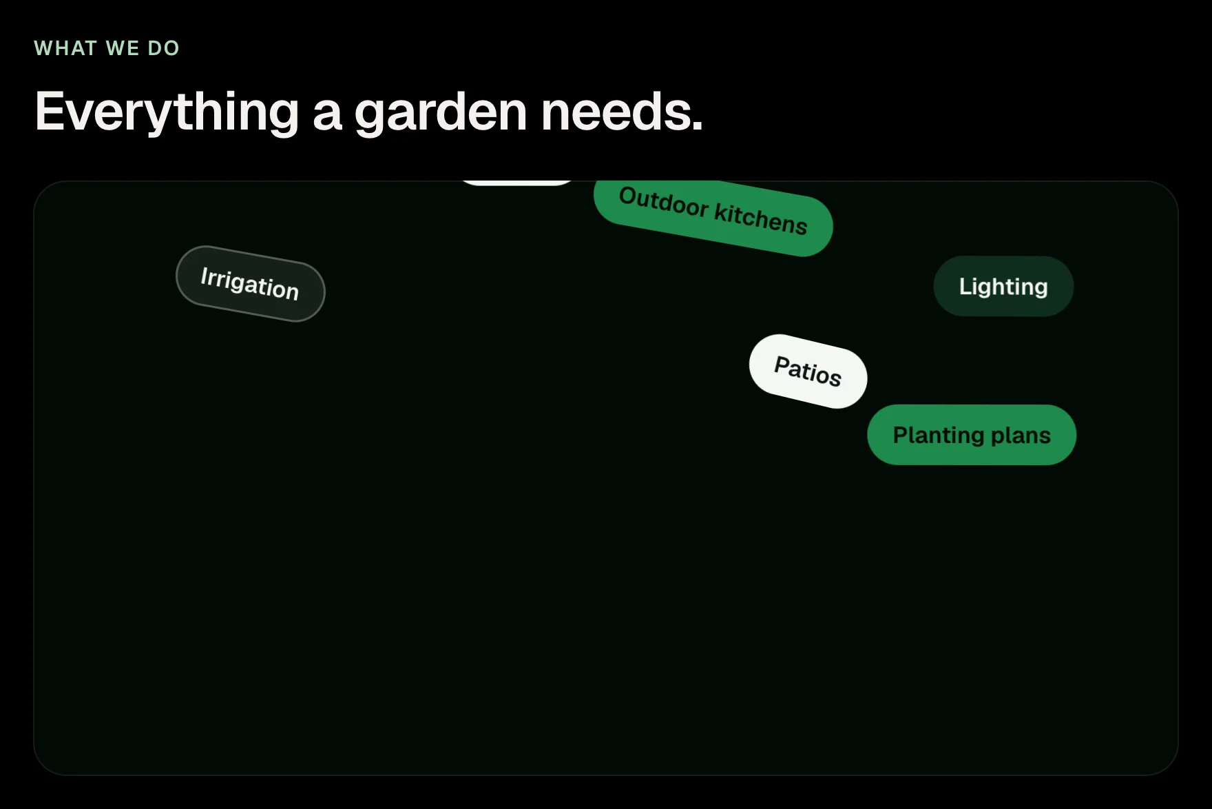
A box of tags that drop in, pile up with real weight, and can be picked up and thrown, with a mouse or a finger. For skills, services, tools or values. Needs the EtchPress Runtime; without it the tags are a tidy wrapped row.
Skills on a portfolio. Services at a glance. The tools a team works with. Values or topics on an about page.
eyebrow (text, optional); title (text, optional); tags (repeater: label)
Open the item pageMost work starts two to four weeks after you say yes. Urgent needs are seen the same day.
Yes. Every quote lists each line of work and its price, and the invoice matches it unless you change the scope.
We move the dates with you and confirm the new ones in writing the same day.
One question and its answer as native details and summary: no script, keyboard and screen-reader behaviour for free, and the chevron turns with CSS. The answer is a slot, so it can hold paragraphs, lists, links or a button.
A questions list on a service or pricing page. A single expandable note inside an article. Shipping, returns or policy answers on a shop page.
question (text); startOpen (boolean); answer slot (anything; a default paragraph shows while it is empty)
Open the item pageMost projects start four to six weeks after you approve the quote. Emergency repairs go out the same day.
Yes. Every quote lists each line of work and its price, and the invoice matches it unless you change the scope.
We reschedule the outdoor days and tell you the night before. Indoor work carries on.
We file them and the fee is on the quote as its own line.
Two years on workmanship, and the manufacturer's on materials.
A Section intro beside or above a list of FAQ items (native details, no script). The first question starts open.
A questions section before the closing call to action. A support page with the most asked questions. Objection handling on a pricing page.
A pattern: edit the Section intro and each FAQ item's question and answer slot; add or remove items.
Open the item page
A paragraph or heading whose words turn from muted to full colour in reading order as the reader scrolls. Pinned, the text holds in the middle of the screen while a tall section scrolls through; in the flow, it fills as it rises. Pure CSS on a view timeline (Chrome, Edge, Safari 26) plus a few lines that wrap the words; where the browser lacks view timelines the text is simply filled.
A mission statement that fills with colour as it is read. A pinned manifesto paragraph between two sections. A pull quote that rewards the scroll.
text (text); level (select: h2, h3, p); size (select: normal, large, display); fillColor (select: text, primary); pin (select: pinned, flow).
Open the item page
Nothing matches those filters. Clear one, or call (503) 555-0147.
Filter and sort any list of cards without a plugin: a segmented type switch, sort buttons and a filter popover with checkbox groups, a live result count and an empty state. Types, sorts and filter groups are repeaters; the cards are a slot, and each card's list item carries the data it is judged by.
A directory of clinics, locations or staff that filters without a plugin. A service or product finder with types, sorts and checkbox filters. A project archive filtered by kind and year.
label (text); types (repeater: label, value, matched against data-type on each item); sorts (repeater: label, key, order asc or desc, read from data-); filters (repeater: label, key, values comma separated, matched against data-); noun and nounOne (text, for the count: visits and visit); emptyText (text); items slot (a list whose items carry data attributes)
Open the item pageBrand and tagline, contact details with icons, up to three link columns as repeaters, and a legal row. Dark by default, light on a switch. Every link column is a repeater, so a client adds a link without touching the layout.
A site footer with contact details and up to three link columns. A dark footer for a light site, or the reverse. A footer a client can add links to without touching the layout.
brandName, brandHref, logo (image URL, optional), tagline; tone (select: dark, light); phone, phoneHref, email, address (details, each optional); column1Heading and column1Links (repeater: label, url), the same for columns 2 and 3; legal (text); legalLinks (repeater: label, url)
Open the item pageA dark pill: your site's accent colour rises from below on hover and the label flips to dark ink.
A dark call to action that turns to the accent colour on hover. A hero button on a dark or photographic background. A sign up or book now button for a studio or software site.
label (text); href (url); size (select: default, large)
Open the item pageA pill filled with a gradient of your site's accent colour in continuous motion across its face. White label, dark chevron.
A call to action filled with moving colour. A launch or waitlist button that draws the eye on a dark page. A featured plan button.
label (text); href (url); size (select: default, large)
Open the item pageA pill as a luminous tube: an outline and label in your site's accent colour, an inner glow, and a subtle sign-style flicker without end.
A call to action that glows like a sign. A button for nightlife, gaming, music or event sites. An accent action on a dark hero.
label (text); href (url); size (select: default, large)
Open the item pageA dark pill with a light circling its edge without end and a soft halo orbiting outside it. White label, a chevron in your site's accent colour, which is also the colour of the light.
A primary call to action on a dark hero, with a light circling its edge. A get started button for a studio, agency or software site. A single standout action on an otherwise quiet page.
label (text); href (url); size (select: default, large)
Open the item pageA dark pill with a breathing glow: a ring expands and fades while the shadow beats, without end. White label, a chevron in your site's accent colour.
A call to action that breathes to draw attention. A live, open now or limited time action. A join or subscribe button on a dark band.
label (text); href (url); size (select: default, large)
Open the item pageA dark pill with a diagonal shine that crosses it every time you hover. White label, a chevron in your site's accent colour.
A dark call to action with a shine on hover. A view work or see plans button. A premium action beside a plain secondary one.
label (text); href (url); size (select: default, large)
Open the item pageA yard you will actually use.
Design, build and care from one crew.
A wrapper that lays fine film grain over whatever you put inside it: a section, a hero, a card. The grain is an SVG noise filter in a data URI, blended over the content, with strength and blend mode as props. No images, no script.
A hero photo with a film texture over it. A flat colour band given some tooth. A card or section that should feel printed rather than digital.
strength (select: light, medium, heavy); blend (select: soft light, overlay, multiply); slot: content; radius (select: card, soft, none), matched to the corners of what you slot in.
Open the item pageFour steps from first call to finished yard.
You know the price and the dates before anything starts.
A dotted or lined grid behind your content, fading out from the centre so it never fights the text. Dots or lines, spacing and a fade shape as props. Pure CSS, tokens only.
A technical or product hero on a dotted grid. A blueprint feel behind a process or pricing section. A quiet texture behind a centred headline.
pattern (select: dots, lines); spacing (select: tight, normal, wide); fade (select: centre, top, none); tone (select: light, dark); slot: content
Open the item pageBrand on the left, navigation in the middle, phone and a button on the right; sticky or static, light or dark, with a plain or bold phone. The navigation is a slot that holds Etch's own Nav and Burger components (included), so the menu, dropdowns and mobile panel are Etch's, styled with your tokens.
A service business header with phone and a booking button. A sticky header on light or dark. A header whose menu a client edits in WordPress.
brandName (text); brandHref (link); logo (image URL, optional: shown instead of the wordmark); position (select: sticky, static); tone (select: light, dark); phoneStyle (select: plain, bold); showPhone (boolean); phone (text); phoneHref (link); showCta (boolean); ctaLabel (text); ctaHref (link); nav slot (Etch Nav and Burger, or anything)
Open the item pageAn editorial masthead: a one-line announcement above, a serif wordmark with a small tag, navigation, phone and a button, ruled by a hairline. Sticky, with a shadow once the page has moved. The navigation is a slot holding Etch's own Nav and Burger (included).
An editorial or law firm masthead with an announcement line. A header for a publication, a practice or a studio. A sticky masthead that gains a shadow once the page moves.
showAnnouncement (boolean); announcement (text); announcementLinkLabel and announcementHref; brandName (text); brandTag (text, the small suffix such as LLP); brandHref (link); position (select: sticky, static); showPhone, phone, phoneHref; showCta, ctaLabel, ctaHref; nav slot
Open the item pageA floating pill: brand, navigation and a burger in a blurred capsule that hangs from the top of the page, with the button sliding in once the page has scrolled. Fixed on a site, in flow here so you can see it. The navigation is a slot holding Etch's own Nav and Burger (included).
A floating header for a modern product or studio site. A header whose button appears once the visitor has scrolled. A light header over a full-bleed hero.
brandName (text); brandHref (link); logo (image URL, optional); position (select: fixed, in flow); ctaLabel (text); ctaHref (link); ctaShort (text, the label at narrow widths); nav slot
Open the item pageA display headline whose letters rise out of the line one after another, then its last word changes through a short list, letter by letter. The headline keeps its height through every word, so nothing below it moves. Needs the EtchPress Runtime; without it the headline is plain.
The headline of a home page: what you build, for whom, said three ways. A services line that names each service in turn. An about page statement. A hero for a studio that does several things well.
text (text); word (the last word, at rest); more (the words it changes to, separated by |); level (select: h1, h2); size (select: display, heading); repeat (select: twice round then rest, without end)
Open the item pageA headline whose letters lift, grow and take the accent colour as the pointer comes near, and settle as it leaves. On a phone a finger does the same and a soft wave crosses the line as the page scrolls. Needs the EtchPress Runtime; without it the headline is plain.
A playful hero headline. A contact section's invitation. A 404 page. The name of a studio at the top of its site.
text (text); level (select: h2, h1, h3); size (select: display, heading)
Open the item page
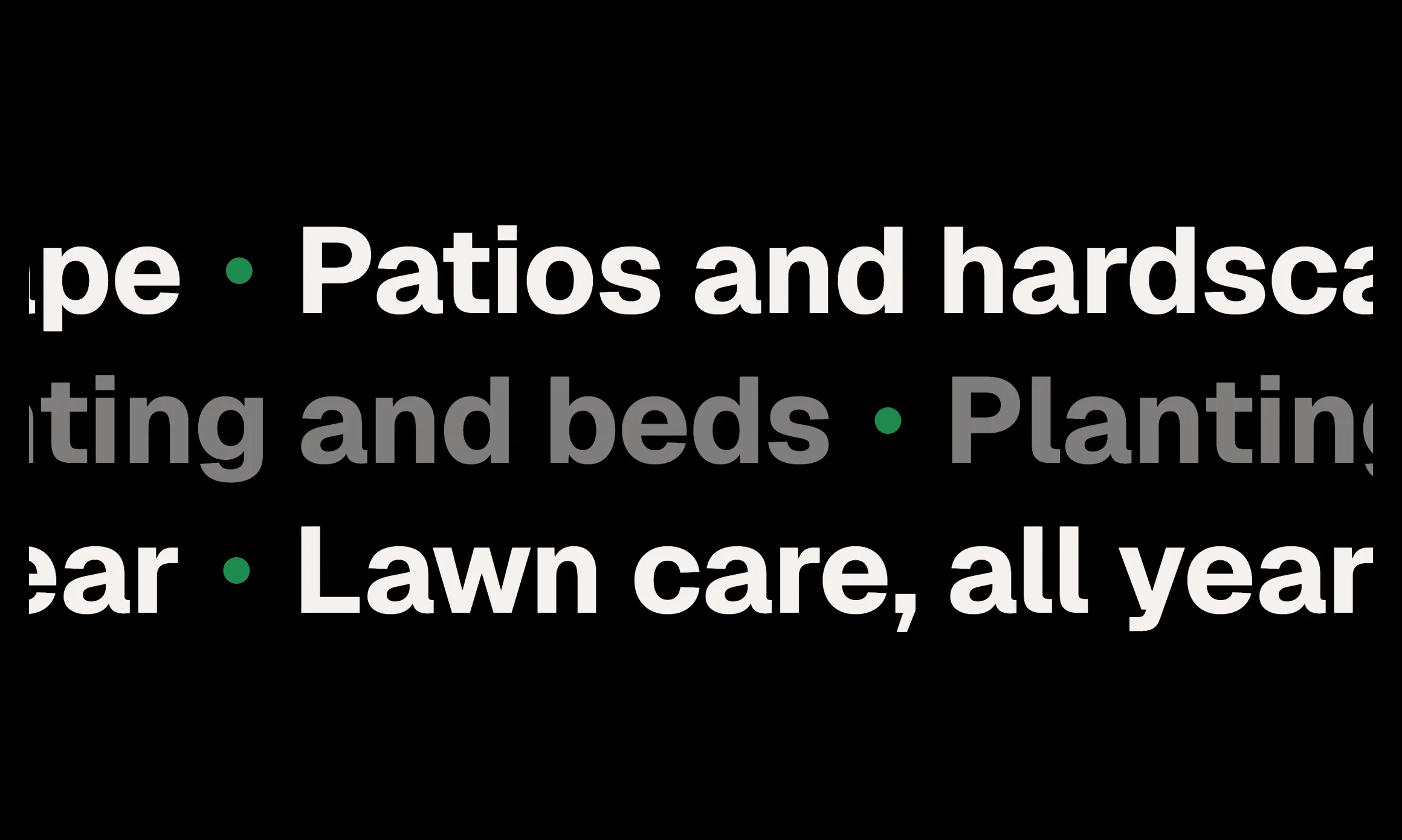
Rows of very large type that slide past without end, alternate rows the other way. Scrolling the page speeds them up, leans them and turns them round when the scroll turns. The same on a phone. Needs the EtchPress Runtime; without it each row is one still line.
A band of words between two sections: what you do, said large. Client or city names on a studio's home page. A footer opener. A break in a long case study.
rows (repeater: text, style: solid or soft); speed (select: calm, slow, quick)
Open the item pageHelp that fits the day you actually have.
Book online, get a clear answer the same day, and know what happens next before anything starts.

The words centred, a wide image or product shot below: a Section intro at H1 with two buttons, an optional proof row, and a framed media panel. The quiet opener for software, clinics and anything that wants the headline alone.
A software or clinic home page opener. A landing page hero with a product shot below the words. A page opener where the headline stands alone.
A pattern: edit the Section intro's props, the proof facts and the image. Add bg–light to the section for a light band.
Open the item pageFixed today. Priced before we start.
Someone with you within the hour when it is urgent, and a price you agree to before the work begins.
Here in 40 minutes on a Sunday.
Something failed at 7am. The office answered, help arrived before 8 and the price was exactly what she quoted on the phone.
A full-bleed photo under a dark scrim with the words set on it: a Section intro at H1 in light text, a proof row, and an optional floating review card that hangs off the bottom edge. The opener for trades, hospitality and anything with a strong photo.
A trades or hospitality hero with the words over a photo. A full-bleed opener with a floating review card. A seasonal or campaign landing page.
A pattern: edit the Section intro's props, the photo, the proof facts and the Review card inside. Minimum height is clamped between 34 and 52rem.
Open the item pageDone properly, the first time.
Plan, deliver and support from one team. You get a written plan and a line-item price before anything starts.
The page opener with the words on one side and a photo on the other: a Section intro at H1 with two buttons, a proof row of three facts under it, and a framed image. Media left or right, plain or on a light band.
A service business home page opener with a photo beside the words. A landing page hero with two actions and three proof points. An about page opener.
A pattern: edit the Section intro's props (eyebrow, headline, lead, buttons), the three proof facts, and the image. The section carries the classes for media side (hero-split–media-left) and band (bg–light).
Open the item page
A heading with one phrase marked by a highlighter stroke that draws itself in when the heading scrolls into view. Before, after and the marked phrase are three text props, so the sentence reads as one heading.
A headline with its key phrase marked as it comes into view. A value statement at the top of a section. A pull line in the middle of a long page.
before (text); phrase (text); after (text); level (select: h1, h2, h3); colour (select: primary, accent, neutral); style (select: marker, underline, block)
Open the item page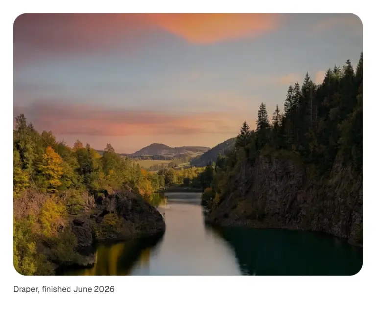
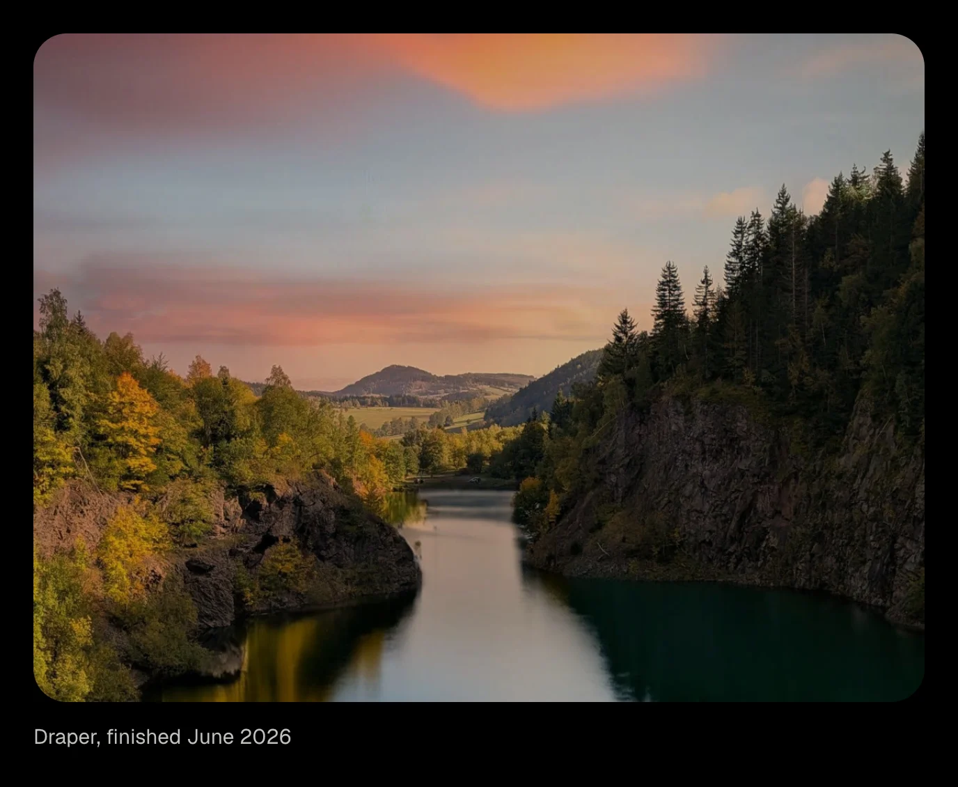
A figure whose image wipes into view as it scrolls in, from the side or the bottom, with a slow settle from a slight zoom. Optional caption. Scroll-driven CSS, no script.
A case study image that wipes in as the reader reaches it. A portfolio piece with a caption. A product photo with a slow settle.
image (image); alt (text); caption (text, optional); direction (select: up, left, right, down, curtain, circle); ratio (select: 4:3, 16:9, 1:1, 3:4); zoom (boolean)
Open the item pageSelected work
Move across to look through them.
Pictures appear one after another along the pointer's path, around the words and never over them and fade behind it, over a heading. Until someone moves, and on a phone, a slow figure of eight draws the trail by itself; a finger dragged across draws its own. Needs the EtchPress Runtime; without it the pictures sit in a quiet row.
A photographer's or a studio's hero. The opening of a lookbook or a collection. A playful band on an about page. A gallery teaser above the real gallery.
eyebrow (text, optional); title (text); lead (text, optional); images (repeater: image, alt)
Open the item pageRecovered the client's share of a family business after a two-year dispute with a former partner.
Verdict, 2026A landlord's claim for eight years of rent, reduced to a single payment and a clean exit.
Settled, 2026An injunction sought against a departing executive, dismissed on the second hearing.
Dismissed, 2025Water intrusion in a new build, paid by the builder's insurer without trial.
Settled, 2025Results as a ruled ledger: a serif figure and the matter on one line, or the wide form with a summary and an outcome. Rows are a repeater. Made for law firms, agencies and anyone with numbers worth a line each.
Case results for a law firm, one line each. A record of projects with figures for an agency. Pricing or fees set out as ruled rows.
label (text, optional heading above the rows); layout (select: compact, wide); rows (repeater: figure, matter, summary, outcome)
Open the item page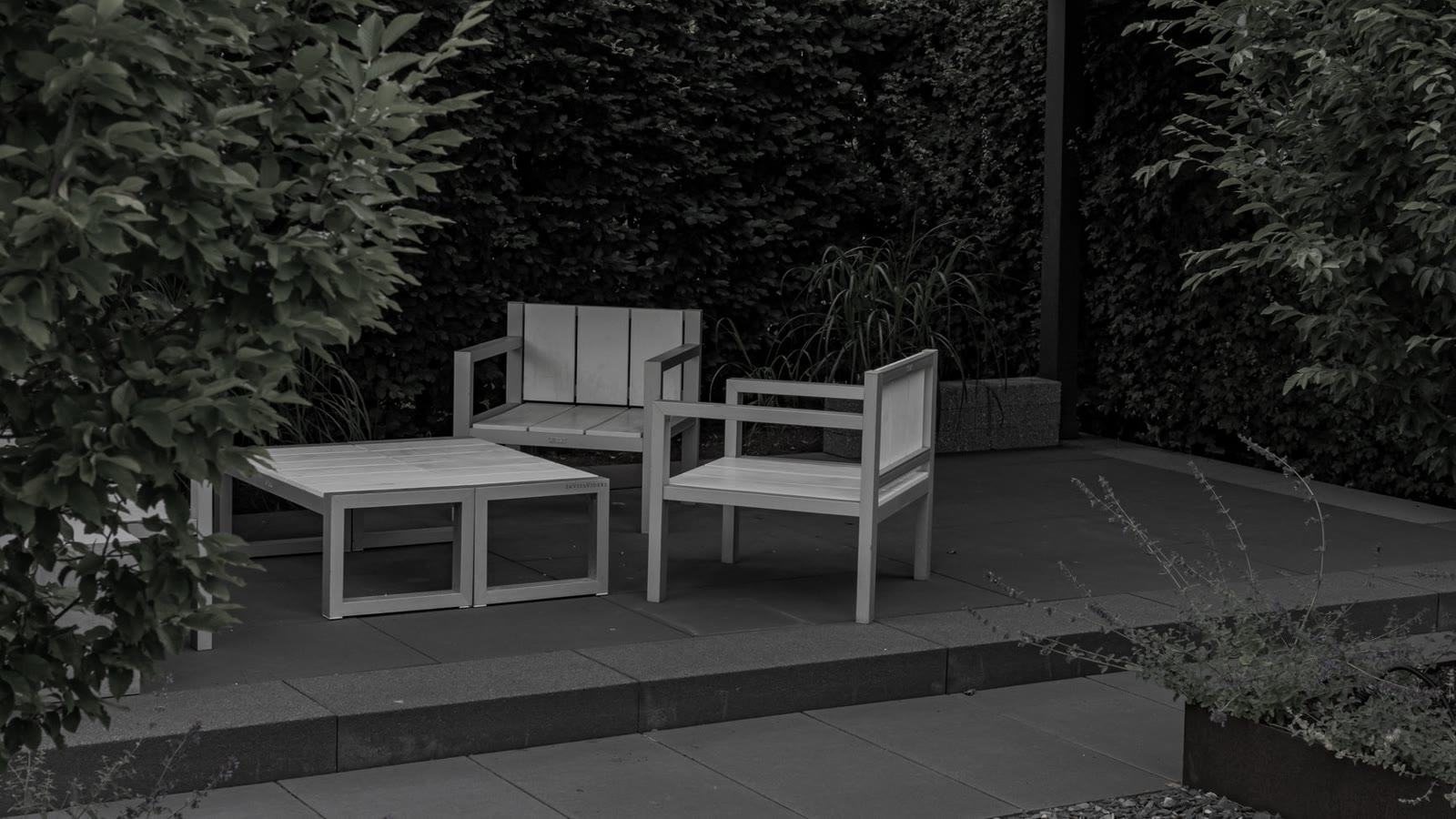
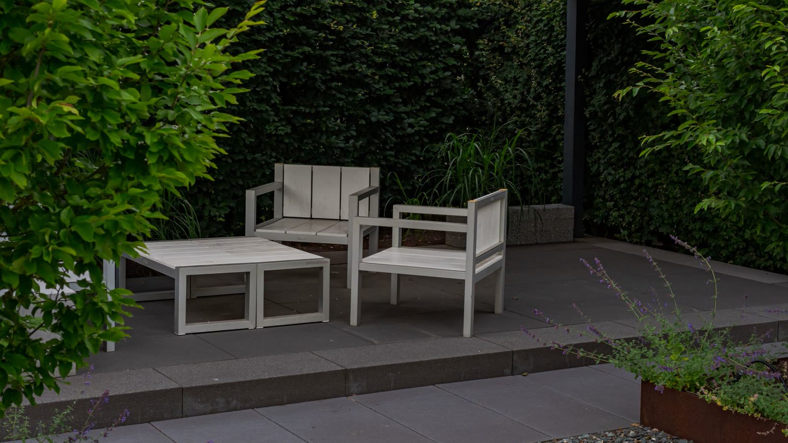
The plot in March, and the same view in August.
Two pictures, one hidden under the other, and a round lens that follows the pointer or your finger to show what is underneath. Left alone it drifts on its own. For before and after, a drawing and the finished thing, day and night. Needs the EtchPress Runtime; without it the two pictures sit side by side.
Before and after. A plan and the finished build. A product and what is inside it. Day and night, summer and winter.
image and alt (the picture you see); overImage and overAlt (the picture in the lens); caption (text, optional); size (select: small, medium, large)
Open the item page
A heading whose lines rise from behind a mask, one after the other, when it is seen or when the page loads. The lines are found after layout, so it works at any width. Needs the EtchPress Motion stylesheet; without it the text is simply there.
The headline of a hero, rising line by line as the page opens. A section heading that arrives when the reader scrolls to it. A short statement on an about page. A pull quote of two or three lines.
text (text); level (select: h2, h1, h3, p); trigger (select: scroll, load); speed (select: medium, slow, fast)
Open the item pageA text link whose letters roll up out of the line on hover while the same word rolls in from below, letter by letter or all at once. For a navigation row, a footer, or one large call to read on. No stylesheet to install.
The links of a header or a footer, with a little life on hover. One large link at the end of a section: "See the work". A display-size call to action on a studio home page. Any inline link that should feel made, not default.
label (text); href (url); size (select: text, large, display); tone (select: link colour, heading colour); mode (select: letter by letter, all at once)
Open the item pageWith a mouse the photo follows the pointer. On a phone it follows the row at the middle of the screen as you scroll.
A list of projects or services where one floating photo follows the pointer and wipes to each row's picture. On a phone the photo rides down the list and shows the row at the middle of the screen as you scroll. Needs the EtchPress Runtime; without it each row keeps its own small picture.
Selected work on a studio or contractor's home page. A services index where every service has a photo. A list of case studies or press. A menu of locations or team members.
rows (repeater: number, title, meta, image, alt, href)
Open the item page


A row of logos that drifts sideways without end, never pausing on hover, stopping only for reduced motion or while off screen. Logos are a repeater; a second row can run the other way. Animated by script, so no keyframes to install.
A row of client or partner logos that drifts past. Insurers accepted, on a clinic page. As seen in or trusted by, under a hero.
heading (text, read by screen readers); logos (repeater: image URL, name); speed (select: slow, medium, fast); secondRow (boolean, runs the other way); height (select: small, medium, large)
Open the item page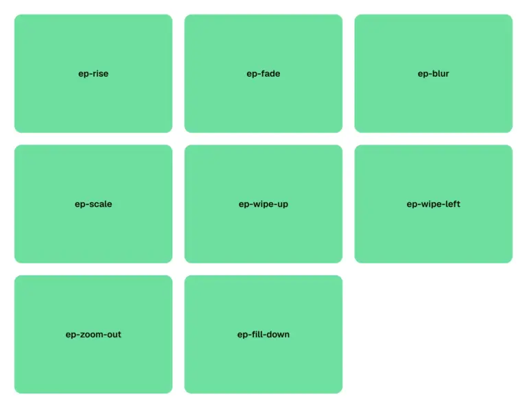
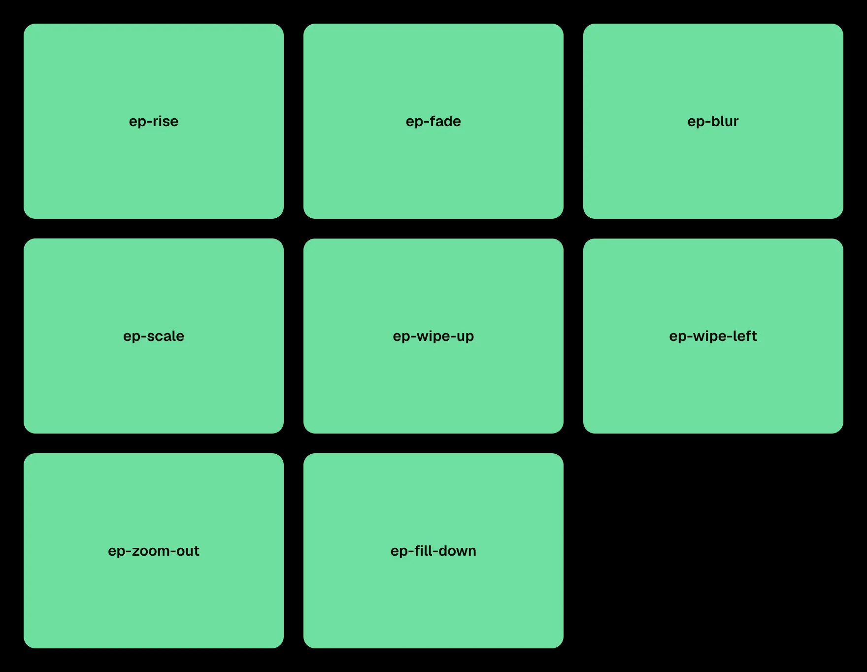
The one-time install behind every motion item: the keyframes (rise, fade, blur, scale, wipes, sweep, circle, block, fill, shine, aurora, marquee, count, stack, focus, and the glow buttons' pulse, sweep, flicker and flow), the registered properties they animate, the easing tokens (ACSS's presets when the site has them) and two spring easings sampled into linear(). Copy it, then in Etch open Styles, Stylesheets, add one named EtchPress Motion and paste. Free.
The one-time install behind every motion item in the library. Entrances, wipes and fills for your own elements, by keyframe name. Easing and spring tokens shared across a whole site.
None. Install once per site: Copy, then Etch, Styles, Stylesheets, New, name it EtchPress Motion, paste, save. Every motion item then works by class; without it they show their finished state.
Open the item pageA row of tall picture cards on a dark band. Each card carries a frosted glass panel with a title and a line of text; point at a card and it rises, its picture moves closer, the panel slides up to show a glowing outline button, and the other cards step back into shadow. A tap or the keyboard opens a card the same way. One small script, no plugin.
A featured collections row for a gallery, a studio or a shop. Three services or categories, each with a picture and one way in. A portfolio teaser where each card leads to a case study. A dark showcase band between two light sections.
label (text, the name of the group for screen readers); items (repeater: image, alt, title, description, linkLabel, url); variant (select: dark band as designed, or no ground so the cards sit on your own section)
Open the item pageWhole websites for one kind of business. Every page, the header, the footer, the contact form. Built the way Page Building 101 teaches it.
See kitsHeroes, pricing, services, testimonials, FAQs, footers. Each one a section you paste in and fill.
Browse patternsReal Etch components with props: cards, buttons, accordions, forms. Change one and every instance follows.
See componentsClaude Code and Codex learn the system. Ask for a new section and it lands in the same tokens and classes as the kits.
How the skill worksFeature cards on a warm dark ground. At rest they are flat and quiet. Point at one and its edge lights: a green to cyan ring, a comet of light that travels round the border with a second one half a turn behind, a soft tint inside and a halo. Four across, two, then one, by the space they have.
What a product includes, four things at a glance. Services on a dark landing page. Plan or tier highlights. Feature links at the foot of a home page.
cards (repeater: icon, title, text, linkLabel, href); variant (select: dark ground as designed, or no ground)
Open the item pageWhole websites for one kind of business. Every page, the header, the footer, the contact form. Built the way Page Building 101 teaches it.
See kitsA dark content card that leans toward the pointer in 3D while its border becomes a green to cyan ring that follows the cursor. A still glow lights behind it, a faint tint appears inside, and the shadow under it shrinks as the card lifts. Icon, title, text and a link. Dark as designed, light, or following the page's scheme.
One feature that deserves the spotlight on a dark page. A row of three or four product or service cards. A link card to a pricing or contact page. A highlighted plan beside quieter ones.
tone (select: dark, light, auto); icon (select), title, text, linkLabel, href, ringA, ringB, ringMint (the ring's three colours), line (the ring's thickness), inkIcon, inkTitle, inkText, inkLink (the colours inside the card), tilt (select: none, subtle, normal, strong)
Open the item pageReady to plan your yard?
Tell us about the project. We walk it with you within a week.
A section background that behaves like a night sea: four blurred wave glows roll along the bottom in slow counter-rhythm, fine dust rises through the dark, and the whole scene leans toward the pointer in real 3D while the content in the slot stays still. Dark as drawn by our designer; light is its own version, pastel waves on the paper with deeper dust. Still under reduced motion, and the tilt only answers a mouse.
A dark hero background that moves without a video. A closing call to action band with depth. A light hero on the paper with a pastel tide low in the frame. A section divider that reacts to the pointer.
tone (select: dark, light); motion (select: full, waves, still); tilt (select: on, off); slot: content
Open the item pageThe crew
The same crew designs, builds and looks after every garden.


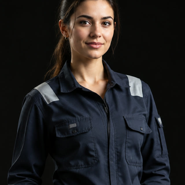




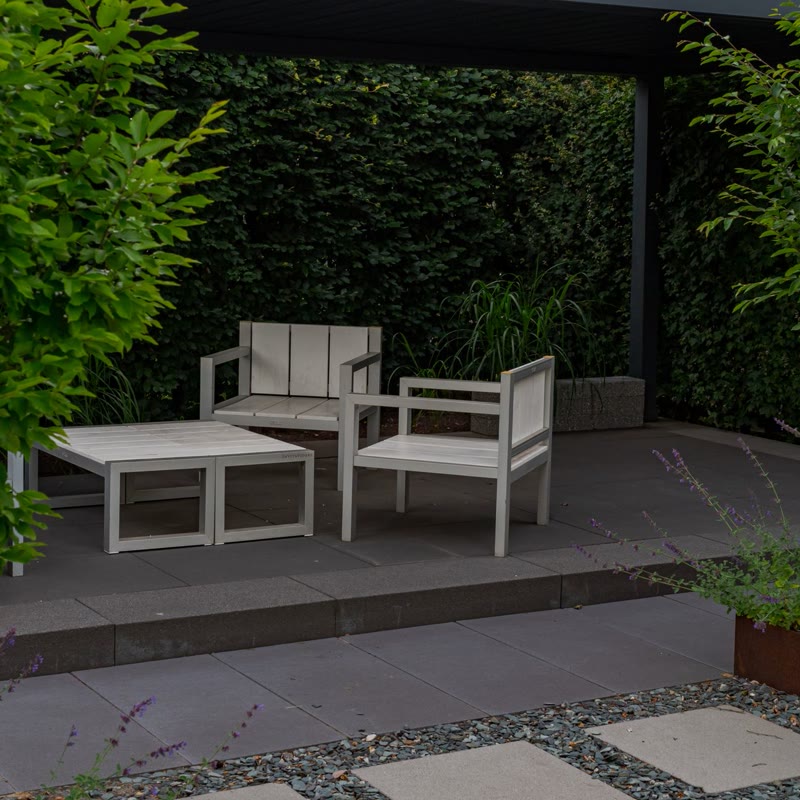
Pictures circle a heading on two tilted rings, nearer ones larger and in front, the far side passing behind. It turns slowly by itself; dragging it, with a mouse or a finger, spins it. Needs the EtchPress Runtime; without it the pictures sit in a row under the heading.
The people behind a company, around its name. Integrations around a product. Clients or partners around a claim. A community section.
eyebrow (text, optional); title (text); text (text, optional); items (repeater: image, alt)
Open the item page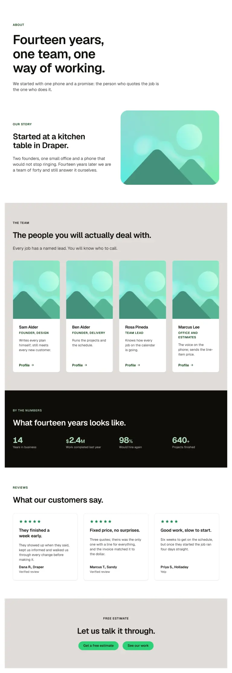
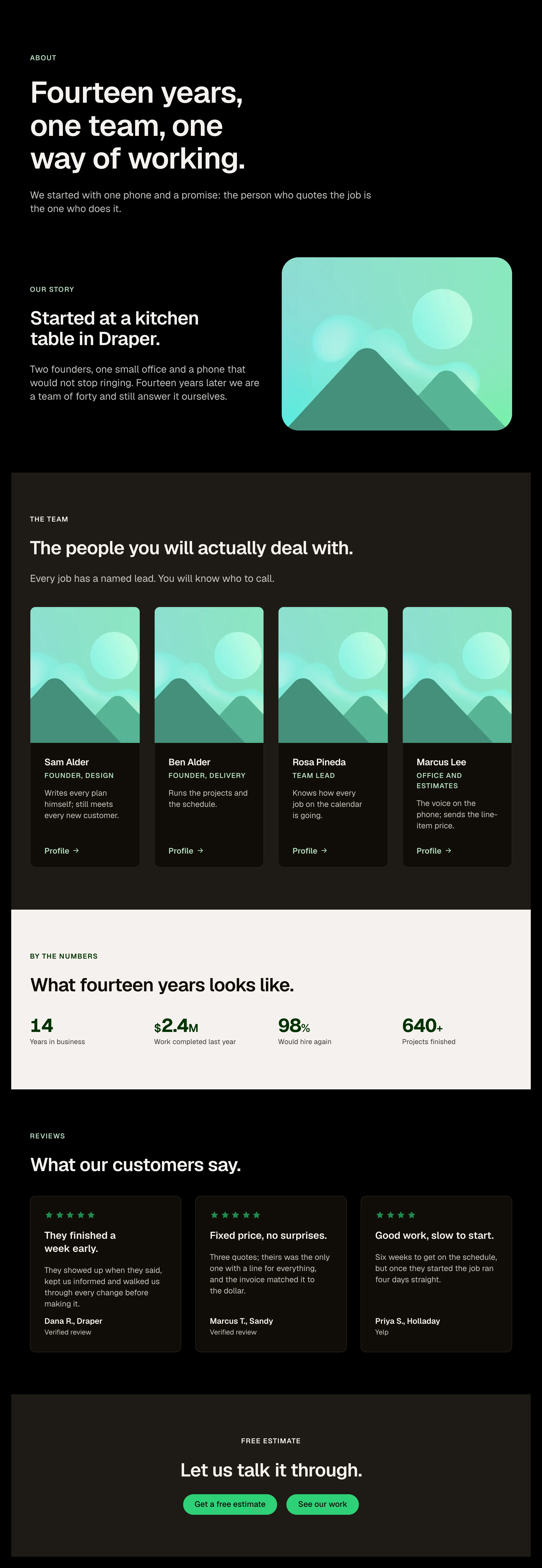
An about page in one paste: page intro, the story beside a photo, the team, a stats band, reviews and a closing call to action.
An about page for a service business in one paste. A team and story page for a studio or practice. A starting point to rearrange section by section.
A page: edit each section's props and cards; replace the placeholder photo and portraits.
Open the item page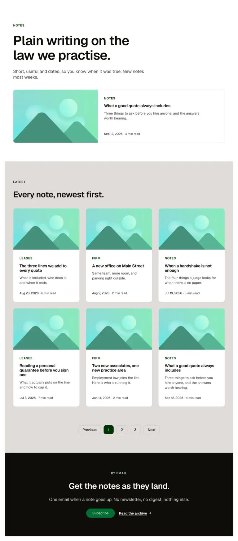
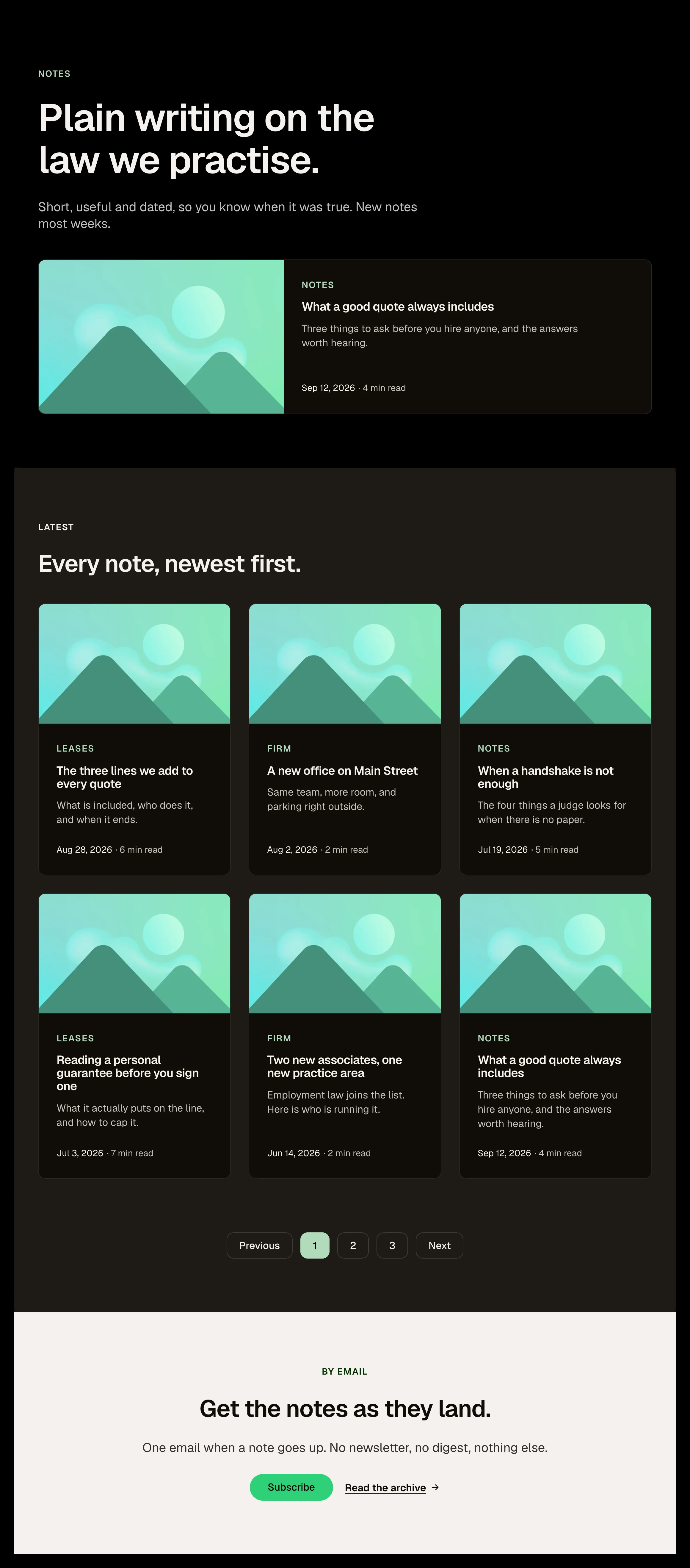
A blog archive in one paste: page intro, one featured post across the width, six posts newest first with pagination, and an email call to action. On a site, wrap the cards in a posts loop and map the Blog card's props from the post.
A blog archive with a featured post and pagination. A news or resources index. A starting point to bind to a posts loop.
A page: edit the intro; replace the cards with a posts loop mapped to the Blog card's props; point the pagination at your archive.
Open the item page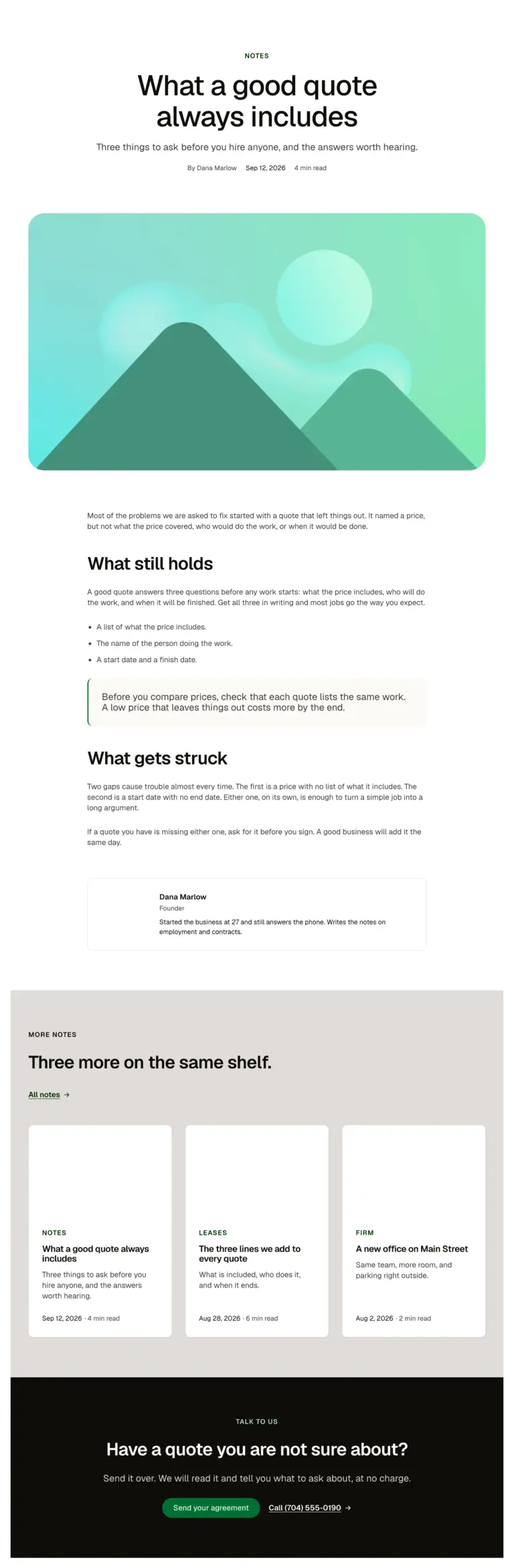
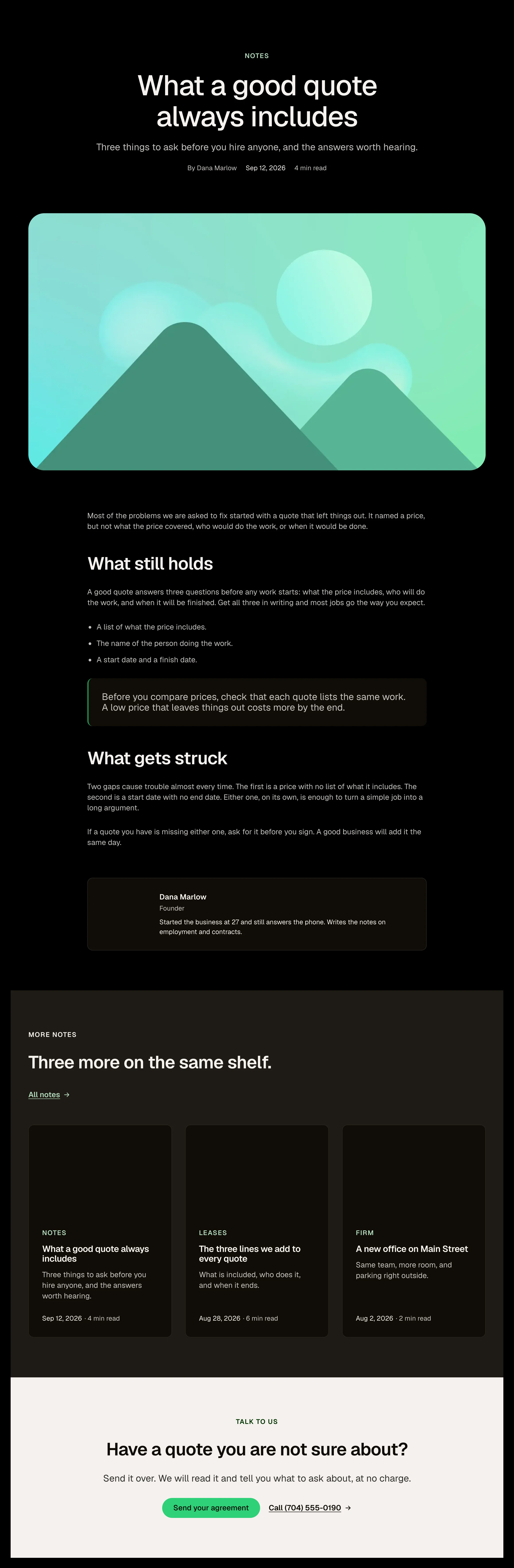
A single post in one paste: centred header with category, title, lead and meta, a wide hero image, the article at reading width with a pull quote and a list, an author box, three more posts and a call to action. On a site, bind the header, image and body to the post.
A single article with header, image, body and author. A case study or news story template. A starting point to bind to the post's fields.
A page: bind title, date, image and body to the post; edit the author box; wrap the three cards in a related-posts loop.
Open the item page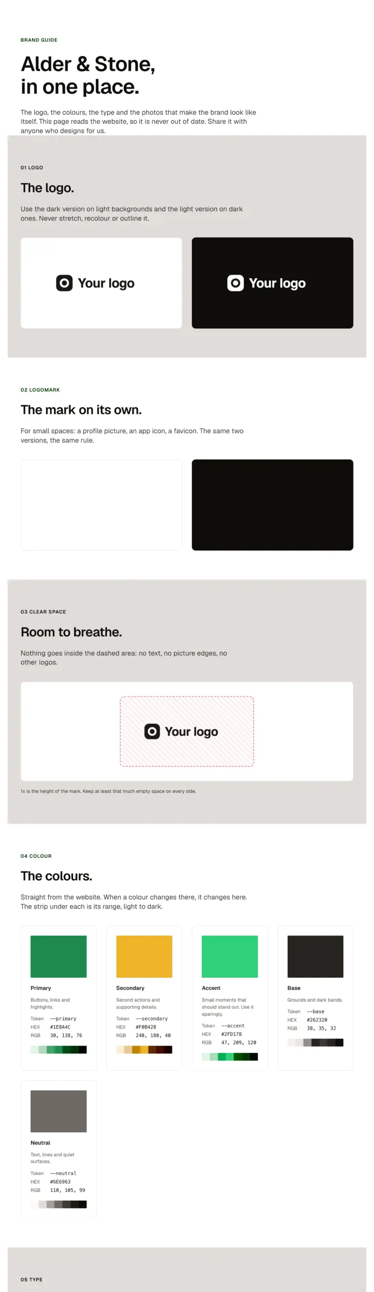
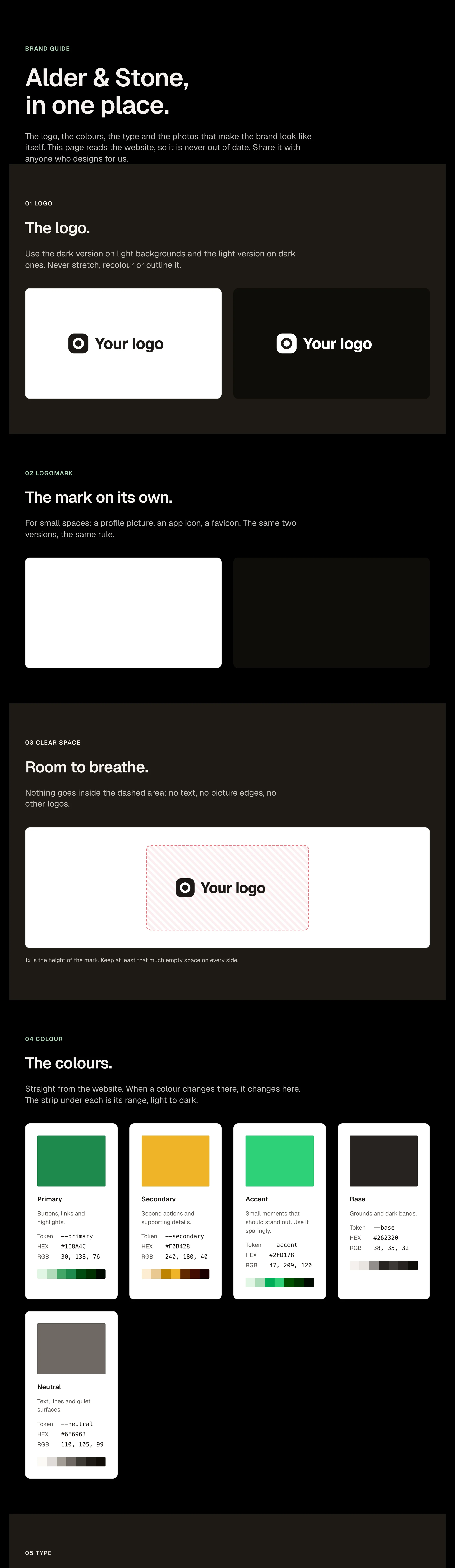
A brand guide for a client in one paste: the logo and the mark on light and dark, clear space, the colours with their HEX, RGB and shades, the typefaces and the type scale, all read live from the site, and the brand's photos. Share it with a magic link from the panel.
A page: swap the two logos, the two marks and the photos for the client's (Media Library), name the colours, edit the words. The colours, fonts and sizes fill in from Automatic.css on their own.
Open the item page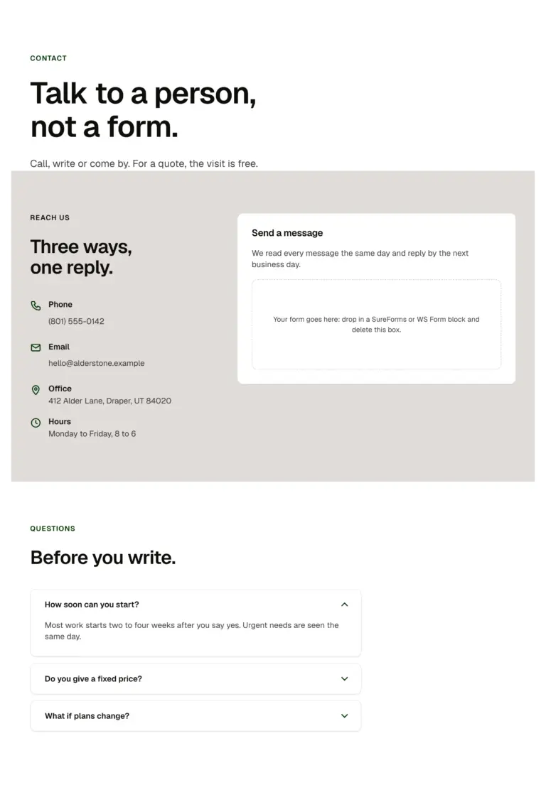
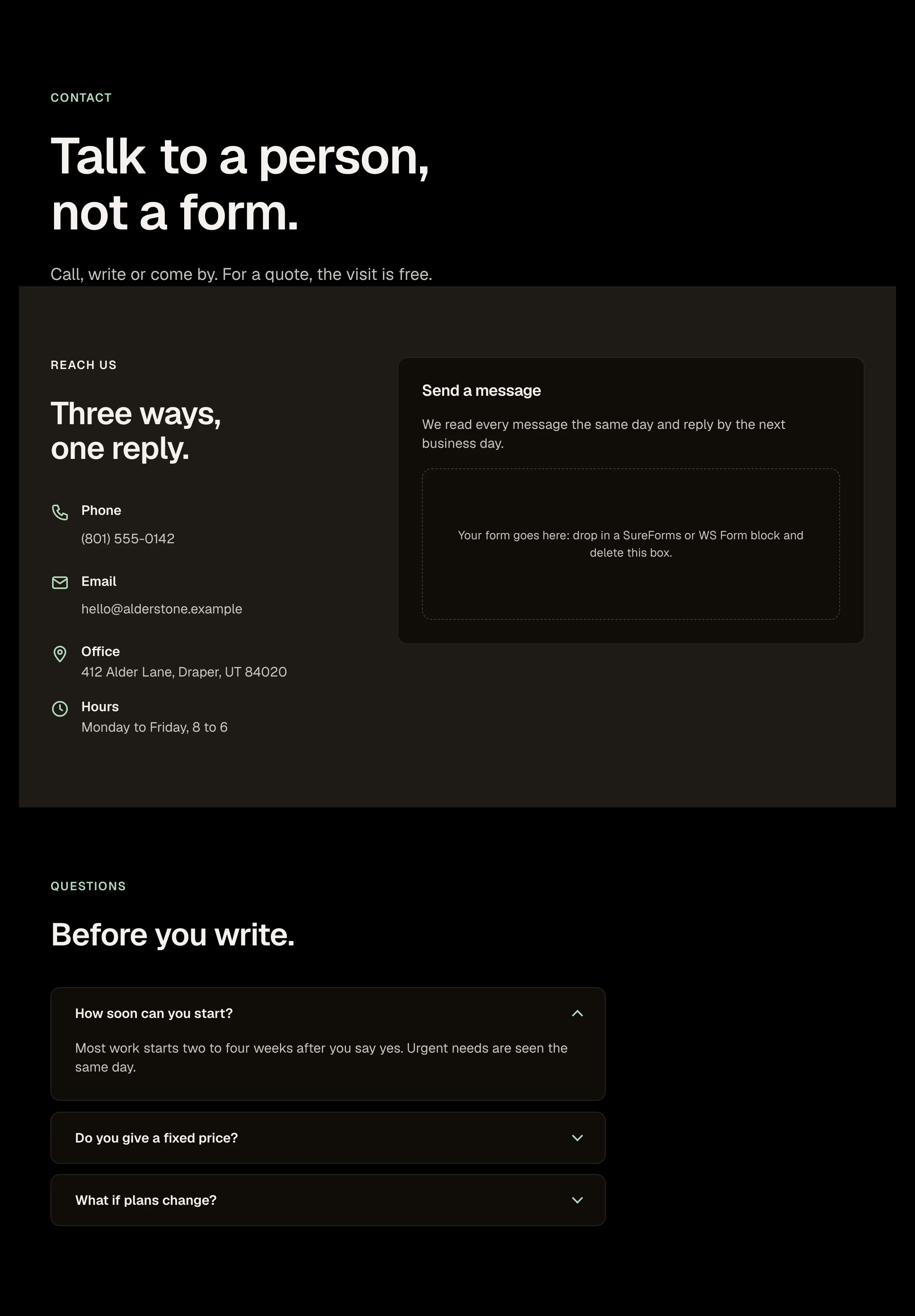
A contact page in one paste: page intro, the contact section with details and a form card, and three questions.
A contact page with details, a form and three questions. A book a visit page. A get a quote page.
A page: edit the details, drop your form block into the marked box, edit the questions.
Open the item page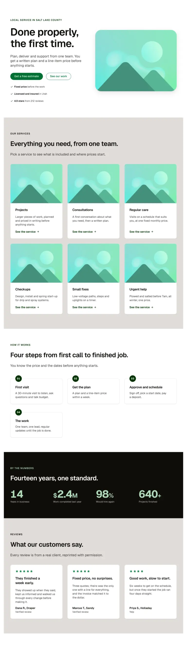
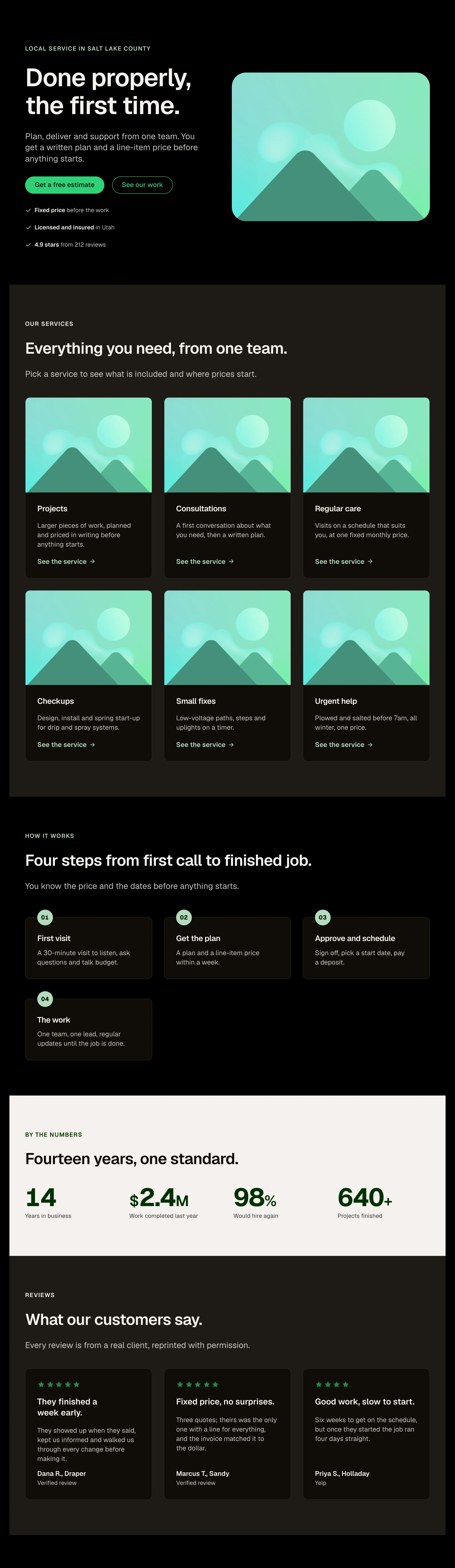
A complete service-business home page in one paste: hero with media, services grid, process steps, a stats band, reviews, questions and a closing call to action. Seven sections, every one a library layout.
A complete service business home page in one paste. A first draft to show a client the same day. Seven sections to keep, swap or remove.
A page: edit each section's Section intro and cards; swap the hero for the immersive one (second variant).
Open the item page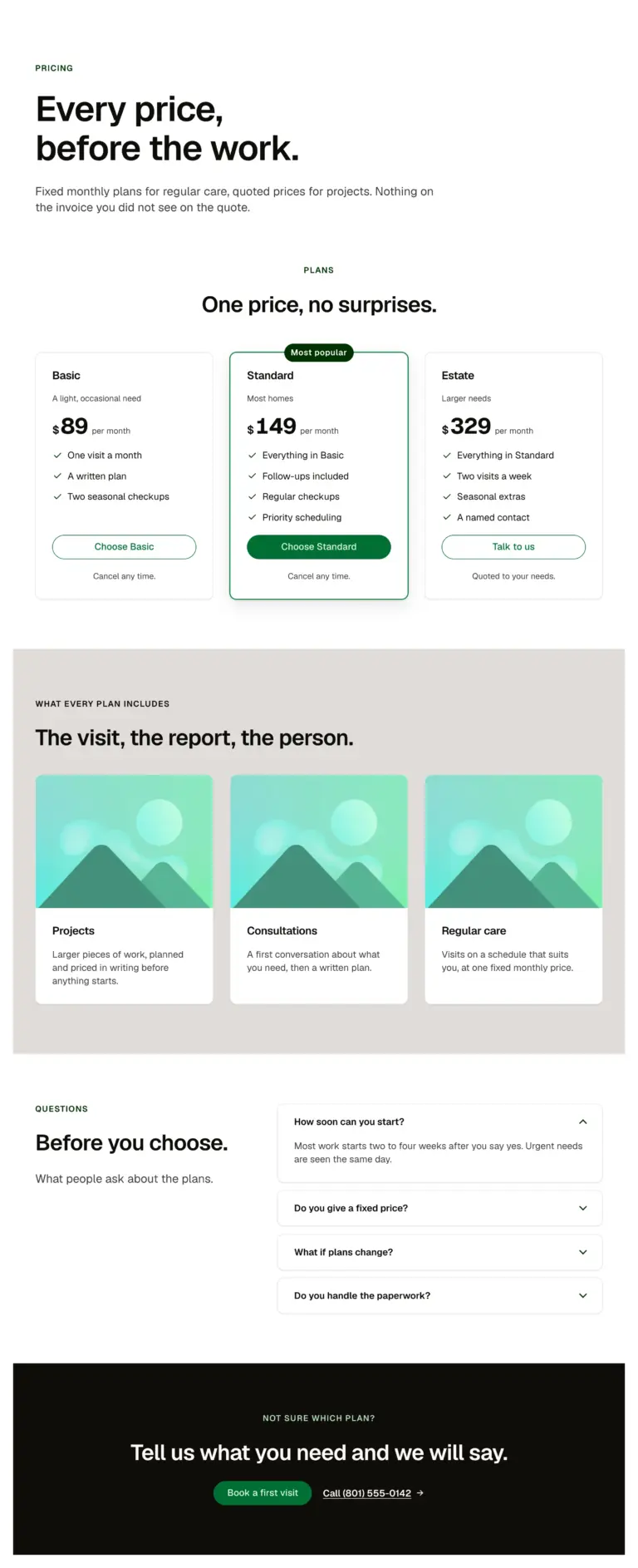
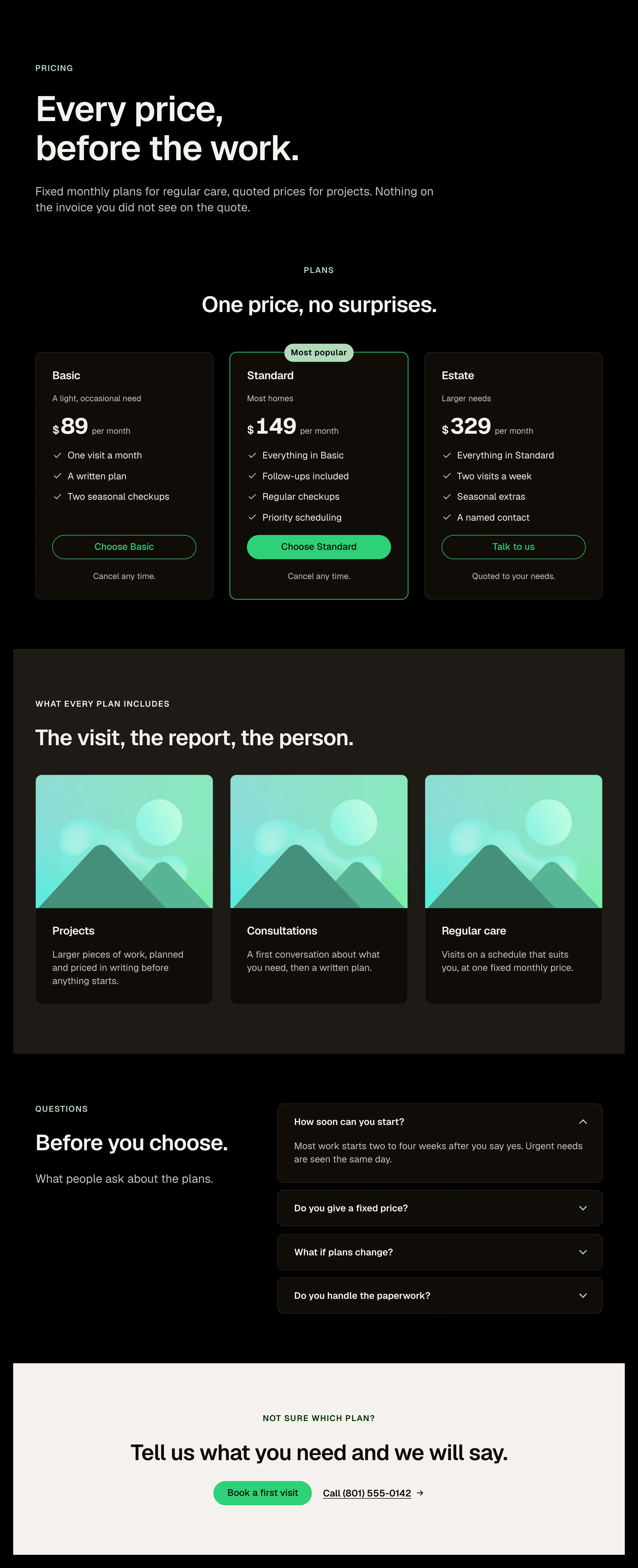
A pricing page in one paste: page intro, the pricing table, what every plan includes, questions and a closing call to action.
A pricing page with plans, inclusions and questions. A membership or packages page. A services and fees page.
A page: edit the plans (each a Plan card with a feature repeater), the included cards and the questions.
Open the item page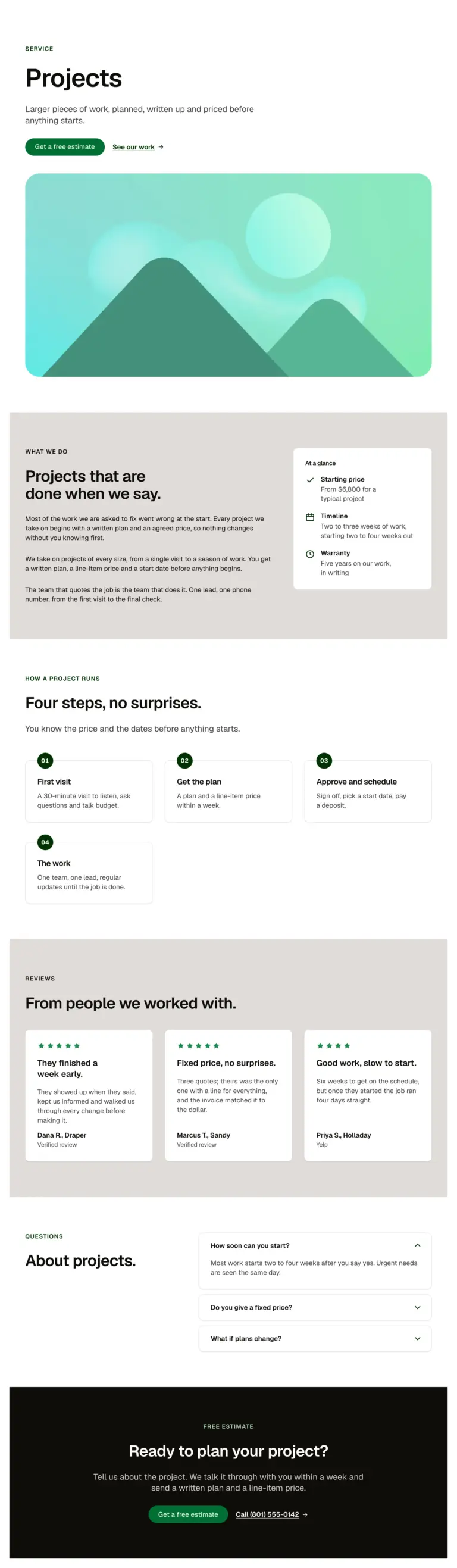
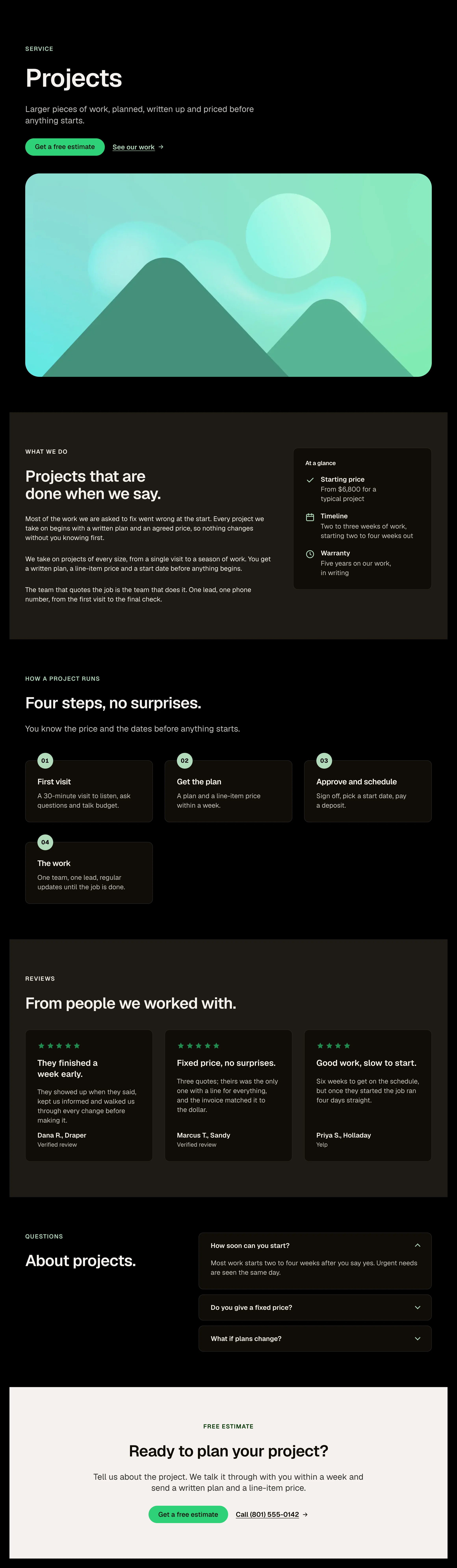
A single service page in one paste: page intro with actions, a wide image, the description beside a sticky at-a-glance card (price, timeline, warranty as Detail items), how the project runs, reviews, questions and a closing call to action.
A single service page with a sticky at a glance card. A treatment, practice area or package page. A template to bind to a services post type.
A page: edit the intro, the description and the three Detail items; replace the image; edit the steps and questions.
Open the item page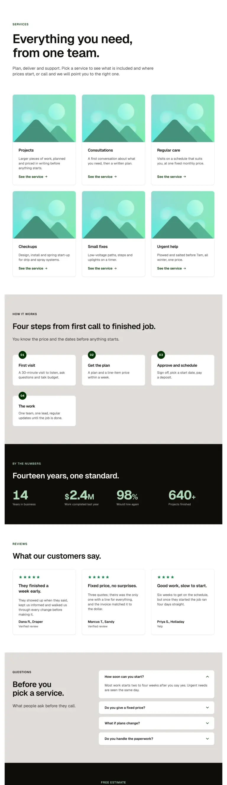
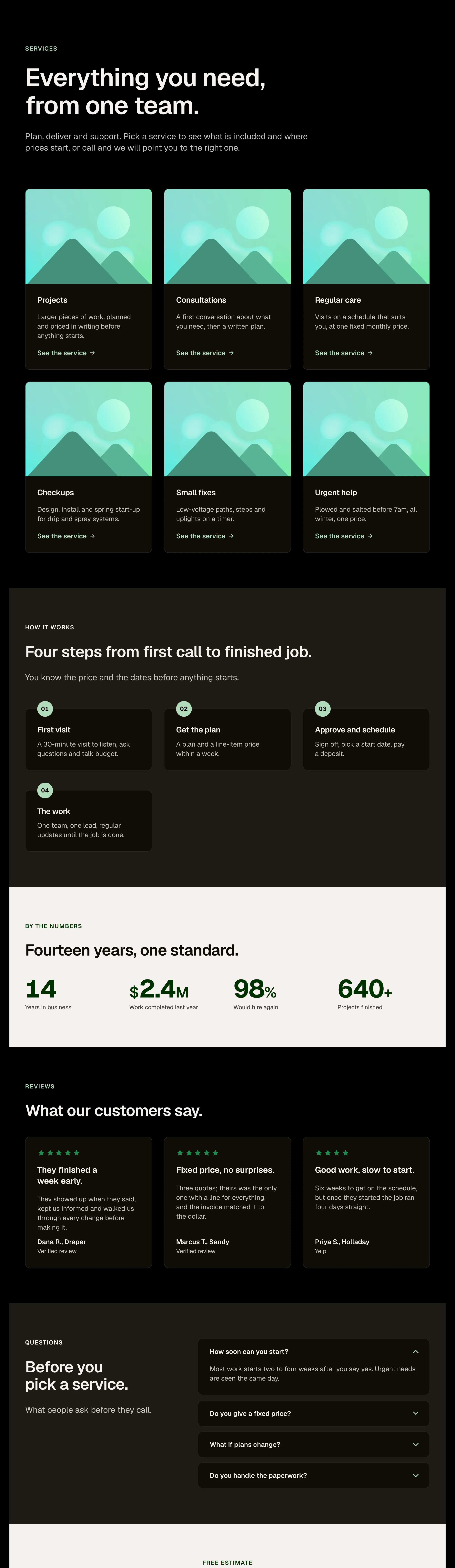
A services overview in one paste: page intro, six Service cards, how it works, a stats band, reviews, questions and a closing call to action.
A services overview with six cards and a process. A practice areas or treatments index. A what we do page.
A page: edit the intro and each Service card; link every card to its service page.
Open the item pageWhat we do
A row of tall picture panels: the one you point at opens wide and shows its title, text and link, and the others narrow to slivers. Tap to open on a phone, where the panels stack and open downward. Needs the EtchPress Runtime; without it it is a grid of cards.
Services or categories on a home page. A portfolio with a few hero projects. Team or locations. Product ranges.
eyebrow (text, optional); title (text, optional); panels (repeater: image, alt, title, text, linkLabel, href); open (select: how wide the open panel is)
Open the item page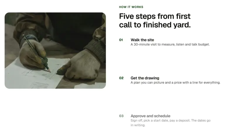
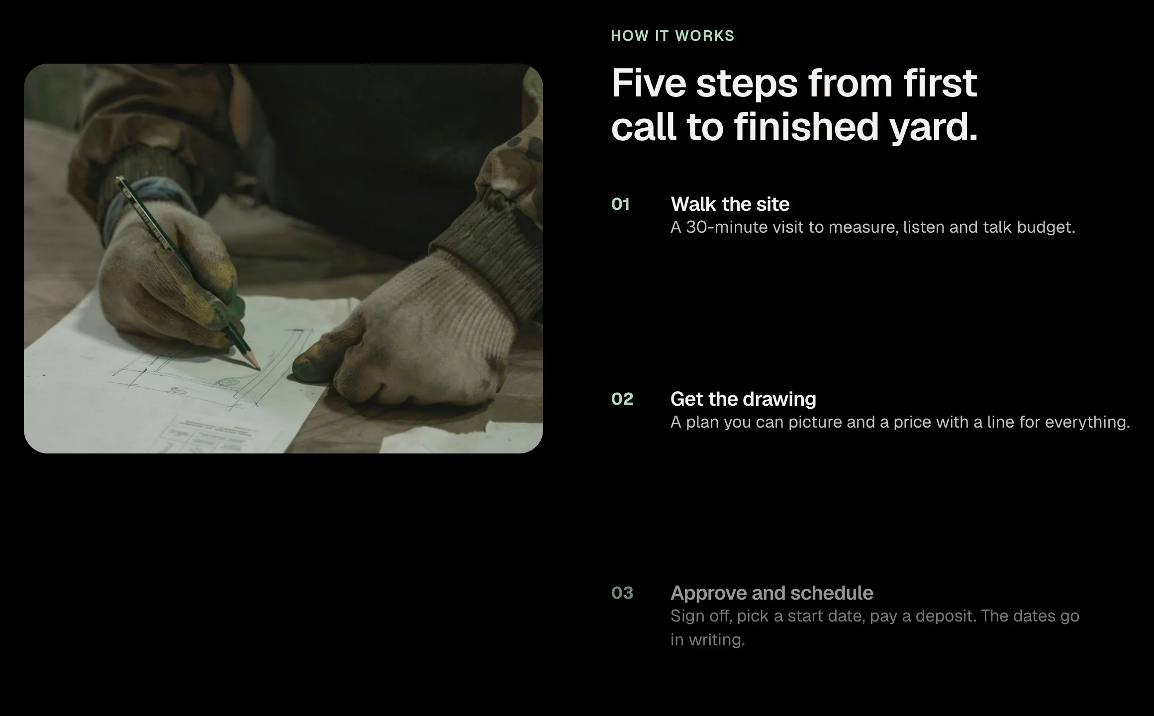
A two-column section where the image stays put while the steps scroll past it, each step brightening as it reaches the middle of the screen. Steps are a repeater. On narrow screens the image sits above the steps.
A how it works section where the image holds while the steps pass. A product tour with one screenshot and several points. A process explained beside a photo.
eyebrow (text); headline (text); image (image); alt (text); steps (repeater: title, text); tone (select: light, dark)
Open the item pageA light, occasional need
$89per month
Cancel any time.
Most homes
$149per month
Cancel any time.
Larger needs
$329per month
Quoted to your needs.
One plan: name, who it is for, the price with its period, a feature list as a repeater, a button and a note. A featured switch lifts the recommended plan with a chip and an accent border. Prefix and period keep one baseline with the figure.
One plan in a pricing table. A membership tier with a features list. A package card on a services page.
name (text); who (text); price (text); prefix (text, such as $); period (text, such as per month); features (repeater: label); ctaLabel and ctaHref; note (text); featured (boolean); chip (text, shown on the featured plan); glow (boolean, a light at the card's foot on hover or focus); size (select: medium, small)
Open the item page
Five practices
Hover a practice to see the team that runs it.
An index of services or practice areas as numbered, ruled rows that link out, with a sticky photo beside them that swaps to the row under the pointer or keyboard focus. Rows are a repeater. Numbers count themselves.
A law firm's practice areas as ruled, numbered rows. A services index with a photo that follows the pointer. A table of contents for a long site.
rows (repeater: title, short description, href, image URL); showAside (boolean); asideTitle and asideText (text, shown until a row is hovered)
Open the item pageOne price, no surprises.
Every plan is a fixed monthly price with the visits, the scope and your contact written down.
A light, occasional need
$89per month
Cancel any time.
Most homes
$149per month
Cancel any time.
Larger needs
$329per month
Quoted to your needs.
A Section intro over two or three Plan cards, one featured. Plain, light band or dark; monthly or annual; a variant whose cards glow at the foot on hover. Each card's features are a repeater, so a plan changes without touching the layout.
Two or three plans with one recommended. Monthly and annual pricing. Packages for a service business.
A pattern: edit the Section intro and each Plan card's props; add or remove cards in the grid.
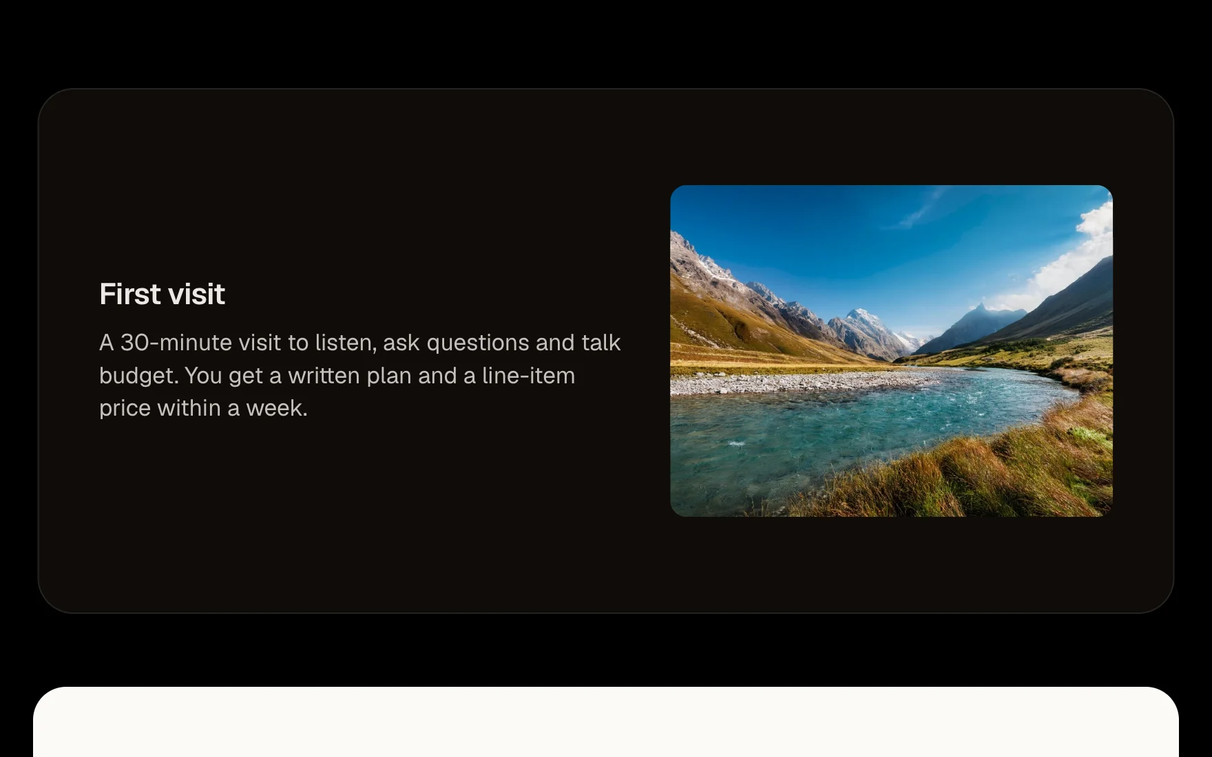
Open the item pageA 30-minute visit to listen, ask questions and talk budget.
A plan and a line-item price within a week.
Sign off, pick a start date, pay a deposit.
One team, one lead, regular updates until the job is done.
One step of a process: a numbered badge drawn by a CSS counter, a heading and a description. Put them in the process list and the numbers count themselves, so reordering never means renumbering.
One step in a how it works list. A numbered stage that renumbers itself when reordered. An onboarding or installation step.
title (text); description (text); size (select: medium, small)
Open the item pageFour steps from first call to finished job.
You know the price and the dates before anything starts.
A 30-minute visit to listen, ask questions and talk budget.
A plan and a line-item price within a week.
Sign off, pick a start date, pay a deposit.
One team, one lead, regular updates until the job is done.
A Section intro over a numbered list of Process cards. The list counts the steps, so adding one never means renumbering.
A how it works section. An onboarding sequence on a landing page. What happens next, after a contact form.
A pattern: edit the Section intro and each Process card; add or remove steps in the list.
Open the item pageStep one
01A 30-minute visit to listen, ask questions and talk budget.
What we check
B+Everything checked before we start, so nothing surprises anyone later.
Our promise
100%The invoice matches the quote to the dollar.
Numbered facts on a rule with a dot at each one. Hovering a card raises it on a white surface with a soft glow and lights its number; a kicker line slides in above. In a row of four the first card can hold the raised state until the pointer arrives. Pure CSS.
A row of facts that light up on hover. Process steps or promises set on a rule. Figures with a line of explanation each.
figure (text, the big number); title (text); text (text); kicker (text, optional line that appears on hover); href (url, optional)
Open the item page
A heading or paragraph whose words enter one after another: rising, fading or sharpening from a blur. Triggered when it scrolls into view or on page load. Needs the EtchPress Motion stylesheet (free); without it, and for people who prefer reduced motion, the text simply shows. Line wipe: a colour bar crosses each line and the words are there when it leaves; word blocks do the same per word.
A headline whose words arrive one after another. A section opener that enters when it is reached. A short statement on a landing page.
text (text); level (select: h1, h2, h3, p); effect (select: wipe, rise, blur, fade, block); trigger (select: scroll, load); speed (select: medium, slow, fast)
Open the item pageThey finished a week early.
They showed up when they said, kept us informed and walked us through every change before making it. The result is exactly what we agreed.
Fixed price, no surprises.
We had three quotes. Theirs was the only one with a line for everything, and the final invoice matched it to the dollar.
Good work, slow to start.
Took six weeks to get on the schedule, but once they started the work ran four days straight and it shows.
A testimonial as a card: star rating, a one-line callout, the quote in a real blockquote with the reviewer and source in its caption. The rating is a select; the stars are drawn by CSS and read out as one label.
A testimonial with stars, a callout and the quote. A review inside a hero or beside a form. One card in a wall of reviews.
rating (select, 1 to 5); callout (text, one line); quote (text); reviewer (text, name and town); source (text, where the review was left); size (select: medium, small)
Open the item pageSelected work
Cards standing on a ring in depth. It turns slowly on its own, turns with a drag and keeps its spin when you let go; Previous and Next step it one card at a time. Swipe it on a phone. Needs the EtchPress Runtime; without it it is a row of cards to swipe.
A portfolio that wants to be touched. Team members. Products in a range. Testimonials with photos.
eyebrow (text, optional); title (text, optional); cards (repeater: image, alt, title, meta); auto (select: turn on its own, or only when moved); prevLabel and nextLabel
Open the item page
The lake at the bottom of the Lakeside garden.
A picture that behaves like still water: rings spread from wherever the pointer or your finger moves across it, and one drops in on its own now and then. Needs the EtchPress Runtime; without it, or where the browser has no WebGL, it is simply the picture.
A hero picture that answers the pointer. A feature image on a case study. A product shot with some life in it. A portrait or a place.
image and alt; caption (text, optional); ratio (select: the picture's shape); strength (select: gentle, medium, strong)
Open the item pageSame-day, in clinic or video.
Labs, vitals and a plan for the year.
Cleared to play in one visit.
Full-body exam with dermoscopy.
Vaccines and prescriptions before you go.
For snoring, apnea and insomnia.
Skin-prick panel, results same day.
A labelled row of cards that scrolls sideways, with real previous and next buttons that page through it and disable at the ends. The cards are a slot: drop any cards in. Keyboard users get a focusable track; touch users swipe with scroll snap.
A row of services or products that scrolls sideways. A more like this strip under an article. A team, locations or categories strip on a phone-first page.
label (text, the row's heading); cardWidth (select: narrow, medium, wide); items slot (list items with any card inside)
Open the item page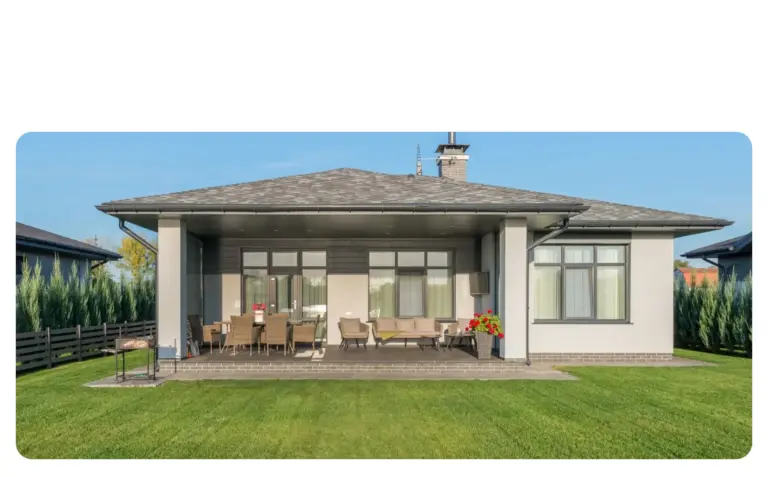
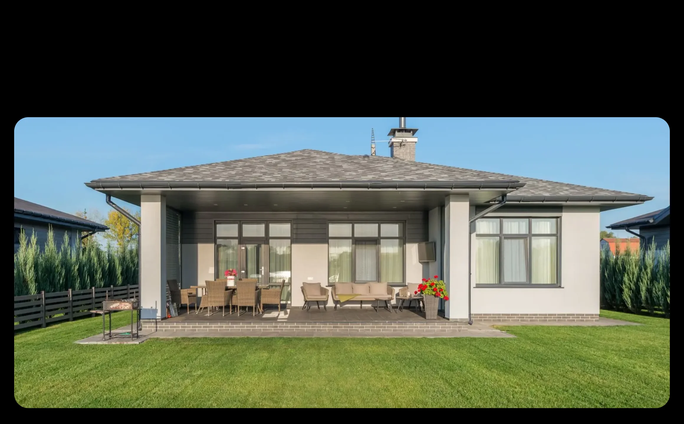
One wide photo holds on screen while the page scrolls, splits into two, three or four cards, and each card turns over to its own title, line and link. On a phone, with reduced motion, or without its script, it is a heading over plain cards. No plugin and no stylesheet.
The services of a home page as one showpiece: a photo of the work that becomes the three things you do. A studio's disciplines, each card turning to a link. Before the plain services grid, as the one moment of theatre on the page. A process in three or four steps, each with its own page.
eyebrow (text, optional); title (text); image (one wide photo, cut across the cards); cards (repeater, two to four: number, title, text, linkLabel, href)
Open the item page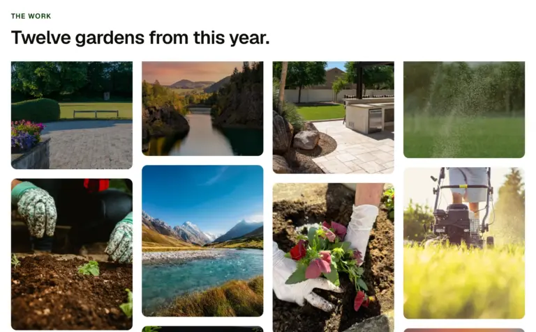
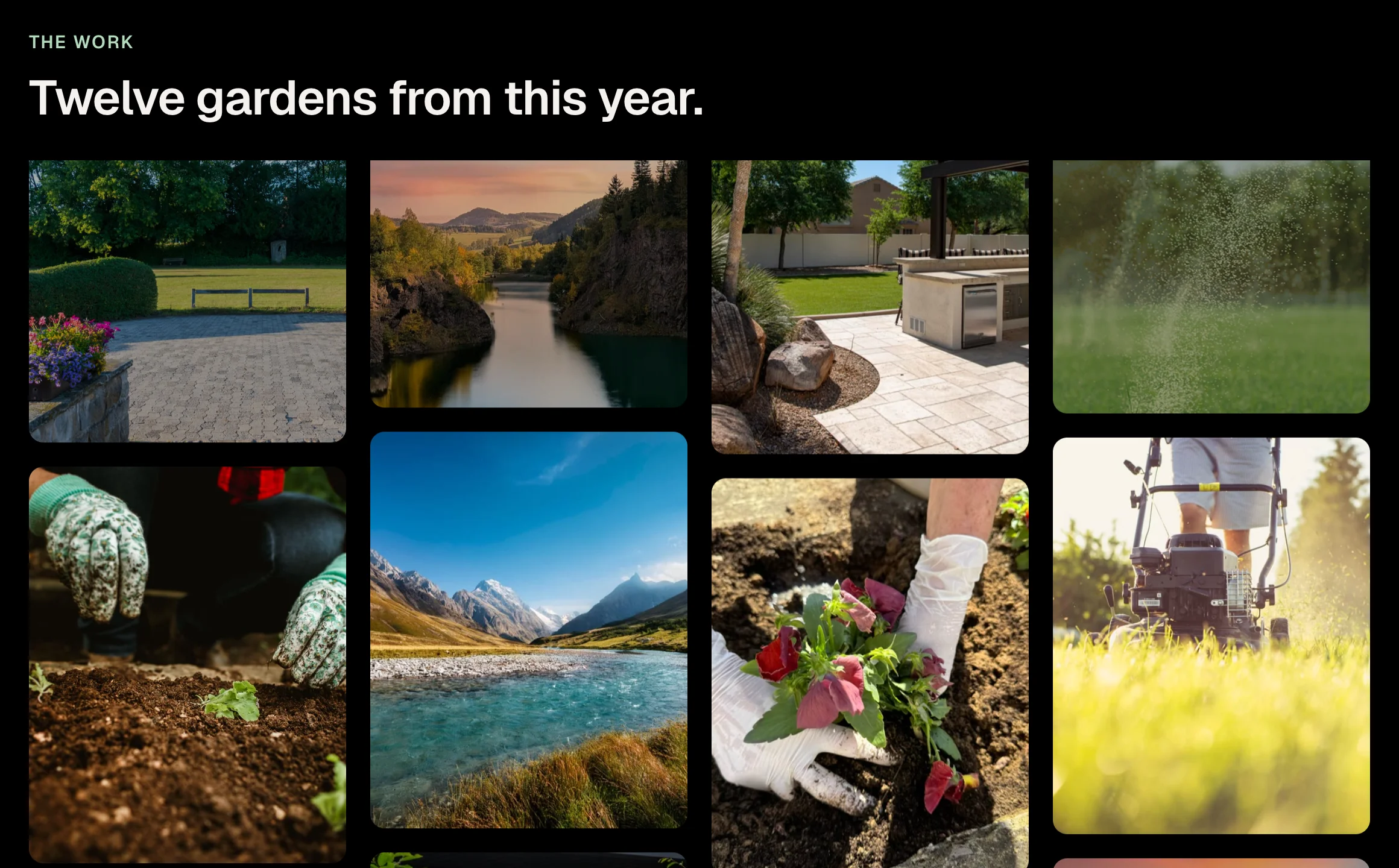
A wall of pictures in columns that travel at different speeds as the page scrolls, alternate columns the other way, so the wall seems to breathe. Two columns on a phone, four on a wide screen. Needs the EtchPress Runtime; without it it is a plain even grid.
A portfolio wall. Photos from an event or a place. A product range shown at a glance. Press or social proof as pictures.
eyebrow (text, optional); title (text, optional); images (repeater: image, alt)
Open the item page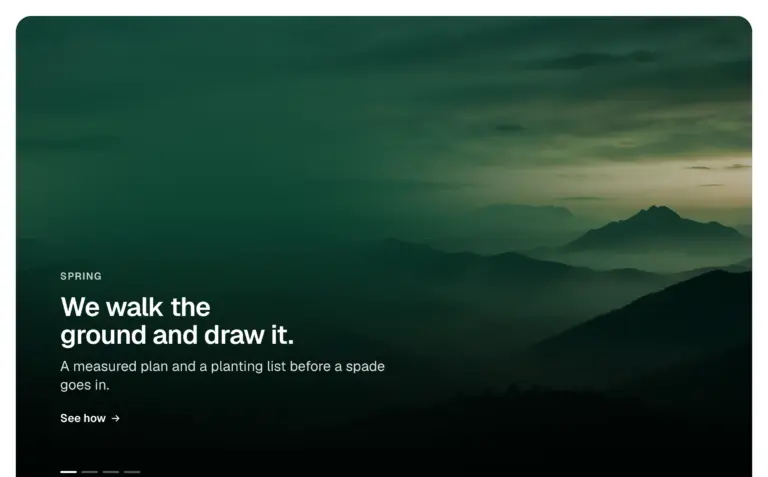
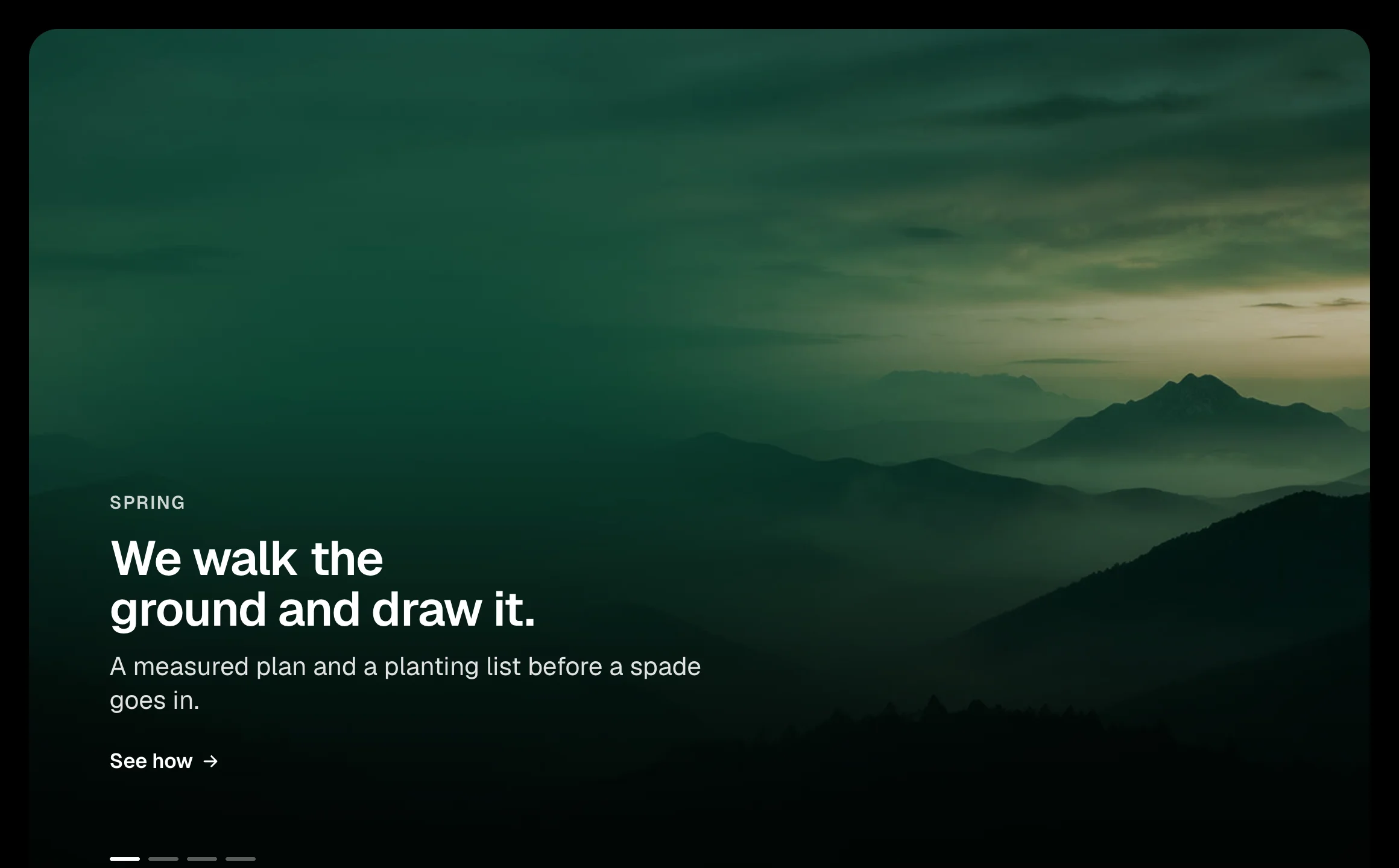
Full picture panels, one frame: as you scroll, the next panel is uncovered through a growing circle, a rising wipe or a diagonal, its picture easing back and its words arriving. The same on a phone. Needs the EtchPress Runtime; without it the panels simply follow one another.
A home page that tells three or four things in turn. Chapters of a case study. Seasons, places or product lines. A launch page.
panels (repeater: image, alt, eyebrow, title, text, linkLabel, href); shape (select: circle, wipe up, diagonal)
Open the item page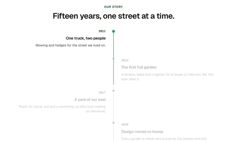
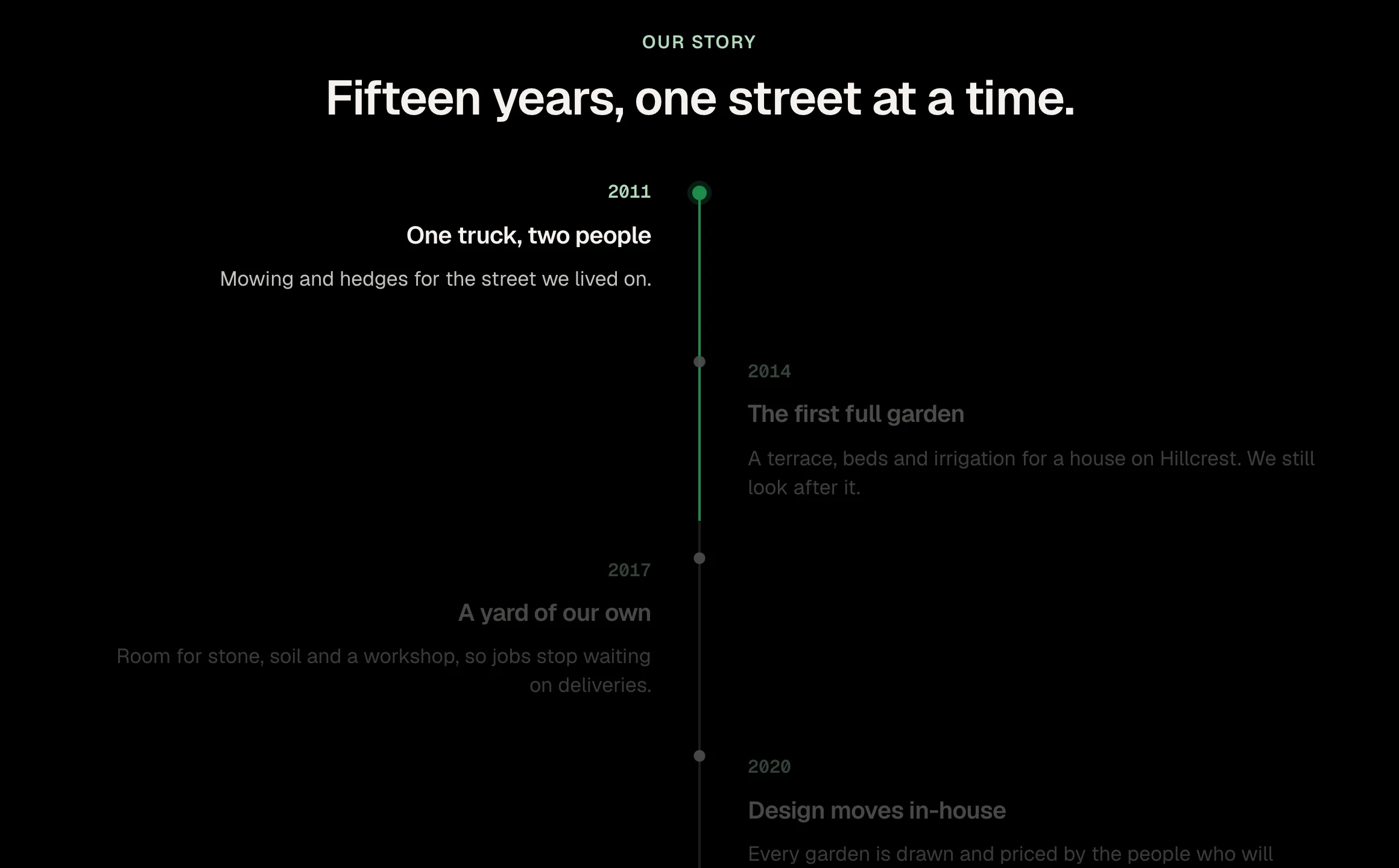
A timeline whose line draws itself as you scroll, lighting each entry as it arrives. Entries alternate either side of the line on a wide screen and line up beside it on a phone. Needs the EtchPress Runtime; without it the timeline is simply all there.
A company history. A project timeline or roadmap. The stages of a service. A changelog told as a story.
eyebrow (text, optional); title (text, optional); entries (repeater: when, title, text)
Open the item page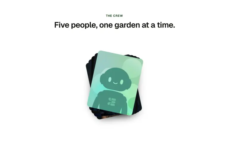
A stack of pictures that fans out into a row as you scroll, each one settling level with its name beneath it, while the section holds on screen. On a phone the row overlaps like a hand of cards. Needs the EtchPress Runtime; without it it is a row of cards.
Introducing a team. A handful of featured projects. Product ranges. The stages of something, shown as pictures.
eyebrow (text, optional); title (text, optional); cards (repeater: image, alt, title)
Open the item page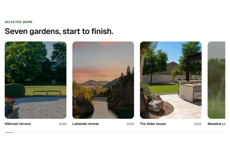
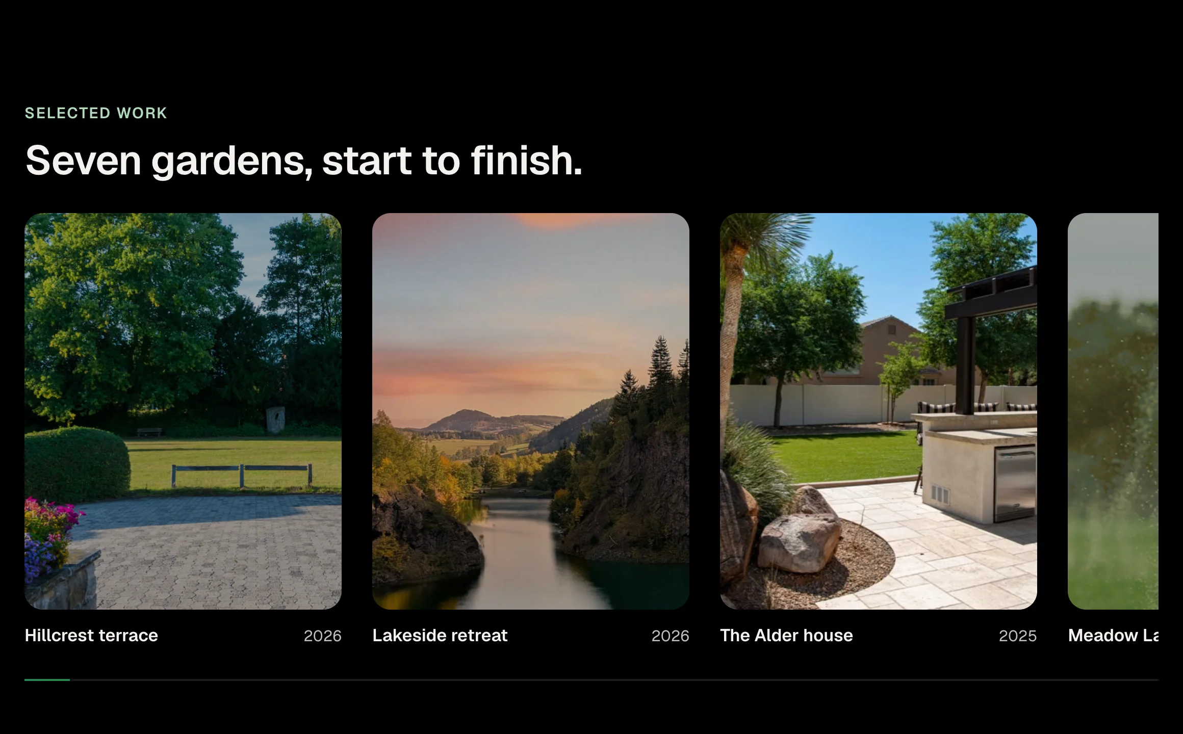
A row of pictures that travels sideways while the page scrolls and the section holds on screen, each picture drifting inside its frame, a bar showing how far along. On a phone the row is swiped by hand, with the same drift and bar. Needs the EtchPress Runtime; without it it is a row you scroll.
Selected work, six to ten projects. A product line shown one after the other. A timeline of a company's years. Before the plain gallery grid, as the page's one moment of theatre.
eyebrow (text, optional); title (text); cards (repeater: title, meta, image, alt, href)
Open the item page
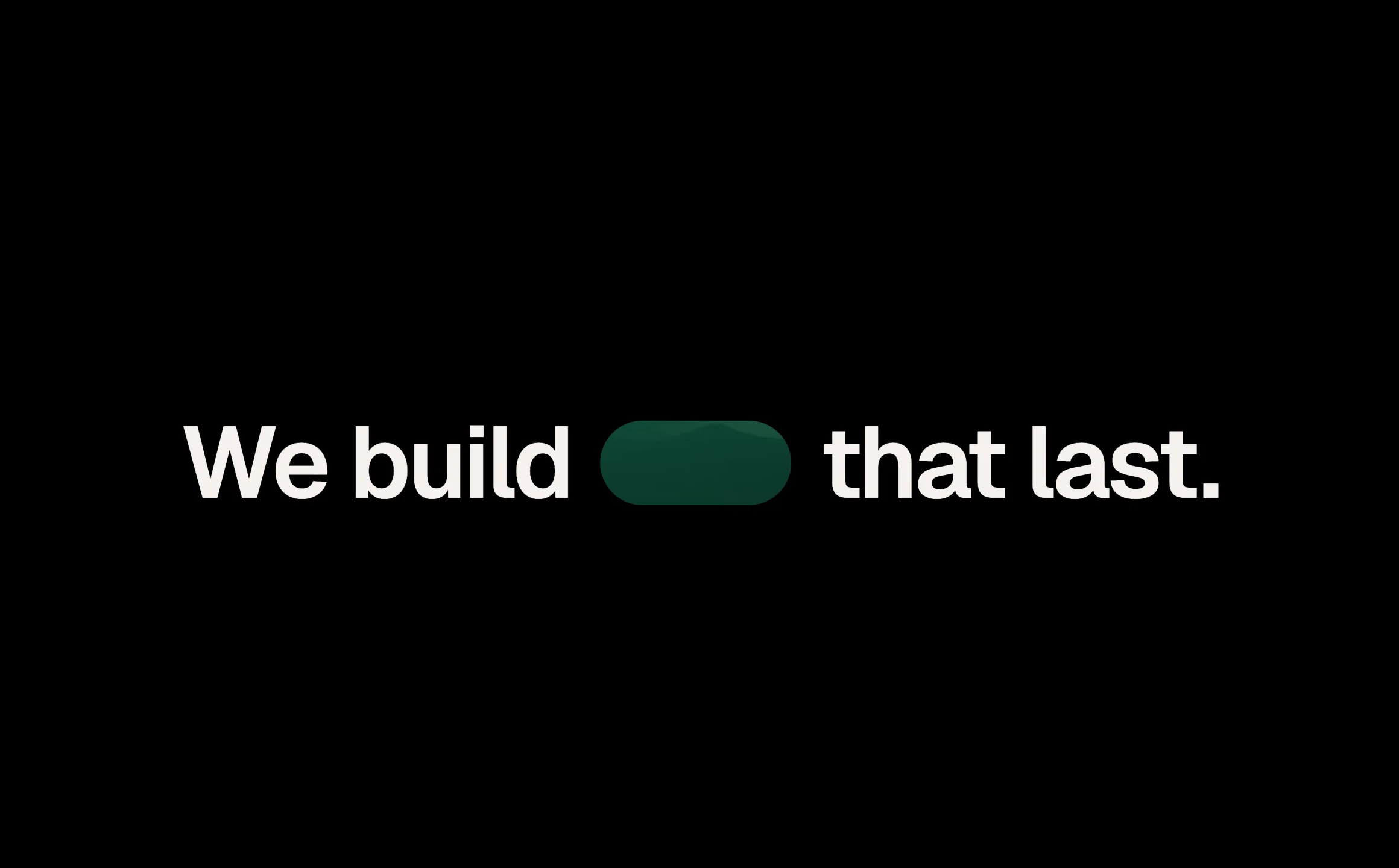
A picture the size of a word sits inside the headline. As the page scrolls the section holds, the picture opens until it fills the screen, the words part, and a caption arrives over it. The same on a phone. Needs the EtchPress Runtime; without it it is a headline with its picture and a caption.
The opening of a home page for a business whose work is visual. The turn from a claim to the proof on a case study. An about page: the sentence, then the place. A campaign landing page with one photograph.
lead (the first words); tail (the last words); image and alt; text (the caption); linkLabel (optional) and href
Open the item page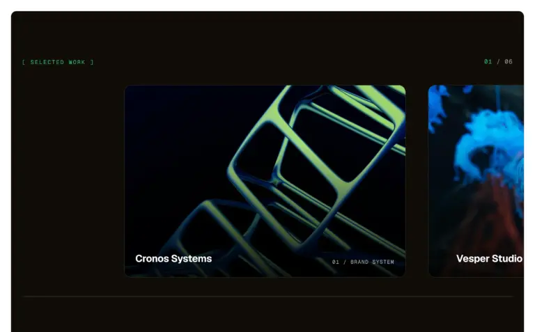
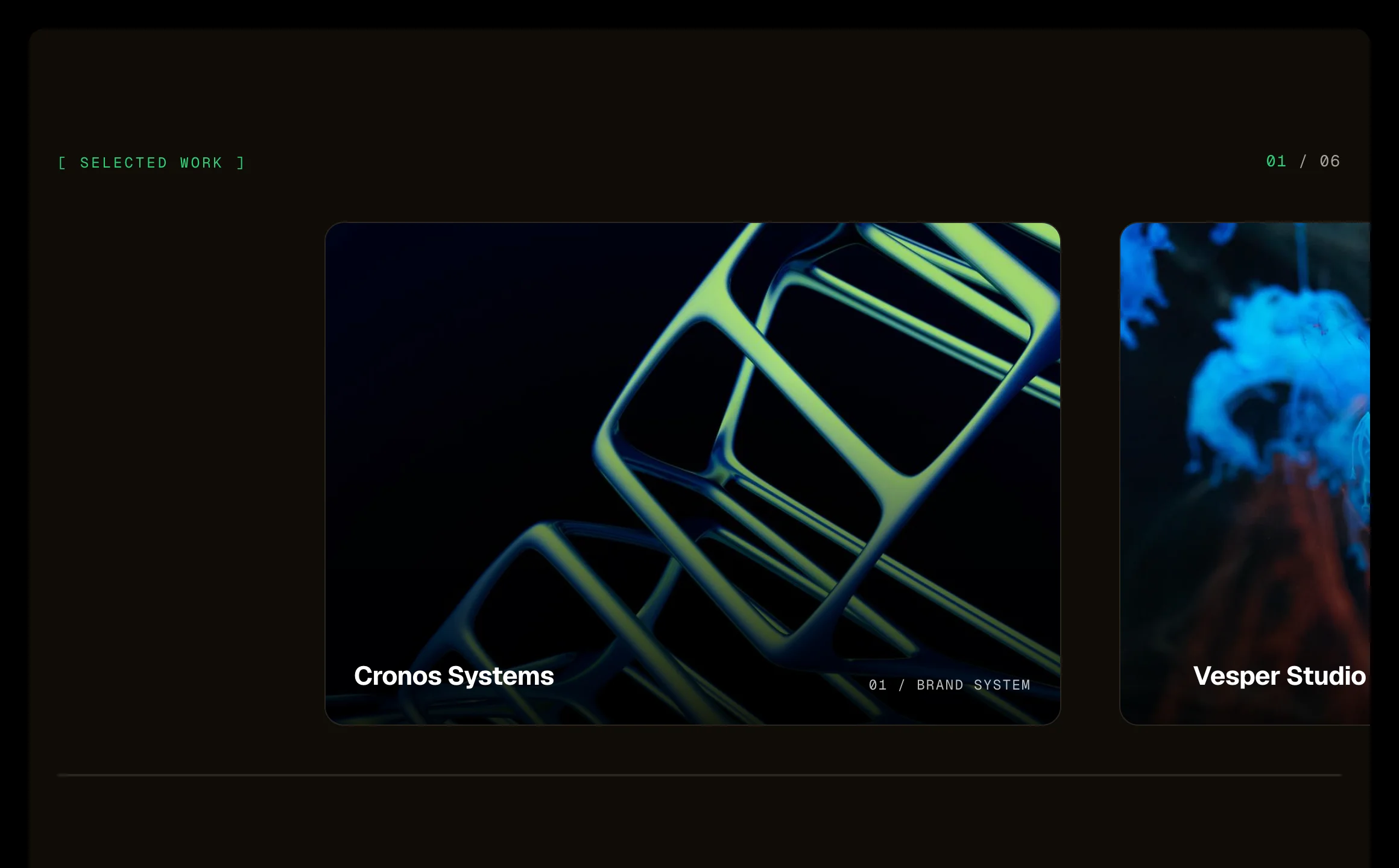
A row of large picture cards that travels sideways while the section holds on screen, like a camera panning. Three layers move at three speeds: the picture, its caption, and a large ghost numeral behind each card, so it reads as depth. A counter above and a progress line below. The same on a phone. Needs the EtchPress Runtime; without it it is a row of cards to swipe.
Selected work on a studio or agency site. A portfolio's featured projects. A product line shown one at a time. Chapters or case studies on a landing page.
eyebrow (text); cards (repeater: image, alt, title, label)
Open the item page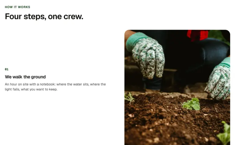
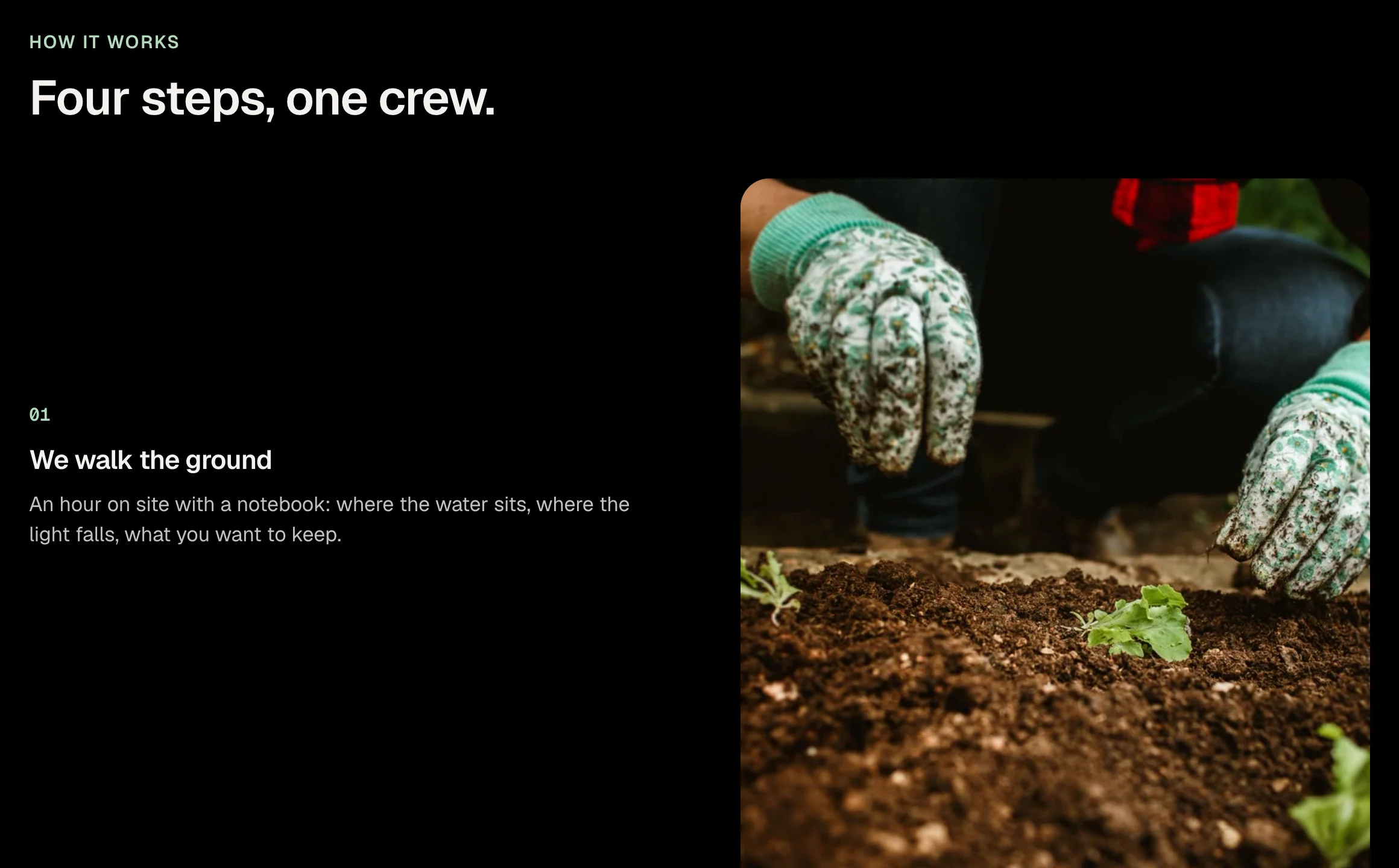
Steps that scroll past while one picture stays in view and changes to match the step you are reading. Beside the steps on a wide screen, held at the top on a phone. Needs the EtchPress Runtime; without it each step simply has its picture above it.
How a service works, step by step. A product tour with a screenshot per feature. A case study told in stages. An onboarding or process page.
eyebrow (text, optional); title (text, optional); steps (repeater: image, alt, title, text)
Open the item page

A picture shows only through the letters of one large word. As the page scrolls the section holds and the word grows until you have passed through it into the picture, and a caption arrives. The same on a phone. Needs the EtchPress Runtime; without it it is the word, the picture and the caption.
The opening of a campaign page. A one-word brand statement that becomes the product. The start of a case study. A chapter break on a long story page.
word (one short word); image and alt; text (the caption); linkLabel (optional) and href
Open the item pageA search box that opens a search window over the page: type to narrow a list of pages, services or anything you name, move with the arrow keys, open with Enter, close with Escape. Cmd K or Ctrl K opens it from anywhere. No plugin, no search index: the results are a list you fill in the component's settings.
A site search for a small site without a search plugin: pages, services, locations. A symptom or service finder in a clinic or agency header. A command menu for a docs site or a product's help pages.
placeholder (text, shown in the box and the field); label (text, the window's accessible name); items (repeater: title, category, link, keywords, matched word by word against what is typed); emptyText (text); hotkey (select: on, off; the first palette on a page with it on answers Cmd K or Ctrl K).
Open the item pagePlain answers, fixed prices, the same team every time.
Everything under one number. You hear the price before the work starts, and the person who quoted it is the one who does it.
The opening of every section: a literal heading as the eyebrow, the headline as a paragraph, an optional lead and up to three actions. Heading level, alignment and every optional piece are props.
The opening of any section: eyebrow, headline, lead and actions. A page header at H1. A centred introduction above a grid.
eyebrow (text, the literal heading); level (select: h2, h1, h3); headline (text); showLead (boolean); lead (text); align (select: start, center); showActions (boolean); primaryLabel and primaryHref; secondaryLabel and secondaryHref; linkLabel and linkHref
Open the item pageCome in, be seen within 20 minutes.
Three clinics, walk-in and booked visits, labs on site.
See a doctor from your sofa.
Same doctors, same notes, from any phone or laptop.
A segmented control (a sliding thumb behind two to four options) that switches between panels. Each panel is a slot, so anything goes inside. Real buttons with pressed state, arrow-key movement and no layout jump between panels.
Monthly and annual pricing behind one switch. Two to four views of the same content, such as plans, tiers or audiences. A tabs replacement that keeps its height.
label (text, names the control for screen readers); option1 to option4 (text, empty options are left out); align (select: start, center); panel1 to panel4 slots
Open the item pageA first conversation about what you need, then a written plan to work from.
See the serviceA linked card for a service or feature: image, heading, one-line description and a cue. The whole card is the click target, the heading carries the link, and the image is a placeholder that travels inside the JSON until you map your own.
A services grid where every card links to its page. A features list with photos. A card to map from a services loop.
title (text); description (text); href (link); image (image URL, a neutral placeholder by default); alt (text); showCue (boolean); cue (text); size (select: medium, small)
Open the item pageEverything you need, from one team.
Pick a service to see what is included and where prices start.
A Section intro over a responsive grid of Service cards. Three, four or six cards, plain or on a light band; the grid reflows from three across to one by container width.
A what we do section with three, four or six services. A features grid on a landing page. A categories overview.
A pattern: edit the Section intro and each Service card's props; add or remove cards in the grid.
Open the item page

A band of light that crosses a line of text: twice when it is first seen, or without end for a status that is in progress. The light is a faded run of the text's own colour, so it reads on any ground. Needs the EtchPress Motion stylesheet; without it the text is plain.
A short claim in a hero that catches the eye once. A status line while a form or a quote is being prepared. An eyebrow over a new offer. A number or a date that deserves a second look.
text (text); level (select: h2, h3, p, eyebrow); repeat (select: twice when seen, without end); speed (select: medium, slow, fast)
Open the item page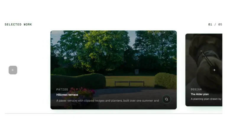
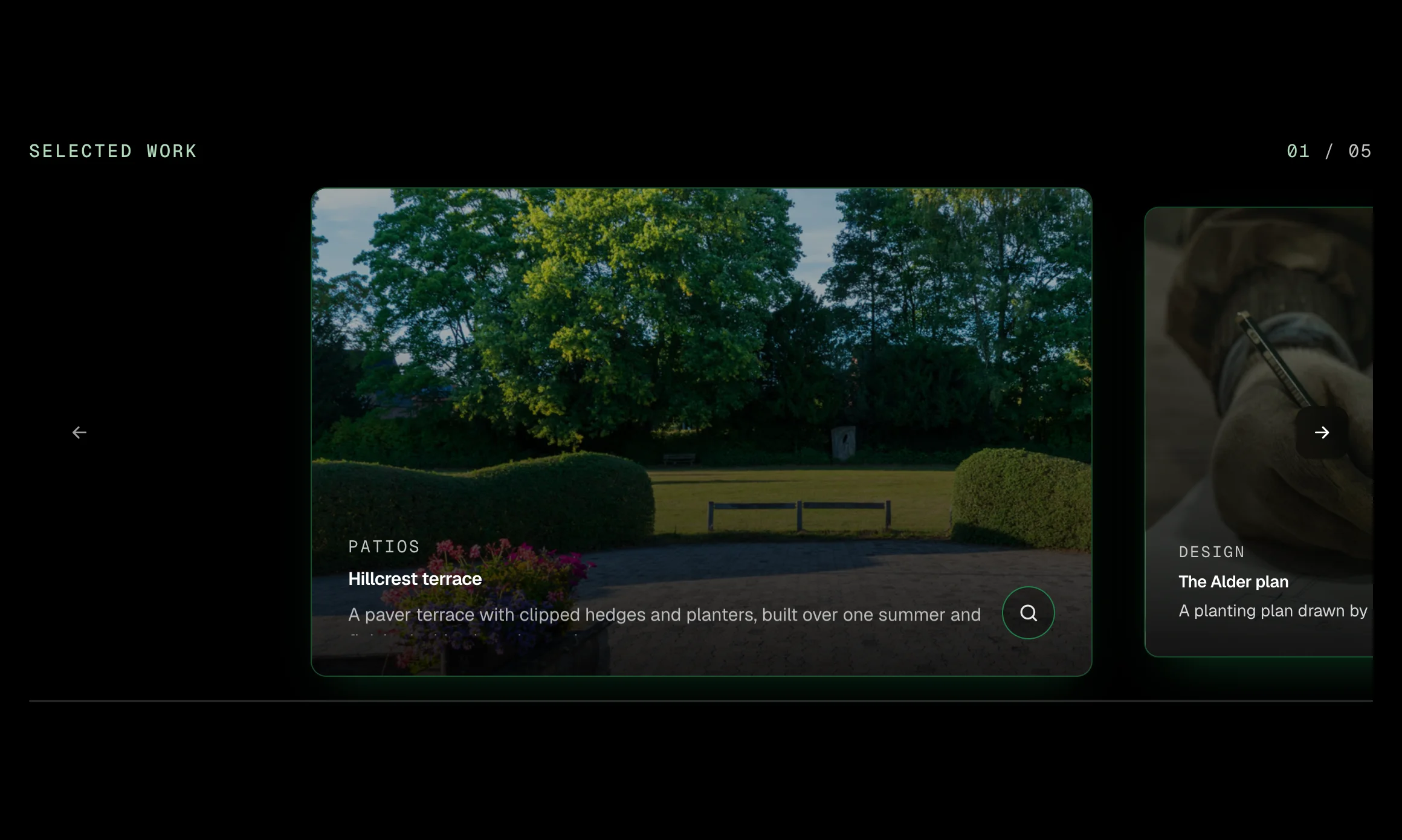
A row of large photo cards for selected work. In the spotlight layout the centred card is bright with an outline and a caption on a dark scrim, and its neighbours sit dimmed at the edges; two or three in view makes it a plain row. Swipe, drag with the mouse, use the arrows or the keyboard; a counter and a progress line keep the place, a zoom opens the picture full size, and autoplay comes with a Pause control. Native scroll snap with one small script, no plugin.
A selected work section on a studio or contractor home page. A gallery of finished projects with captions and a full size view. A row of two or three photo cards for services, locations or rooms. A testimonial or case study reel that advances on its own, with a Pause control.
label (text, the eyebrow and the carousel's name); showLabel (boolean: hide the eyebrow under a section heading, the name stays for screen readers); items (repeater: image, alt, title, category, description); layout (select: spotlight, two in view, three in view); cardWidth (select, spotlight only: medium, wide, narrow portrait); autoplay (select: off, every 5 seconds, every 8 seconds); showCount (boolean); showProgress (boolean); showZoom (boolean, the lightbox); intro (select: none, or advance two cards when first seen)
Open the item pageThe invoice matches the quote to the dollar, or we eat the difference.
A start date and a finish date on the quote, in writing.
Every message answered the day it arrives, by a person.
The lead who quoted the job answers the phone during it.
A card whose glow follows the pointer across it, with a matching light on the border. A grid of them shares one pointer, so the light moves from card to card. A small script sets two custom properties; the rest is CSS. Touch devices get a still card.
A features grid where a light follows the pointer. A set of promises or benefits on a dark or light page. A pricing inclusions block with more life than plain cards.
title (text); text (text); icon (select: none, check, calendar, clock, phone, mail, pin); href (url, optional); size (select: medium, small)
Open the item page
Cards that pin near the top as you scroll and stack, each one settling back a step as the next slides over it. One list, one card per item; the list carries a few lines of script that measure the scroll, so it works in every browser. Full-screen cards (the default) or content-height cards; the outgoing card settles back smaller, dimmer and rounder as the next slides over.
A sequence of steps or features that stack as the page scrolls. A case study told card by card. A product's main points on a long landing page.
title (text); text (text); image (image, optional); tone (select: light, dark, primary); size (select: full, content).
Open the item pageA number and its label. Tabular figures, a size select, and an optional prefix and suffix so 14+, .4M and 98% keep one baseline. Put four in a row for a numbers band.
A number and its label, in a band of four. A single headline figure beside a paragraph. Results in a case study.
number (text); prefix (text, optional); suffix (text, optional); label (text); size (select: large, medium, display)
Open the item pageFourteen years, one standard.
Four Stats in a row, on dark with a Section intro or on a light band alone. Prefix and suffix keep one baseline.
A numbers band between two sections. Proof under a hero. Results on an about page.
A pattern: edit each Stat's props and the intro; add or remove stats in the list.
Open the item page

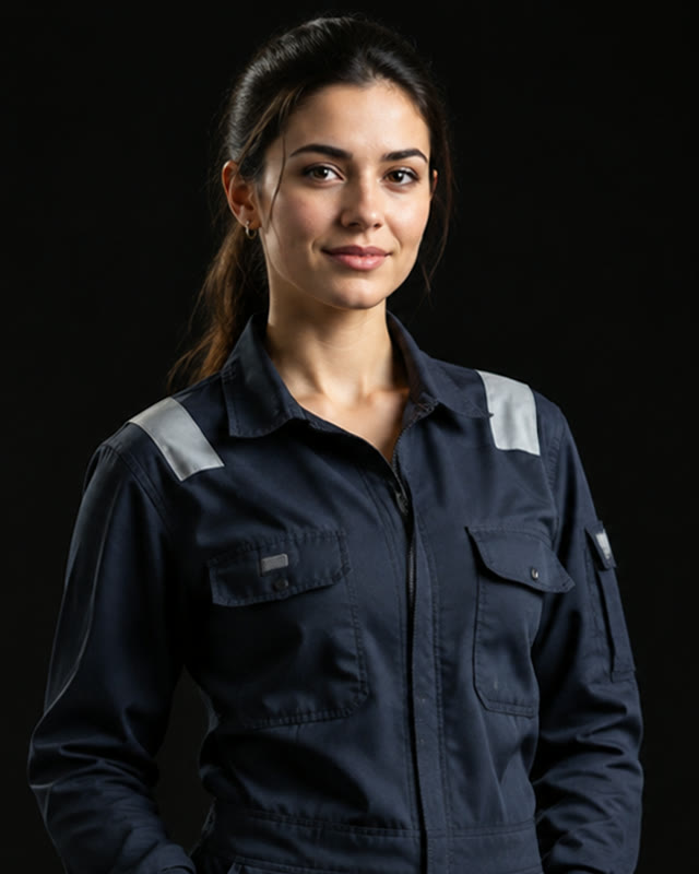

A person: portrait, name, role, a line of bio and an optional link. The portrait is a placeholder that travels inside the JSON until you map yours; the whole card links when a link is given.
One person in a team grid. A founder or author card. A card to map from a staff loop.
image (image URL); alt (text); name (text); role (text); bio (text, optional); linkLabel and linkHref (optional); shape (select: portrait 4:5, square); size (select: medium, small)
Open the item pageEleven people. One rule.
Every client hears the plan and the price before the work starts. Everyone here works that way.

A Section intro over a grid of Team cards, four or six across, portrait or square. Plain or on a light band.
A meet the team section. A doctors, attorneys or trainers grid. A speakers or contributors list.
A pattern: edit the Section intro and each Team card; add or remove cards.
Open the item pageWhat our customers say.
Every review is from a real client, reprinted with permission.
They finished a week early.
They showed up when they said, kept us informed and walked us through every change before making it.
Fixed price, no surprises.
Three quotes; theirs was the only one with a line for everything, and the invoice matched it to the dollar.
Good work, slow to start.
Six weeks to get on the schedule, but once they started the job ran four days straight.
Our neighbours keep asking who did it.
Two years on and it still works like the day it was finished. The plan held up.
Answered the phone.
Every time. That alone put them ahead of the other four.
The plan sold it.
We saw exactly what we were paying for before we paid for it.
A Section intro over a grid of Review cards, plain, on a light band or on dark. Three, four or six.
A wall of reviews on a home page. Social proof before a pricing table. A reviews page.
A pattern: edit the Section intro and each Review card; add or remove cards.
Open the item pageA line of type whose letters run through other letters and settle from left to right when it is seen, like a departure board. Hovering it, or tapping it on a phone, runs it again. Needs the EtchPress Runtime; without it the line is plain.
An eyebrow or a short claim on a technical product's page. A number or a code that should feel computed. Section labels on a studio site. A status line that deserves a second look.
text (text); level (select: h2, h1, h3, p); font (select: monospace, the heading font); speed (select: medium, slow, fast)
Open the item pageA dated notice in a small card: a caption, the headline, one short paragraph, when it was posted and a link for details. For a closure, new hours, an offer or a new location. Light or dark, medium or small.
A holiday closure or a change of hours on the home page. A seasonal offer with its end date. A new location or a new service, dated. A dark tile in a light section, or the reverse.
caption (text); title (text); body (text); date (text, as shown, optional) and datetime (ISO); linkLabel and linkHref (optional); tone (select: light, dark); size (select: medium, small)
Open the item pageWhat is included, as a small card: a caption, a title and one line per item with a check; an item can be marked not included and shows a muted cross instead. A note and one link. Light or dark, medium or small.
What a plan or a visit includes, beside the plan cards. What to bring to an appointment. What a quote covers and what it does not, on a service page. A dark tile in a light section, or the reverse.
caption (text); title (text); rows (repeater: label, included as a switch); note (text, optional); linkLabel and linkHref (optional); tone (select: light, dark); size (select: medium, small)
Open the item pageOpening hours in a small card: a caption, a status line, the days with their hours, a note and one link. Today's row is picked out on its own, in the page's language. Light or dark, medium or small.
Opening hours on a contact page or in the footer band. A tile in a bento or "why us" section beside a rating and a stat. A clinic's or a shop's hours with today picked out. A dark tile on a light page, or the reverse.
caption (text); title (text, the status line); rows (repeater: day, hours); note (text, optional); linkLabel and linkHref (optional); tone (select: light, dark); size (select: medium, small)
Open the item pageThe next open date in a small card: the date large, the slot under it, a line on lead time and the book link. The date is text you set or bind, so it says what you mean. Light or dark, medium or small.
The next estimate visit beside the contact form. A clinic's next new-patient slot on the home page. Lead time in plain words for a busy season. A dark tile in a light section, or the reverse.
caption (text); title (text, what the visit is); date (text, the display line); slot (text, optional); note (text, optional); linkLabel and linkHref (optional); tone (select: light, dark); size (select: medium, small)
Open the item pageA review score in a small card: the score as a large numeral, five stars that fill to it to the decimal, the number of reviews, where they are and one link to read them. Light or dark, medium or small.
A Google or Trustpilot score beside the hours and a stat in a bento band. Proof next to the booking form on a service page. A footer tile that links to the review profile. A dark tile in a light section, or the reverse.
caption (text); title (text); score (text, such as 4.9: the stars fill to it, to the decimal); count (text); source (text, optional); linkLabel and linkHref (optional); tone (select: light, dark); size (select: medium, small)
Open the item page
One photo as a small card, with a gradient fade and the caption, title and place over it at the bottom, and a link to the gallery. Dark on the photo in both schemes. Medium or small.
The latest finished job beside the hours, the rating and a stat. A photo tile that opens the gallery. A before-and-after teaser on a service page. One strong image in a band of quiet tiles.
image (image URL); alt (text); caption (text); title (text); where (text, optional); linkLabel and linkHref (optional); size (select: medium, small)
Open the item pageWhere the business works, as a small card: a title that says it in words, the places as a row of chips that wraps, a note on the radius and a link to check an address. Light or dark, medium or small.
The service area beside the hours and the contact form. The towns a clinic or a firm serves, with a link to the directions page. A radius in plain words for a trade that travels. A dark tile in a light section, or the reverse.
caption (text); title (text); places (repeater: name); note (text, optional); linkLabel and linkHref (optional); tone (select: light, dark); size (select: medium, small)
Open the item pageA number and its label in a small card, with one line of change against the last period and an arrow that points up, down or level. Light or dark, medium or small.
Jobs completed this month, beside the hours and the rating in a bento band. A figure with its direction on an about page: years, crews, projects. A patient or client count with the change since last year. A dark tile in a light section, or the reverse.
caption (text); label (text, the title); number (text); prefix and suffix (text, optional); change (text, optional); trend (select: up, down, level); note (text, optional); linkLabel and linkHref (optional); tone (select: light, dark); size (select: medium, small)
Open the item pageNothing matches. Clear the search.