
Sick visit
Same-day, in clinic or video.
A labelled row of cards that scrolls sideways, with real previous and next buttons that page through it and disable at the ends. The cards are a slot: drop any cards in. Keyboard users get a focusable track; touch users swipe with scroll snap.
Same-day, in clinic or video.
Labs, vitals and a plan for the year.
Cleared to play in one visit.
Full-body exam with dermoscopy.
Vaccines and prescriptions before you go.
For snoring, apnea and insomnia.
Skin-prick panel, results same day.
Same-day, in clinic or video.
Labs, vitals and a plan for the year.
Cleared to play in one visit.
Full-body exam with dermoscopy.
Vaccines and prescriptions before you go.
For snoring, apnea and insomnia.
Skin-prick panel, results same day.
Same-day, in clinic or video.
Labs, vitals and a plan for the year.
Cleared to play in one visit.
Full-body exam with dermoscopy.
Vaccines and prescriptions before you go.
For snoring, apnea and insomnia.
Skin-prick panel, results same day.
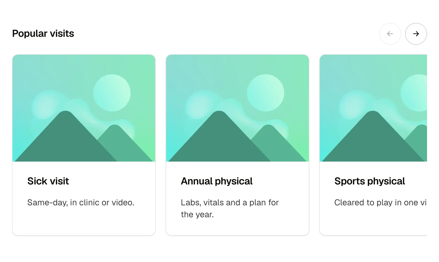
A row of services or products that scrolls sideways. A more like this strip under an article. A team, locations or categories strip on a phone-first page.
label (text, the row's heading); cardWidth (select: narrow, medium, wide); items slot (list items with any card inside)
Arrows enabled and disabled at each end; hover and focus on the arrows; the track is focusable and scrolls with arrow keys; scroll snap on touch.
Content and options are 2 props in the component's settings panel, and what goes inside is a slot you fill with your own blocks. Colour, type, spacing and radius follow your Automatic.css settings, so a change to the site's palette or scale changes this too. For anything else, edit the classes in the Style Manager, starting with .row-scroller, .service-card. Its behaviour is a small script that travels with the component; no plugin and nothing to install.
h4, space-s, space-m, white, neutral-ultra-light, text-dark, radius-circle, border-color-dark, focus tokens, transition
ACSS 4 defaults. Nothing to switch on.
Version 1.0.1, October 11, 2026: Carries the current Service card (1.1.0): the size option and the card family's shared spacing, corners and part names. Pasted beside the card itself, it no longer asks to update it. Version 1.0.0, September 17, 2026: First release.
Etch 1.6.7 and ACSS 4.0.1. Version 1.0.1.
Members copy this straight into Etch, ready to paste.
Used an earlier version? How to update it
Get lifetime accessEverything here is made for Etch. Pick the builder you use and leave your email: we write once, when EtchPress works there.