Reviews
Rated by the people we work for
4.9
312 reviews
On Google
Read themA review score in a small card: the score as a large numeral, five stars that fill to it to the decimal, the number of reviews, where they are and one link to read them. Light or dark, medium or small.
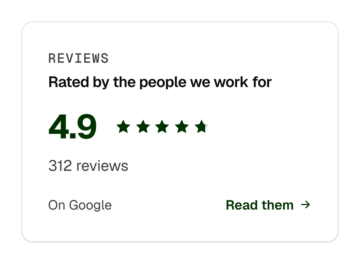
A Google or Trustpilot score beside the hours and a stat in a bento band. Proof next to the booking form on a service page. A footer tile that links to the review profile. A dark tile in a light section, or the reverse.
caption (text); title (text); score (text, such as 4.9: the stars fill to it, to the decimal); count (text); source (text, optional); linkLabel and linkHref (optional); tone (select: light, dark); size (select: medium, small)
Rest; the stars fill to the score (whole stars full; a fractional star is cut between a quarter and three quarters of its width, a half staying a half, so the fraction always shows) and read as one image for screen readers with the score in words; the link's hover, focus and press; dark tone stays dark in both schemes; small. Nothing moves under reduced motion.
Content and options are 9 props in the component's settings panel. Colour, type, spacing and radius follow your Automatic.css settings, so a change to the site's palette or scale changes this too. For anything else, edit the classes in the Style Manager, starting with .widget, .widget-rating.
space-s, space-xs, text-s, text-m, h2, radius, primary-dark, primary-light, warning, text-dark, text-dark-muted, text-light, text-light-muted, neutral-ultra-dark, white, black, box-shadow-1, focus tokens; –ep-font-mono with a fallback.
ACSS 4 defaults. Nothing to switch on. The stars take the warning colour when the site has one, the primary otherwise.
Version 1.0.0, September 30, 2026: First release, part of the widget family built under the component-systems contract.
Etch 1.6.7 and ACSS 4.0.1. Version 1.0.0.
Members copy this straight into Etch, ready to paste.
Used an earlier version? How to update it
Get lifetime accessEverything here is made for Etch. Pick the builder you use and leave your email: we write once, when EtchPress works there.