Notes
What a good quote always includes
Three things to ask before you hire anyone, and the answers worth hearing.
Three things to ask before you hire anyone, and the answers worth hearing.


A post: image, category, title carrying the link, excerpt, date and reading time. Built for loops: map its props from a posts loop and every post renders the same way; the whole card is the click target.
A blog archive fed by a posts loop. A row of three latest posts on a home page. Related posts at the end of an article.
image (image URL); alt (text); category (text); title (text); excerpt (text); date (text, shown as written); datetime (text, ISO for the time element); readTime (text); href (link); layout (select: stacked, horizontal); size (select: medium, small)
Open the item page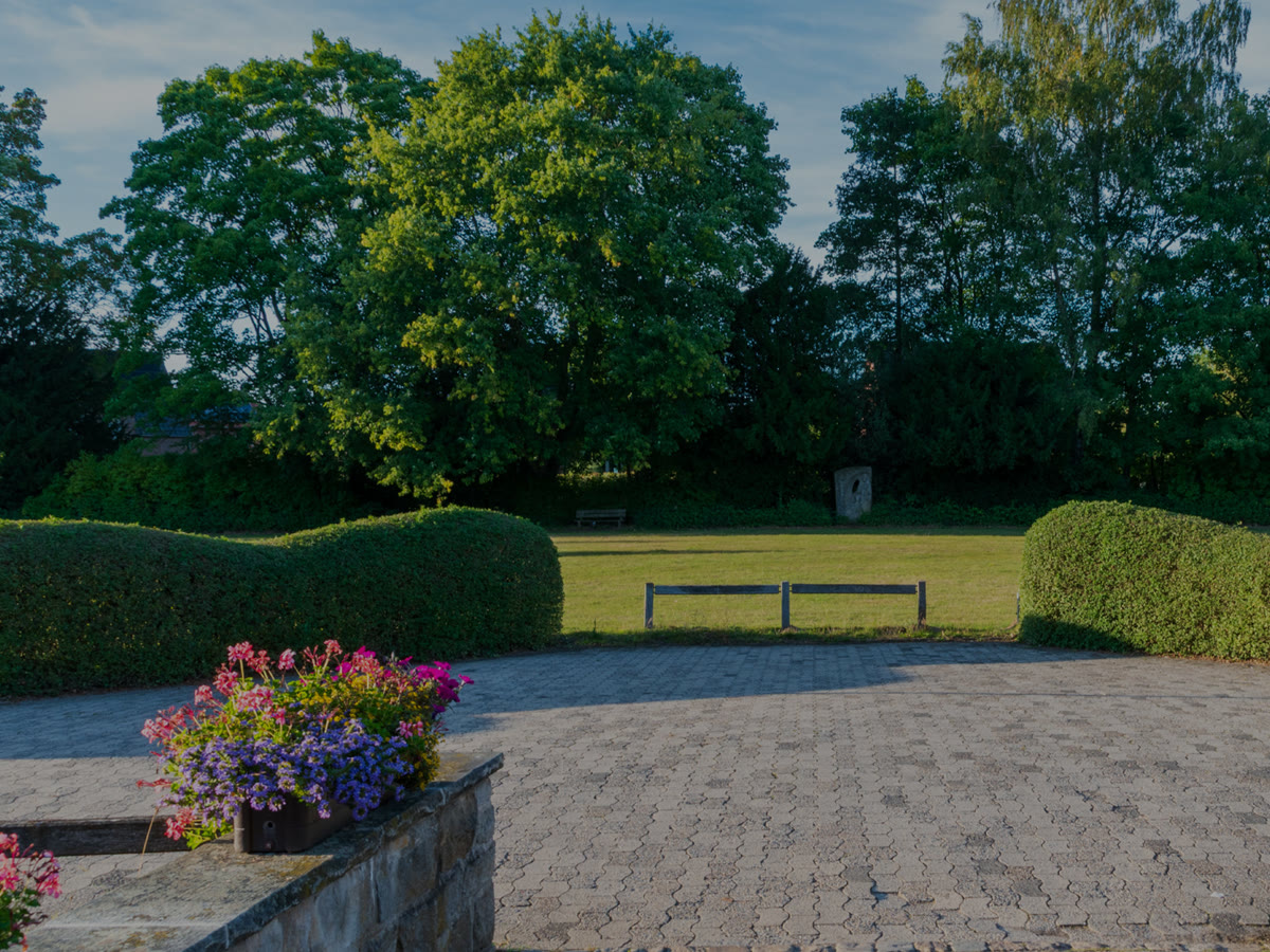
A paver terrace with clipped hedges, built over one summer.
See the project
Native beds around a forest lake, planted for four seasons.
See the project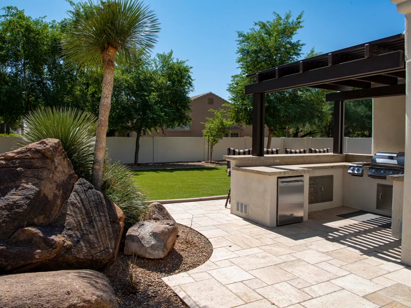
An outdoor kitchen and a patio that stays level through winter.
See the project
Drip and spray across a wide lawn, started each spring.
See the project
Raised beds, planted to the drawing.
See the projectDrag the top card left for the next one, right for the one before, or use the buttons.
A stack of cards. Drag the top one left and it flies off and tucks in at the back while the rest step forward with a small spring; drag right and the last one comes back. It works the same with a mouse and a finger; Previous and Next buttons and the arrow keys do it for a keyboard. Needs the EtchPress Runtime; without it the cards are a row to swipe.
Testimonials worth flicking through. A handful of featured projects. Team members on an about page. Product highlights on a phone-first page.
cards (repeater: image, alt, title, text, linkLabel, href); prevLabel (text, empty hides the button); nextLabel (text)
Open the item pageA photo card that turns toward the pointer in 3D with a soft glare that follows it, its text floating a little above the picture. On a phone it turns as it travels up the screen and leans to a finger. Needs the EtchPress Runtime; without it it is a still photo card.
Project cards on a portfolio or a contractor's work page. Team or speaker cards with a portrait. Three featured services. Product cards on a small catalogue.
image and alt; eyebrow (text, optional); title (text); linkLabel (optional) and href
Open the item pageA row of tall picture cards on a dark band. Each card carries a frosted glass panel with a title and a line of text; point at a card and it rises, its picture moves closer, the panel slides up to show a glowing outline button, and the other cards step back into shadow. A tap or the keyboard opens a card the same way. One small script, no plugin.
A featured collections row for a gallery, a studio or a shop. Three services or categories, each with a picture and one way in. A portfolio teaser where each card leads to a case study. A dark showcase band between two light sections.
label (text, the name of the group for screen readers); items (repeater: image, alt, title, description, linkLabel, url); variant (select: dark band as designed, or no ground so the cards sit on your own section)
Open the item pageWhole websites for one kind of business. Every page, the header, the footer, the contact form. Built the way Page Building 101 teaches it.
See kitsHeroes, pricing, services, testimonials, FAQs, footers. Each one a section you paste in and fill.
Browse patternsReal Etch components with props: cards, buttons, accordions, forms. Change one and every instance follows.
See componentsClaude Code and Codex learn the system. Ask for a new section and it lands in the same tokens and classes as the kits.
How the skill worksFeature cards on a warm dark ground. At rest they are flat and quiet. Point at one and its edge lights: a green to cyan ring, a comet of light that travels round the border with a second one half a turn behind, a soft tint inside and a halo. Four across, two, then one, by the space they have.
What a product includes, four things at a glance. Services on a dark landing page. Plan or tier highlights. Feature links at the foot of a home page.
cards (repeater: icon, title, text, linkLabel, href); variant (select: dark ground as designed, or no ground)
Open the item pageWhole websites for one kind of business. Every page, the header, the footer, the contact form. Built the way Page Building 101 teaches it.
See kitsA dark content card that leans toward the pointer in 3D while its border becomes a green to cyan ring that follows the cursor. A still glow lights behind it, a faint tint appears inside, and the shadow under it shrinks as the card lifts. Icon, title, text and a link. Dark as designed, light, or following the page's scheme.
One feature that deserves the spotlight on a dark page. A row of three or four product or service cards. A link card to a pricing or contact page. A highlighted plan beside quieter ones.
tone (select: dark, light, auto); icon (select), title, text, linkLabel, href, ringA, ringB, ringMint (the ring's three colours), line (the ring's thickness), inkIcon, inkTitle, inkText, inkLink (the colours inside the card), tilt (select: none, subtle, normal, strong)
Open the item pageA light, occasional need
$89per month
Cancel any time.
Most homes
$149per month
Cancel any time.
Larger needs
$329per month
Quoted to your needs.
One plan: name, who it is for, the price with its period, a feature list as a repeater, a button and a note. A featured switch lifts the recommended plan with a chip and an accent border. Prefix and period keep one baseline with the figure.
One plan in a pricing table. A membership tier with a features list. A package card on a services page.
name (text); who (text); price (text); prefix (text, such as $); period (text, such as per month); features (repeater: label); ctaLabel and ctaHref; note (text); featured (boolean); chip (text, shown on the featured plan); glow (boolean, a light at the card's foot on hover or focus); size (select: medium, small)
Open the item pageA 30-minute visit to listen, ask questions and talk budget.
A plan and a line-item price within a week.
Sign off, pick a start date, pay a deposit.
One team, one lead, regular updates until the job is done.
One step of a process: a numbered badge drawn by a CSS counter, a heading and a description. Put them in the process list and the numbers count themselves, so reordering never means renumbering.
One step in a how it works list. A numbered stage that renumbers itself when reordered. An onboarding or installation step.
title (text); description (text); size (select: medium, small)
Open the item pageStep one
01A 30-minute visit to listen, ask questions and talk budget.
What we check
B+Everything checked before we start, so nothing surprises anyone later.
Our promise
100%The invoice matches the quote to the dollar.
Numbered facts on a rule with a dot at each one. Hovering a card raises it on a white surface with a soft glow and lights its number; a kicker line slides in above. In a row of four the first card can hold the raised state until the pointer arrives. Pure CSS.
A row of facts that light up on hover. Process steps or promises set on a rule. Figures with a line of explanation each.
figure (text, the big number); title (text); text (text); kicker (text, optional line that appears on hover); href (url, optional)
Open the item pageThey finished a week early.
They showed up when they said, kept us informed and walked us through every change before making it. The result is exactly what we agreed.
Fixed price, no surprises.
We had three quotes. Theirs was the only one with a line for everything, and the final invoice matched it to the dollar.
Good work, slow to start.
Took six weeks to get on the schedule, but once they started the work ran four days straight and it shows.
A testimonial as a card: star rating, a one-line callout, the quote in a real blockquote with the reviewer and source in its caption. The rating is a select; the stars are drawn by CSS and read out as one label.
A testimonial with stars, a callout and the quote. A review inside a hero or beside a form. One card in a wall of reviews.
rating (select, 1 to 5); callout (text, one line); quote (text); reviewer (text, name and town); source (text, where the review was left); size (select: medium, small)
Open the item page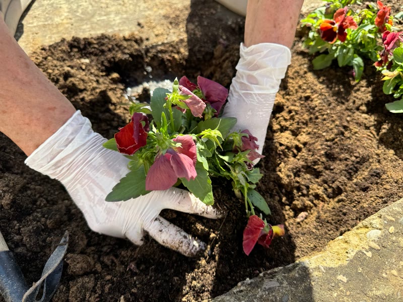
A first conversation about what you need, then a written plan to work from.
See the service
A linked card for a service or feature: image, heading, one-line description and a cue. The whole card is the click target, the heading carries the link, and the image is a placeholder that travels inside the JSON until you map your own.
A services grid where every card links to its page. A features list with photos. A card to map from a services loop.
title (text); description (text); href (link); image (image URL, a neutral placeholder by default); alt (text); showCue (boolean); cue (text); size (select: medium, small)
Open the item pageThe invoice matches the quote to the dollar, or we eat the difference.
A start date and a finish date on the quote, in writing.
Every message answered the day it arrives, by a person.
The lead who quoted the job answers the phone during it.
A card whose glow follows the pointer across it, with a matching light on the border. A grid of them shares one pointer, so the light moves from card to card. A small script sets two custom properties; the rest is CSS. Touch devices get a still card.
A features grid where a light follows the pointer. A set of promises or benefits on a dark or light page. A pricing inclusions block with more life than plain cards.
title (text); text (text); icon (select: none, check, calendar, clock, phone, mail, pin); href (url, optional); size (select: medium, small)
Open the item page



A person: portrait, name, role, a line of bio and an optional link. The portrait is a placeholder that travels inside the JSON until you map yours; the whole card links when a link is given.
One person in a team grid. A founder or author card. A card to map from a staff loop.
image (image URL); alt (text); name (text); role (text); bio (text, optional); linkLabel and linkHref (optional); shape (select: portrait 4:5, square); size (select: medium, small)
Open the item pageNothing matches. Clear the search.