Here in 40 minutes on a Sunday.
Something failed at 7am. The office answered, help arrived before 8 and the price was exactly what she quoted on the phone.
A full-bleed photo under a dark scrim with the words set on it: a Section intro at H1 in light text, a proof row, and an optional floating review card that hangs off the bottom edge. The opener for trades, hospitality and anything with a strong photo.

Fixed today. Priced before we start.
Someone with you within the hour when it is urgent, and a price you agree to before the work begins.
Here in 40 minutes on a Sunday.
Something failed at 7am. The office answered, help arrived before 8 and the price was exactly what she quoted on the phone.
Fixed today. Priced before we start.
Someone with you within the hour when it is urgent, and a price you agree to before the work begins.
Fixed today. Priced before we start.
Someone with you within the hour when it is urgent, and a price you agree to before the work begins.
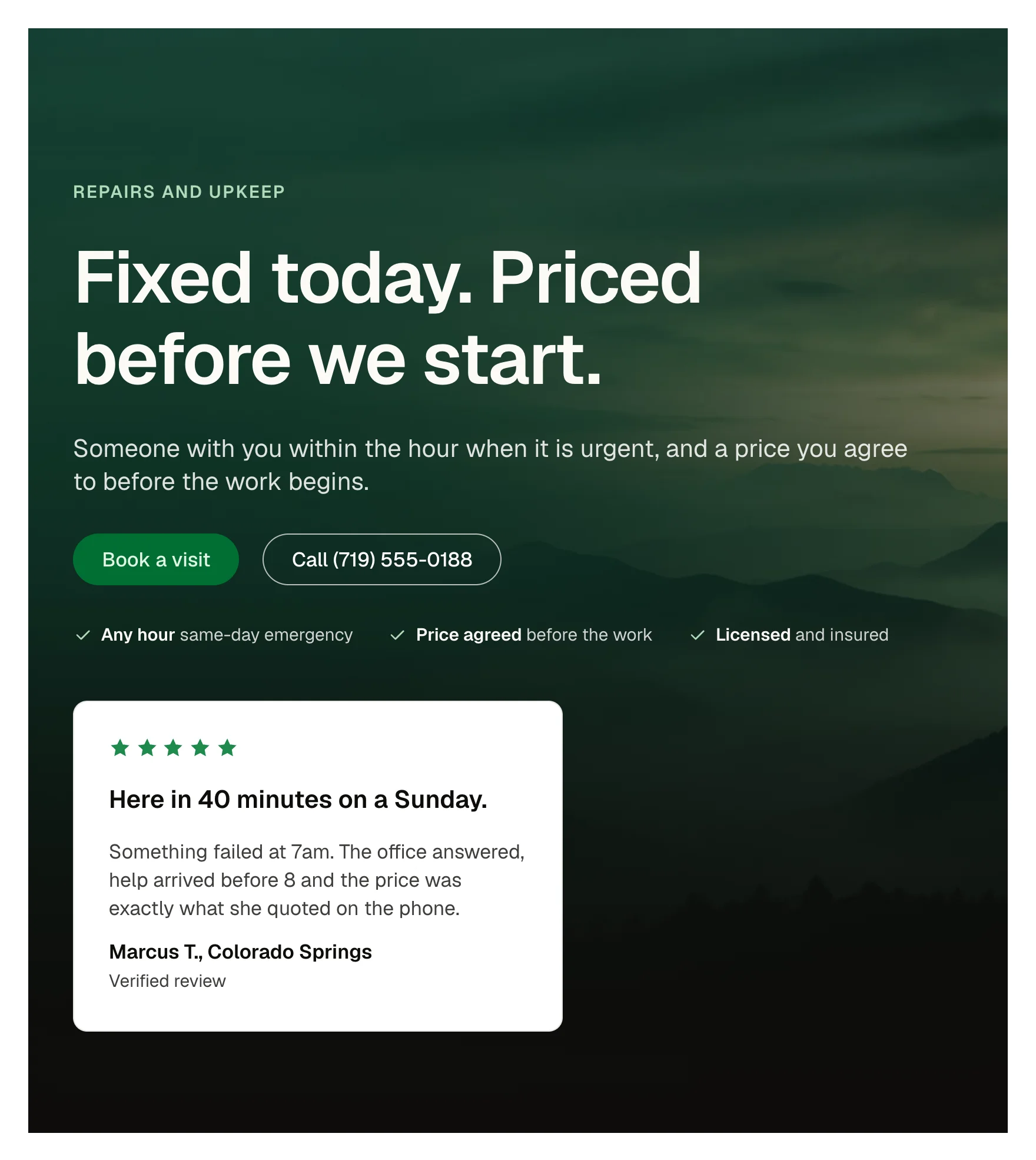
A trades or hospitality hero with the words over a photo. A full-bleed opener with a floating review card. A seasonal or campaign landing page.
A pattern: edit the Section intro's props, the photo, the proof facts and the Review card inside. Minimum height is clamped between 34 and 52rem.
The buttons and link take their states from the Section intro; the review card is static. Below 60rem the card sits under the words.
It is a section built from library components (Review card, Section intro). Edit each component's props, and add or remove cards in the structure panel. Colour, type, spacing and radius follow your Automatic.css settings, so a change to the site's palette or scale changes this too.
section-space-m, section-space-l, gutter, content-width, base-ultra-dark, white, text-light, primary-light, text-s, space-s, space-m, space-l
ACSS 4 defaults. Uses the Section intro and Review card components (included) and btn–primary.
Version 1.0.2, October 11, 2026: Carries the current Review card (1.1.0): the size option and the card family's shared spacing, corners and part names. Pasted beside the card itself, it no longer asks to update it. Version 1.0.1, September 29, 2026: The photo keeps its dark scrim and light text in the dark colour scheme. Version 1.0.0, September 17, 2026: First release.
Etch 1.6.7 and ACSS 4.0.1. Version 1.0.2.
Members copy this straight into Etch, ready to paste.
Used an earlier version? How to update it
Get lifetime accessEverything here is made for Etch. Pick the builder you use and leave your email: we write once, when EtchPress works there.