
Library
Services grid
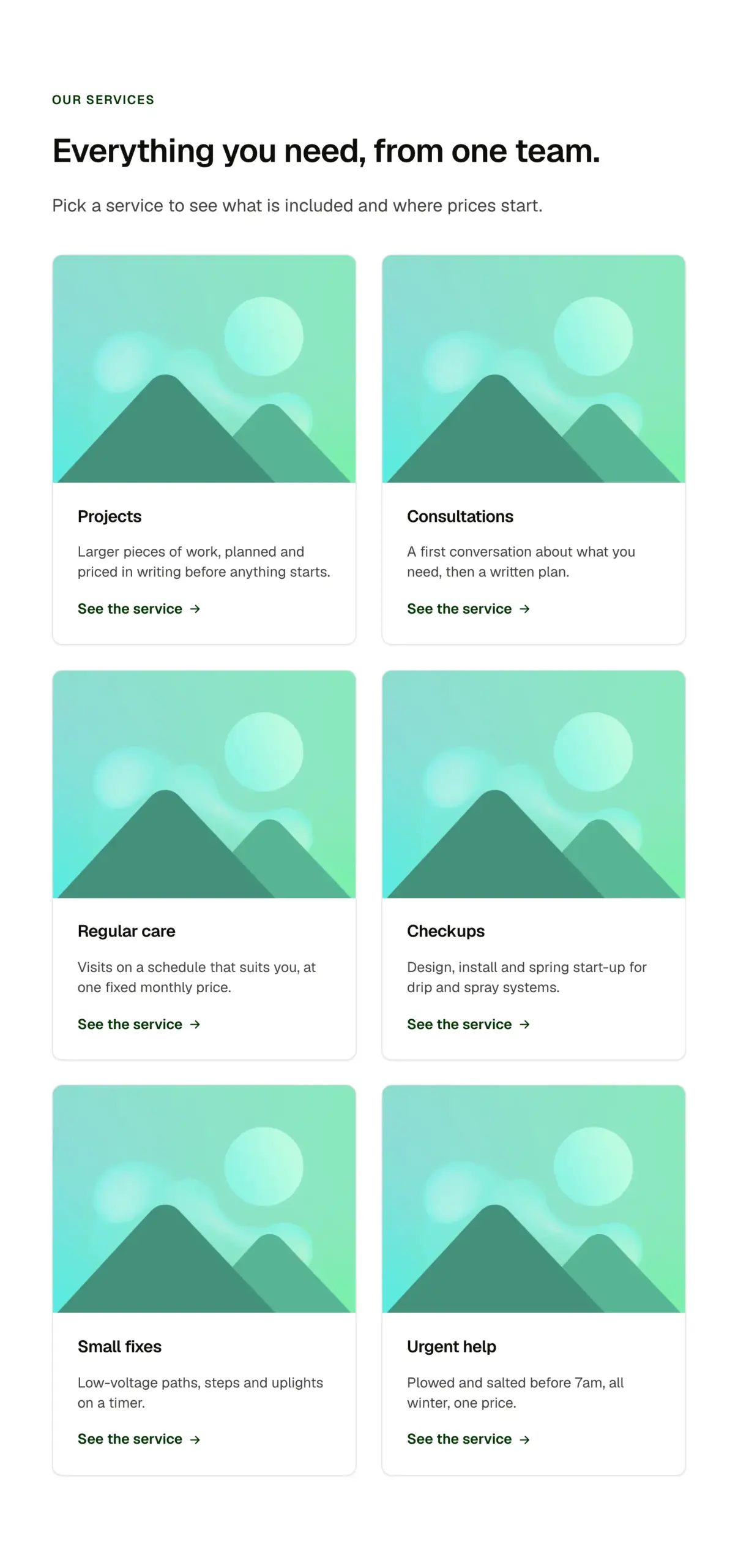
A Section intro over a responsive grid of Service cards. Three, four or six cards, plain or on a light band; the grid reflows from three across to one by container width.
PatternFeaturesServicesLandscaping kit
Live preview
Our services
Everything you need, from one team.
Pick a service to see what is included and where prices start.
Our services
Everything you need, from one team.
Pick a service to see what is included and where prices start.
Our services
Four trades, one number.
What you can build with it
A what we do section with three, four or six services. A features grid on a landing page. A categories overview.
Props
A pattern: edit the Section intro and each Service card's props; add or remove cards in the grid.
States shown
Every state comes from the components inside; see their pages. Grids reflow by container width.
How to change it
It is a section built from library components (Section intro, Service card). Edit each component's props, and add or remove cards in the structure panel. Colour, type, spacing and radius follow your Automatic.css settings, so a change to the site's palette or scale changes this too.
ACSS tokens used
section-space-m, gutter, content-width, space-l, grid-gap, bg-light
ACSS requirements
ACSS 4 defaults. Uses the Section intro and Service card components (included).
Version history
Version 1.0.1, October 11, 2026: Carries the current Service card (1.1.0): the size option and the card family's shared spacing, corners and part names. Pasted beside the card itself, it no longer asks to update it. Version 1.0.0, September 17, 2026: First release.
Tested with
Etch 1.6.7 and ACSS 4.0.1. Version 1.0.1.
Lifetime members
Members copy this straight into Etch, ready to paste.
Used an earlier version? How to update it
Get lifetime accessOther builders
Want EtchPress for Bricks or the block editor?
Everything here is made for Etch. Pick the builder you use and leave your email: we write once, when EtchPress works there.