Practice index
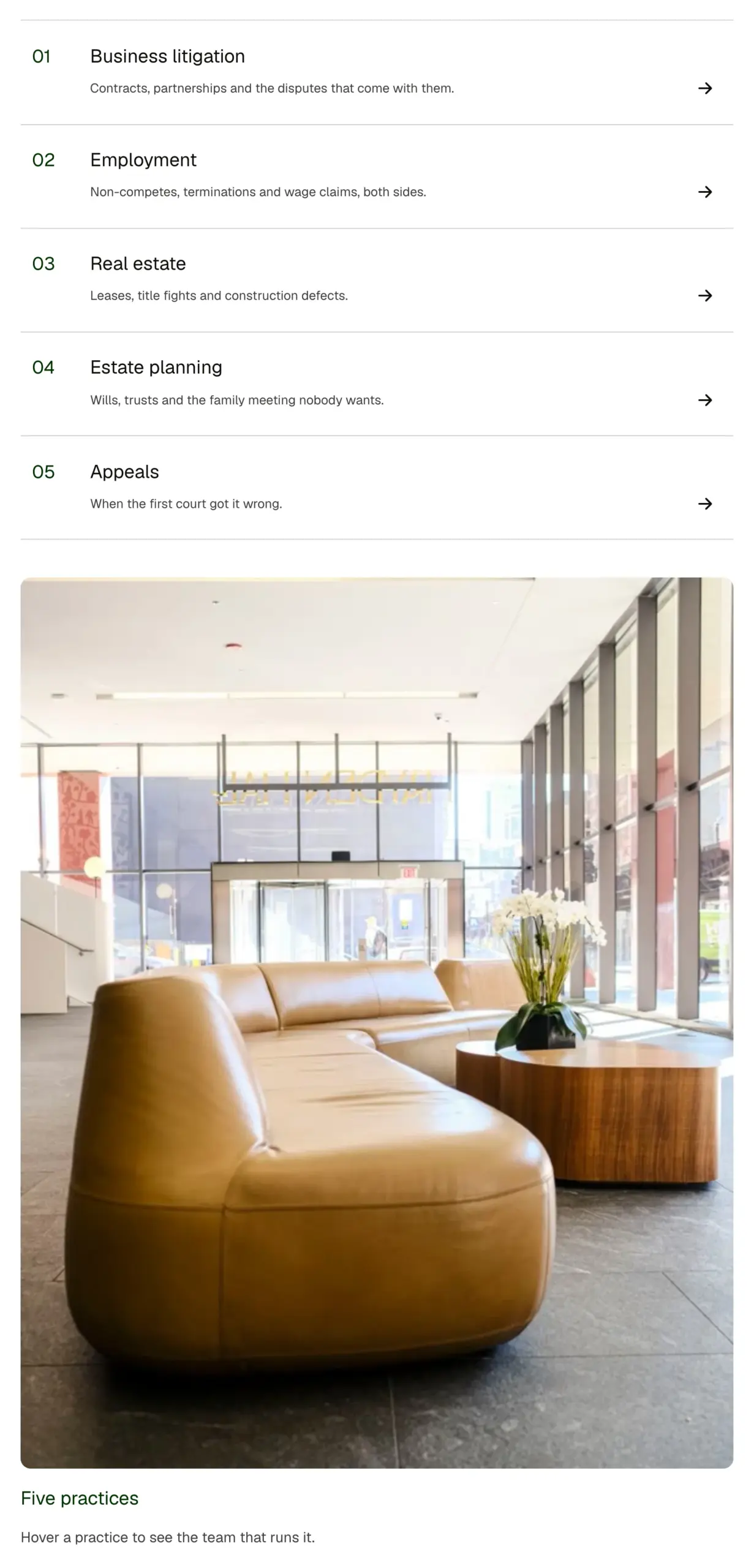
An index of services or practice areas as numbered, ruled rows that link out, with a sticky photo beside them that swaps to the row under the pointer or keyboard focus. Rows are a repeater. Numbers count themselves.
Live preview
- Business litigationContracts, partnerships and the disputes that come with them.
- EmploymentNon-competes, terminations and wage claims, both sides.
- Real estateLeases, title fights and construction defects.
- Estate planningWills, trusts and the family meeting nobody wants.
- AppealsWhen the first court got it wrong.

Five practices
Hover a practice to see the team that runs it.
- Business litigationContracts, partnerships and the disputes that come with them.
- EmploymentNon-competes, terminations and wage claims, both sides.
- Real estateLeases, title fights and construction defects.
- Estate planningWills, trusts and the family meeting nobody wants.
- AppealsWhen the first court got it wrong.
What you can build with it
A law firm's practice areas as ruled, numbered rows. A services index with a photo that follows the pointer. A table of contents for a long site.
Props
rows (repeater: title, short description, href, image URL); showAside (boolean); asideTitle and asideText (text, shown until a row is hovered)
States shown
Row hover and focus (a wash, the arrow slides, the photo and title swap); keyboard focus ring; reduced motion swaps without the fade. Below 60rem of container width the aside sits above the rows.
How to change it
Content and options are 5 props in the component's settings panel. Colour, type, spacing and radius follow your Automatic.css settings, so a change to the site's palette or scale changes this too. For anything else, edit the classes in the Style Manager, starting with .null, .practice-index. Its behaviour is a small script that travels with the component; no plugin and nothing to install.
ACSS tokens used
heading font family, h3, text-l, text-s, text-dark, text-dark-muted, primary-dark, primary (8 percent wash), space-xs, space-s, space-m, space-l, space-xl, border-color-dark, focus tokens, transition
ACSS requirements
ACSS 4 defaults. Nothing to switch on.
Version history
Version 1.0.0, September 17, 2026: First release.
Tested with
Etch 1.6.7 and ACSS 4.0.1. Version 1.0.0.
Lifetime members
Members copy this straight into Etch, ready to paste.
Used an earlier version? How to update it
Get lifetime accessWant EtchPress for Bricks or the block editor?
Everything here is made for Etch. Pick the builder you use and leave your email: we write once, when EtchPress works there.