This month
Jobs completed
46
12% more than last month
A number and its label in a small card, with one line of change against the last period and an arrow that points up, down or level. Light or dark, medium or small.
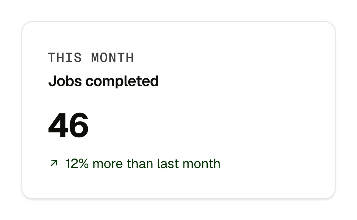
Jobs completed this month, beside the hours and the rating in a bento band. A figure with its direction on an about page: years, crews, projects. A patient or client count with the change since last year. A dark tile in a light section, or the reverse.
caption (text); label (text, the title); number (text); prefix and suffix (text, optional); change (text, optional); trend (select: up, down, level); note (text, optional); linkLabel and linkHref (optional); tone (select: light, dark); size (select: medium, small)
Rest; up in the success colour with the arrow turned up, down in the danger colour with the arrow turned down, level muted and straight; the link's hover, focus and press; dark tone stays dark in both schemes; small. Nothing moves under reduced motion.
Content and options are 12 props in the component's settings panel. Colour, type, spacing and radius follow your Automatic.css settings, so a change to the site's palette or scale changes this too. For anything else, edit the classes in the Style Manager, starting with .widget, .widget-trend.
space-s, space-xs, text-s, text-m, h2, radius, primary-dark, primary-light, success, danger, text-dark, text-dark-muted, text-light, text-light-muted, neutral-ultra-dark, white, black, box-shadow-1, focus tokens; –ep-font-mono with a fallback.
ACSS 4 defaults. The arrow takes the success and danger colours when the site has them, the primary and the muted text otherwise.
Version 1.0.0, September 30, 2026: First release, part of the widget family built under the component-systems contract.
Etch 1.6.7 and ACSS 4.0.1. Version 1.0.0.
Members copy this straight into Etch, ready to paste.
Used an earlier version? How to update it
Get lifetime accessEverything here is made for Etch. Pick the builder you use and leave your email: we write once, when EtchPress works there.