They finished a week early.
They showed up when they said, kept us informed and walked us through every change before making it. The result is exactly what we agreed.
A testimonial as a card: star rating, a one-line callout, the quote in a real blockquote with the reviewer and source in its caption. The rating is a select; the stars are drawn by CSS and read out as one label.
They finished a week early.
They showed up when they said, kept us informed and walked us through every change before making it. The result is exactly what we agreed.
Fixed price, no surprises.
We had three quotes. Theirs was the only one with a line for everything, and the final invoice matched it to the dollar.
Good work, slow to start.
Took six weeks to get on the schedule, but once they started the work ran four days straight and it shows.
They finished a week early.
They showed up when they said, kept us informed and walked us through every change before making it. The result is exactly what we agreed.
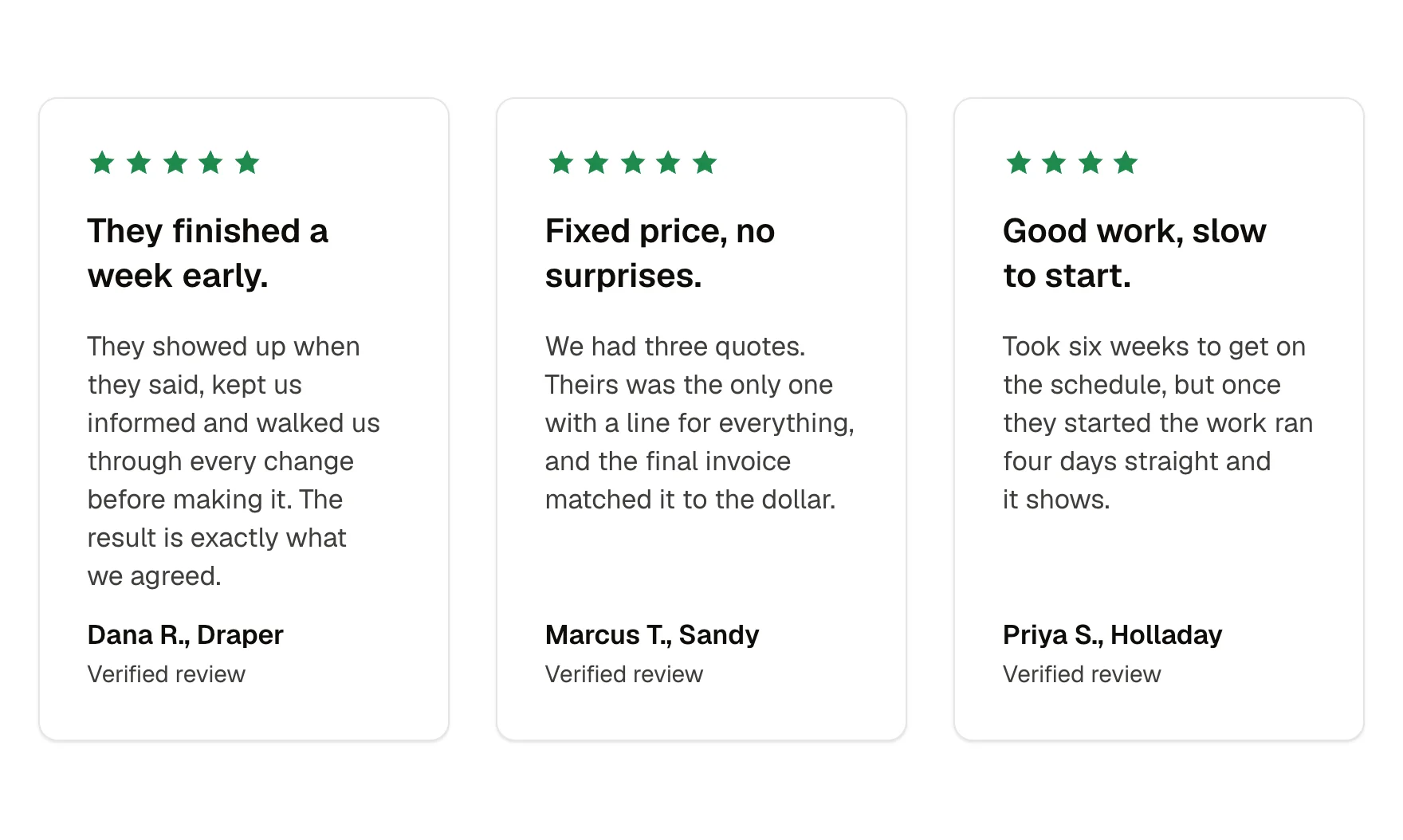
A testimonial with stars, a callout and the quote. A review inside a hero or beside a form. One card in a wall of reviews.
rating (select, 1 to 5); callout (text, one line); quote (text); reviewer (text, name and town); source (text, where the review was left); size (select: medium, small)
None interactive. Stars are decorative and hidden from screen readers; the rating is read once as a label.
Content and options are 6 props in the component's settings panel. Colour, type, spacing and radius follow your Automatic.css settings, so a change to the site's palette or scale changes this too. For anything else, edit the classes in the Style Manager, starting with .review-card, .review-card-grid, .star-rating.
white, radius (card radius when Cards is on), box-shadow-1, space-xs, space-s, space-m (card padding and gap when present), text-l, text-s, text-dark-muted, warning (stars, falls back to primary)
ACSS 4 defaults. Stars use the warning colour when that palette colour is enabled, otherwise the primary colour.
Version 1.1.0, September 30, 2026: Family contract: spacing on the shared card variables (–card-padding, –card-gap, –card-gap-tight, –card-radius) with a size prop, nested corners concentric, part names shared across the card family. Version 1.0.0, September 17, 2026: First release.
Etch 1.6.7 and ACSS 4.0.1. Version 1.1.0.
Members copy this straight into Etch, ready to paste.
Used an earlier version? How to update it
Get lifetime accessEverything here is made for Etch. Pick the builder you use and leave your email: we write once, when EtchPress works there.