Basic
A light, occasional need
$89per month
- One visit a month
- A written plan
- Two seasonal checkups
Cancel any time.
One plan: name, who it is for, the price with its period, a feature list as a repeater, a button and a note. A featured switch lifts the recommended plan with a chip and an accent border. Prefix and period keep one baseline with the figure.
A light, occasional need
$89per month
Cancel any time.
Most homes
$149per month
Cancel any time.
Larger needs
$329per month
Quoted to your needs.
Most homes
$149per month
Cancel any time.
A light, occasional need
$89per month
Cancel any time.
Most homes
$149per month
Cancel any time.
Larger needs
$329per month
Quoted to your needs.
A light, occasional need
$89per month
Cancel any time.
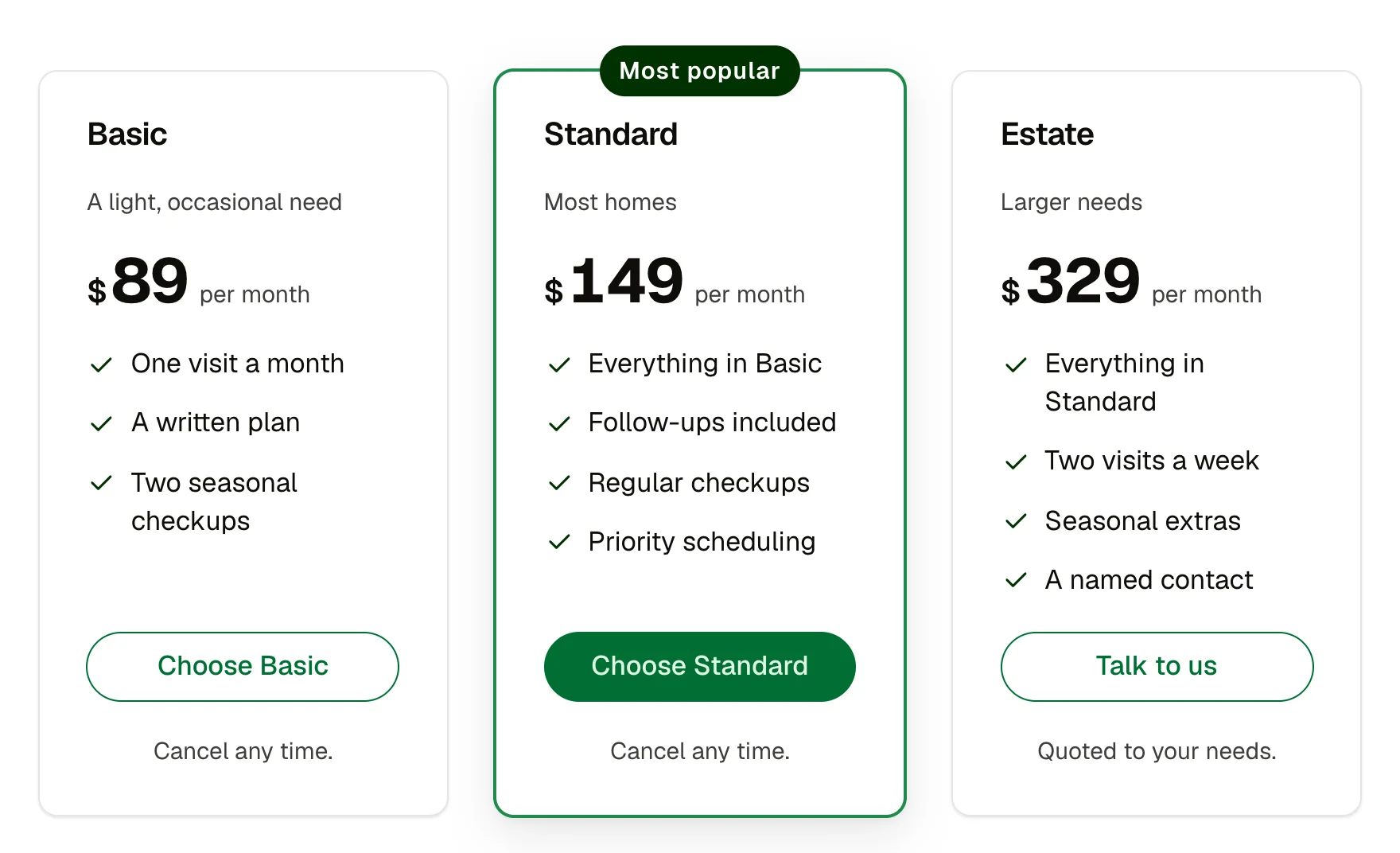
One plan in a pricing table. A membership tier with a features list. A package card on a services page.
name (text); who (text); price (text); prefix (text, such as $); period (text, such as per month); features (repeater: label); ctaLabel and ctaHref; note (text); featured (boolean); chip (text, shown on the featured plan); glow (boolean, a light at the card's foot on hover or focus); size (select: medium, small)
Featured (accent border, chip, primary button; the others use the outline button); hover on the card (lift, and with glow on, a light in the brand colour at its foot; keyboard focus inside the card shows it too); the button takes ACSS button states.
Content and options are 13 props in the component's settings panel. Colour, type, spacing and radius follow your Automatic.css settings, so a change to the site's palette or scale changes this too. For anything else, edit the classes in the Style Manager, starting with .plan-card, .plan-grid.
white, neutral-ultra-light, text-dark, text-dark-muted, primary, primary-dark, primary-ultra-light, h2, h4, text-s, space-xs, space-s, space-m, radius, box-shadow-1, box-shadow-2, focus tokens, transition
ACSS 4 defaults. Uses btn–primary and btn–outline.
Version 1.2.0, October 11, 2026: A Glow on hover setting: a soft light in your brand colour rises behind the card's foot when it is hovered or focused. The featured chip ("Most popular") sits centred on the card's top edge. Version 1.1.0, September 30, 2026: Family contract: spacing on the shared card variables (–card-padding, –card-gap, –card-gap-tight, –card-radius) with a size prop, nested corners concentric, part names shared across the card family (plan card: __name is now __title). Version 1.0.0, September 18, 2026: First release.
Etch 1.6.7 and ACSS 4.0.1. Version 1.2.0.
Members copy this straight into Etch, ready to paste.
Used an earlier version? How to update it
Get lifetime accessEverything here is made for Etch. Pick the builder you use and leave your email: we write once, when EtchPress works there.