Scroll scene: pan
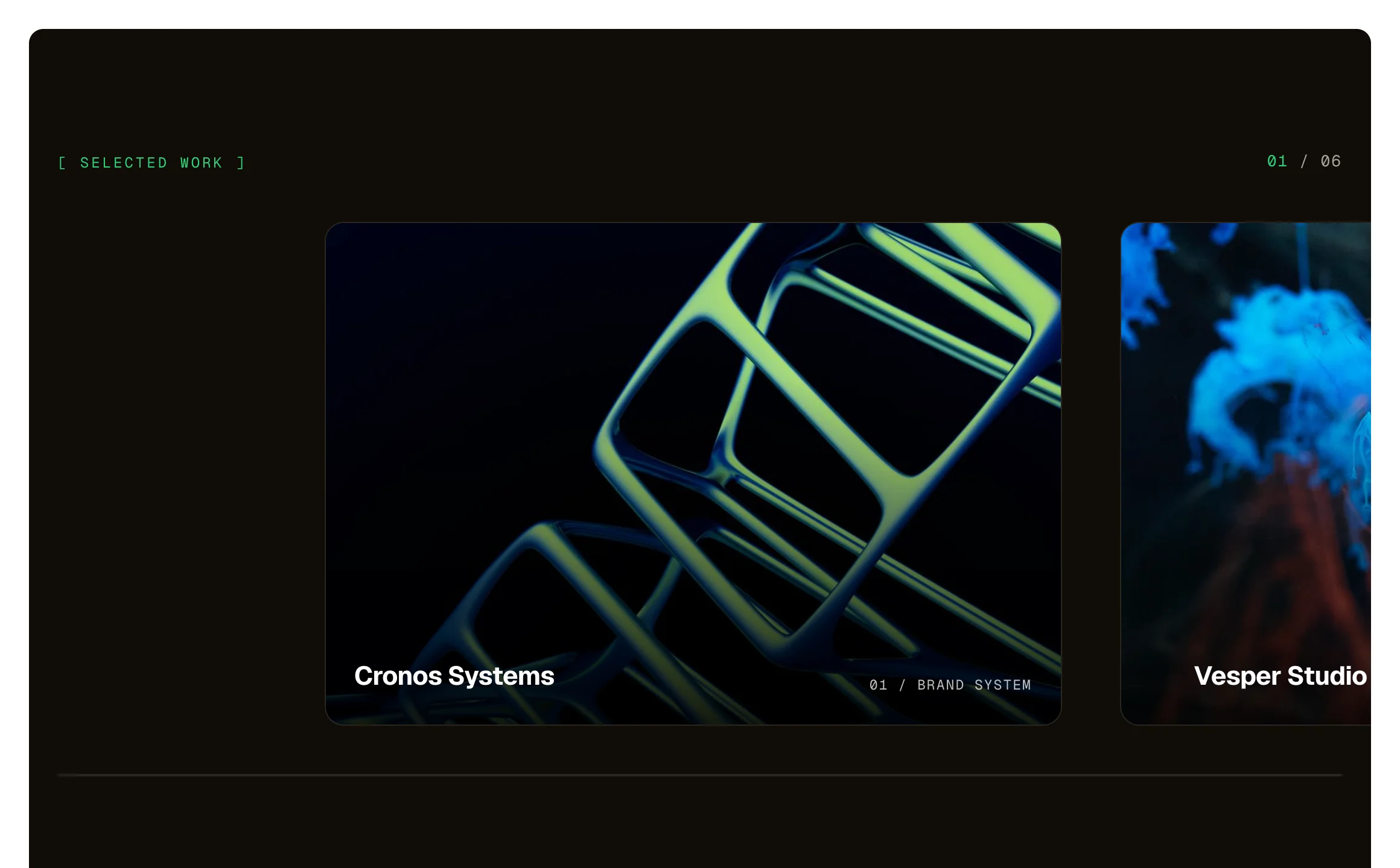
A row of large picture cards that travels sideways while the section holds on screen, like a camera panning. Three layers move at three speeds: the picture, its caption, and a large ghost numeral behind each card, so it reads as depth. A counter above and a progress line below. The same on a phone. Needs the EtchPress Runtime; without it it is a row of cards to swipe.
Live preview
[ SELECTED WORK ]
Cronos Systems

Vesper Studio

Kroma Platform
Pulse Architecture
Vanguard Identity
Northlight Press
[ SELECTED WORK ]
Cronos Systems
Vesper Studio
Kroma Platform
Pulse Architecture
Before you copy
This is a showpiece. It pastes into Etch like any other item and it is complete without anything else, but its motion comes from the EtchPress runtime: a small script that loads only on the pages that use a showpiece.
Etch for WordPress: download the EtchPress Runtime plugin from Downloads in your account, install it and activate it. Paste your licence key under Settings, EtchPress Runtime, and it updates from the Plugins screen like any other plugin.
Etch Studio: download the EtchPress runtime files from Downloads in your account, unzip them and drop them into your project's Asset Manager, then paste the item. Studio ships the files it needs with your site.
What you can build with it
Selected work on a studio or agency site. A portfolio's featured projects. A product line shown one at a time. Chapters or case studies on a landing page.
Props
eyebrow (text); cards (repeater: image, alt, title, label)
States shown
Scrolling: the section holds, the row travels with a soft lag, each picture drifts in its frame, captions drift the other way, numerals fastest; the counter and the line follow. The same on touch. Reduced motion: the hold stays and the row follows the scroll directly, with no lag and no drift. No runtime: a row to swipe.
How to change it
Content and options are 2 props in the component's settings panel. Colour, type, spacing and radius follow your Automatic.css settings, so a change to the site's palette or scale changes this too. For anything else, edit the classes in the Style Manager, starting with .scene-pan. Its behaviour is a small script that travels with the component; no plugin and nothing to install.
ACSS tokens used
The look is dark by design and does not follow the colour scheme: its colours are the item's own variables on .scene-pan (–pan-bg, –pan-surface, –pan-line, –pan-text, –pan-muted). –pan-accent follows your accent colour, or primary. header-height for the hold.
ACSS requirements
ACSS 4 defaults. Needs the EtchPress Runtime, 0.7.0 or later: the EtchPress Runtime plugin on WordPress, or the runtime's files dropped into the project's Asset Manager in Etch Studio. Without it you get the still version.
Version history
Version 1.0.0, October 4, 2026: First release, with the EtchPress Runtime 0.7.0.
Tested with
Etch 1.6.8 and ACSS 4.0.1. Version 1.0.0.
Needs the EtchPress runtime
The plugin on WordPress, or the runtime's files in Etch Studio. Without it you get the still version.
Lifetime members
Members copy this straight into Etch, ready to paste.
Used an earlier version? How to update it
Get lifetime accessWant EtchPress for Bricks or the block editor?
Everything here is made for Etch. Pick the builder you use and leave your email: we write once, when EtchPress works there.