Library
Service card
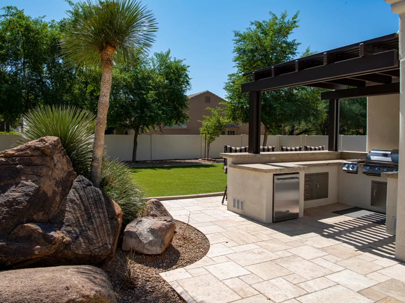
A linked card for a service or feature: image, heading, one-line description and a cue. The whole card is the click target, the heading carries the link, and the image is a placeholder that travels inside the JSON until you map your own.
ComponentFeatures
Live preview

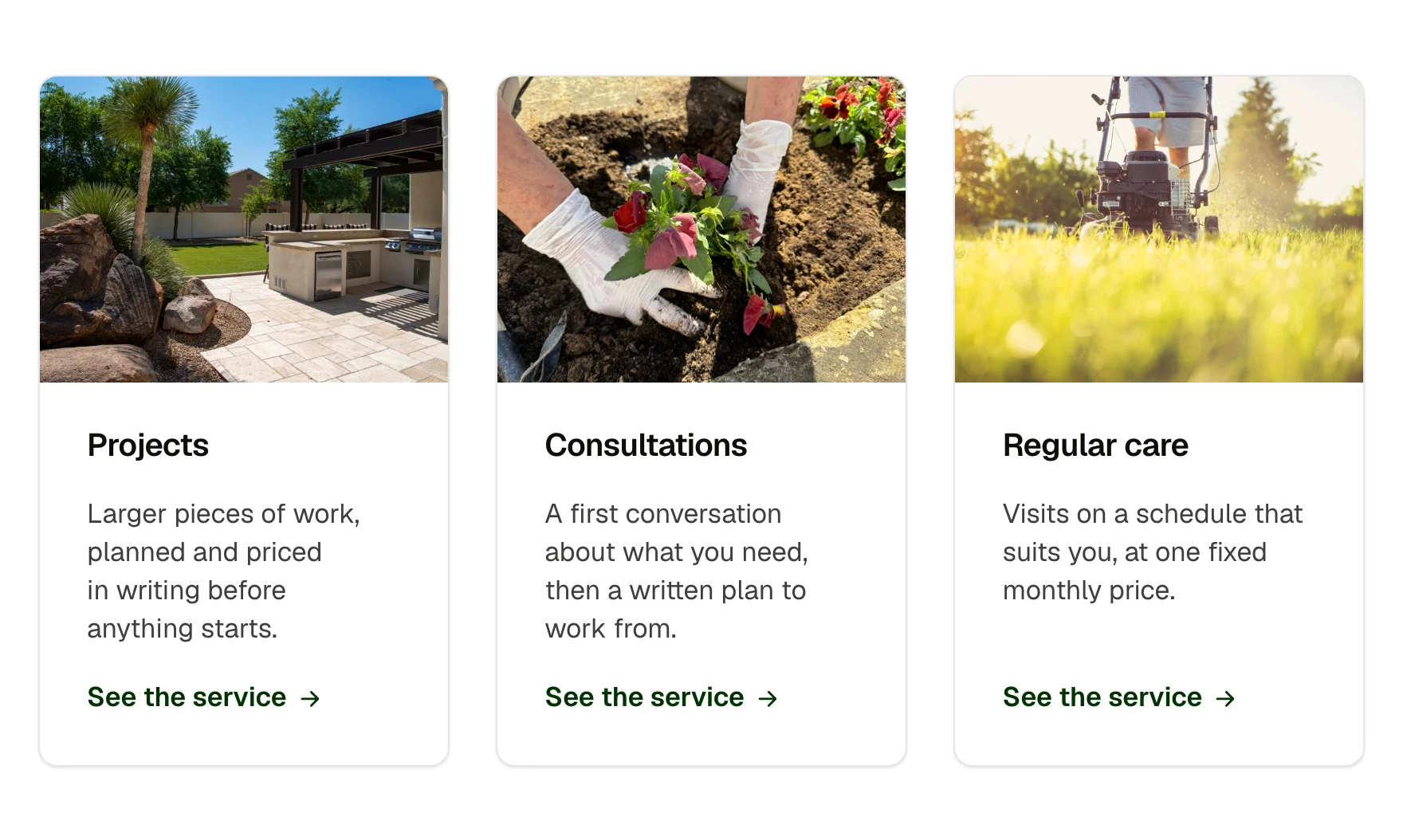
Consultations
A first conversation about what you need, then a written plan to work from.
See the service
Projects
Larger pieces of work, planned and priced in writing before anything starts.
Consultations
A first conversation about what you need, then a written plan to work from.
Regular care
Visits on a schedule that suits you, at one fixed monthly price.
What you can build with it
A services grid where every card links to its page. A features list with photos. A card to map from a services loop.
Props
title (text); description (text); href (link); image (image URL, a neutral placeholder by default); alt (text); showCue (boolean); cue (text); size (select: medium, small)
States shown
Hover and focus-within: the card lifts and its shadow deepens, the image scales, the cue arrow slides. Active: the lift returns. Focus ring on the card when its link is focused by keyboard. Reduced motion: no lift, no scale.
How to change it
Content and options are 8 props in the component's settings panel. Colour, type, spacing and radius follow your Automatic.css settings, so a change to the site's palette or scale changes this too. For anything else, edit the classes in the Style Manager, starting with .service-card, .service-card-grid.
ACSS tokens used
white, radius (card radius token when the site has cards on), box-shadow-1 and 2, space-s, space-m (card padding and gap tokens when present), h4, text-dark-muted, primary-dark, primary, transition
ACSS requirements
ACSS 4 defaults. Reads the card tokens (card radius, padding, gap) when the Cards module is on and falls back to the radius and space scales when it is off. Place cards in any grid; the card fills its cell.
Version history
Version 1.1.0, September 30, 2026: Family contract: spacing on the shared card variables (–card-padding, –card-gap, –card-gap-tight, –card-radius) with a size prop, nested corners concentric, part names shared across the card family (service card: __media-wrapper is now __media). Version 1.0.0, September 17, 2026: First release.
Tested with
Etch 1.6.7 and ACSS 4.0.1. Version 1.1.0.
Lifetime members
Members copy this straight into Etch, ready to paste.
Used an earlier version? How to update it
Get lifetime accessOther builders
Want EtchPress for Bricks or the block editor?
Everything here is made for Etch. Pick the builder you use and leave your email: we write once, when EtchPress works there.